JUMP TO TOPIC
Box and whisker plot – Explanation & Examples
 The definition of the box and whisker plot is:
“The box and whisker plot is a graph used to show the distribution of numerical data through the use of boxes and lines extending from them (whiskers)”
In this topic, we will discuss the box and whisker plot (or box plot) from the following aspects:
- What is a box and whisker plot?
- How to draw a box and whisker plot?
- How to read a box and whisker plot?
- How to make a box and whisker plot using R?
- Practical questions
- Answers
What is a box and whisker plot?
The box and whisker plot is a graph used to show the distribution of numerical data through the use of boxes and lines extending from them (whiskers).
The box and whisker plot shows the 5 summary statistics of the numerical data. These are the minimum, the first quartile, the median, the third quartile, and the maximum.
The first quartile is the data point where 25% of the data points are less than that value.
The median is the data point that halves the data equally.
The third quartile is the data point where 75% of the data points are less than that value.
The box is drawn from the first quartile to the third quartile. A line is passed through the box at the median.
A line (whisker) is extended from the bottom box margin (first quartile) to the minimum.
Another line (whisker) is extended from the top box margin (third quartile) to the maximum.
How to make a box and whisker plot?
We will go through a simple example with steps.
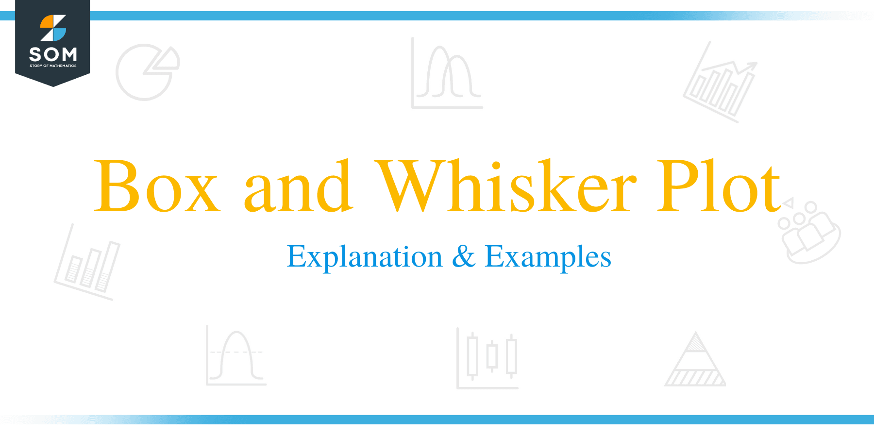
Example 1: For the numbers (1,2,3,4,5). Draw a box plot.
1. Order the data from smallest to largest.
Our data is already in order, 1,2,3,4,5.
2. Find the median.
The median is the central value of the odd list of ordered numbers.
1,2,3,4,5
The median is 3 because there are 2 numbers below 3 (1,2) and two numbers above 3 (4,5).
If we have an even list of ordered numbers, the median value is the sum of the middle pair divided by two.
3. Find the quartiles, the minimum, and the maximum
For an odd list of ordered numbers, the first quartile is the median of the first half of data points including the median.
1,2,3
The first quartile is 2
The third quartile is the median of the second half of data points including the median.
3,4,5
The third quartile is 4
The minimum is 1 and the maximum is 5
For an even list of ordered numbers, the first quartile is the median of the first half of data points and the third quartile is the median of the second half of data points.
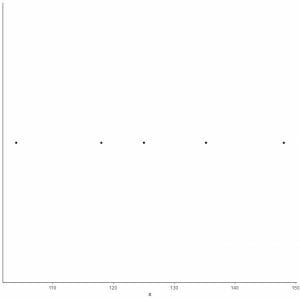
4. Draw an axis that includes all the five summary statistics.

Here, the horizontal x-axis includes all numerical values from the minimum or 1 to the maximum or 5.
5. Draw a point at each value of five summary statistics.
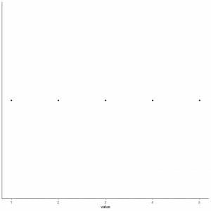
6. Draw a box that extends from the first quartile to the third quartile (2 to 4) and a line at the median (3).
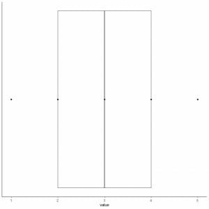
7. Draw a line (whisker) from the first quartile line to the minimum and another line from the third quartile line to the maximum.
We get the box and whisker plot of our data.
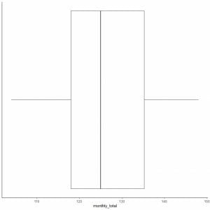
Example 2 of an even list of numbers: The following is the monthly totals of international airline passengers in 1949. These are 12 numbers that correspond to 12 months of the year.
112 118 132 129 121 135 148 148 136 119 104 118
So let’s make a box plot of this data.
1. Order the data from smallest to largest.
104 112 118 118 119 121 129 132 135 136 148 148
2. Find the median.
The median value is the sum of the middle pair divided by two.
104 112 118 118 119 121 129 132 135 136 148 148
the median = (121+129)/2 = 125
3. Find the quartiles, the minimum, and the maximum
For an even list of ordered numbers, the first quartile is the median of the first half of data points and the third quartile is the median of the second half of data points.
In the first half of the data, find the first quartile.
As the first half is also an even list of numbers, so the median value is the sum of the middle pair divided by two.
104 112 118 118 119 121
first quartile = (118+118)/2 = 118
In the second half of data, find the third quartile.
As the second half is also an even list of numbers, so the median value is the sum of the middle pair divided by two.
129 132 135 136 148 148
Third quartile = (135+136)/2 = 135.5
Minimum = 104, maximum = 148
4. Draw an axis that includes all the five summary statistics.
Here, the horizontal x-axis includes all numerical values from minimum or104 to maximum or 148.
5. Draw a point at each value of five summary statistics.
6. Draw a box that extends from the first quartile to the third quartile (118 to 135.5) and a line at the median (125).
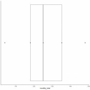
7. Draw a line (whisker) from the first quartile line to the minimum and another line from the third quartile line to the maximum.
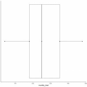
Usually, we do not need the points of summary statistics after drawing the box plot.
Some data points may be plotted, individually, after the end of the whiskers if they are outliers. But how we define that some points are outliers.
Inter-quartile range (IQR) is the difference between the first and third quartiles.
The upper whisker extends from the top of the box (third quartile or Q3) to the largest value but not larger than (Q3+1.5 X IQR).
The lower whisker extends from the bottom of the box (first quartile or Q1) to the smallest value but not smaller than (Q1-1.5 X IQR).
Data points that are larger than (Q3+1.5 X IQR) will be plotted individually after the end of the upper whisker to indicate that they are outlying large values.
Data points that are smaller than (Q1-1.5 X IQR) will be plotted individually after the end of the lower whisker to indicate that they are outlying small values.
Example of data with large outliers
The following is the box plot of the daily Ozone measurements in New York, May to September 1973. We also plot the individual points with the values for the outlying values.
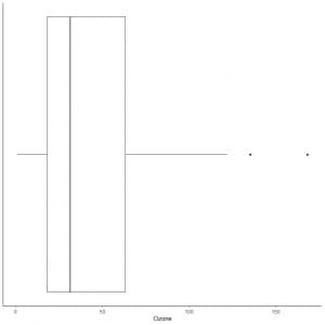
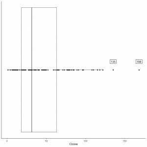
There are two outlying points at 135 and 168.
Q3 of this data = 63.25 and IQR = 45.25.
The two data points (135,168) are larger than (Q3+1.5X IQR) = 63.25 + 1.5X(45.25) = 131.125, so they are plotted individually after the end of the upper whisker.
Example of data with small outliers
The following is the box plot of the physical ability lawyers’ ratings of state judges in the US Superior Court. We also plot the individual points with the values for the outlying values.
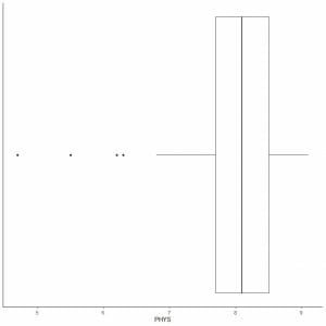
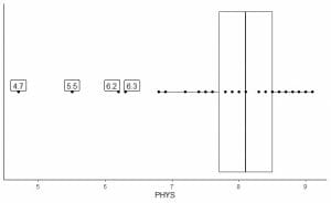
There are 4 outlying points at 4.7, 5.5, 6.2, and 6.3.
Q1 of this data = 7.7 and IQR = 0.8.
The 4 data points (4.7, 5.5, 6.2, 6.3) are smaller than (Q1-1.5 X IQR) = 7.7 – 1.5X(0.8) = 6.5, so they are plotted individually after the end of the lower whisker.
How to read a box and whisker plot?
We read the box plot by looking at the 5 summary statistics of the plotted numerical data.
This will give us, nearly, the distribution of this data.
Example, the following box plot for the temperature daily measurements in New York, May to September 1973.
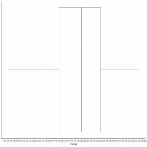
By extrapolating lines from box margins and whiskers.
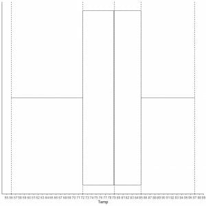
We see that:
Minimum = 56, first quartile = 72, median = 79, third quartile = 85, and maximum = 97.
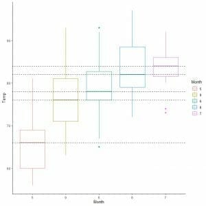
Box plots are used, also, to compare the distribution of a single numerical variable across several categories.
In that case, the x-axis is used for the categorical data and the y axis for the numerical data.
For the airquality data, let’s compare the distribution of Temperature across several months.
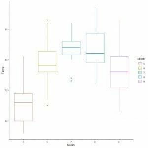
By extrapolating lines from the median of each month, we can see that month 7 (July) has the highest median temperature and month 5 (May) has the lowest median.
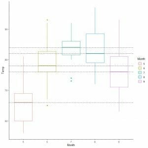
We can also arrange these box plots according to their median value.
How to make box plots using R
R has an excellent package called tidyverse that contains many packages for data visualization (as ggplot2) and data analysis (as dplyr).
These packages allow us to draw different versions of box plots for large datasets.
However, they require the supplied data to be a data frame which is a tabular form to store data in R. One column must be numerical data to visualize as a box plot and the other column is the categorical data you want to compare.
Example 1 of single box plot: The famous (Fisher’s or Anderson’s) iris data set gives the measurements in centimeters of the variables sepal length and width and petal length and width, respectively, for 50 flowers from each of 3 species of iris. The species are Iris setosa, versicolor, and virginica.
We begin our session by activating the tidyverse package using the library function.
Then, we load the iris data using the data function and examine it by the head function (to view the first 6 rows) and str function (to view its structure).
library(tidyverse)
data(“iris”)
head(iris)
## Sepal.Length Sepal.Width Petal.Length Petal.Width Species
## 1 5.1 3.5 1.4 0.2 setosa
## 2 4.9 3.0 1.4 0.2 setosa
## 3 4.7 3.2 1.3 0.2 setosa
## 4 4.6 3.1 1.5 0.2 setosa
## 5 5.0 3.6 1.4 0.2 setosa
## 6 5.4 3.9 1.7 0.4 setosa
str(iris)
## ‘data.frame’: 150 obs. of 5 variables:
## $ Sepal.Length: num 5.1 4.9 4.7 4.6 5 5.4 4.6 5 4.4 4.9 …
## $ Sepal.Width : num 3.5 3 3.2 3.1 3.6 3.9 3.4 3.4 2.9 3.1 …
## $ Petal.Length: num 1.4 1.4 1.3 1.5 1.4 1.7 1.4 1.5 1.4 1.5 …
## $ Petal.Width : num 0.2 0.2 0.2 0.2 0.2 0.4 0.3 0.2 0.2 0.1 …
## $ Species : Factor w/ 3 levels “setosa”,”versicolor”,..: 1 1 1 1 1 1 1 1 1 1 …
The data is composed of 5 columns (variables) and 150 rows (obs. Or observations). One column for the Species and other columns for Sepal.Length, Sepal.Width, Petal.Length, Petal.Width.
To plot a box plot of the sepal length, we use ggplot function with argument data = iris, aes(x = Sepal.length) to plot the sepal length on the x-axis.
We add geom_boxplot function to draw the desired box plot.
ggplot(data = iris, aes(x = Sepal.Length))+
geom_boxplot()
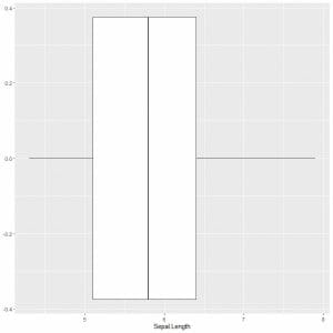
We can deduce approximately the 5 summary statistics as before. This gives us the distribution of the whole Sepal length values.
Example 2 of multiple box plots:
To compare the sepal length across the 3 species, we follow the same code as before but modify the ggplot function with an argument, data = iris, aes(x = Sepal.Length, y = Species, color = Species).
That will produce horizontal box plots that are colored differently according to Species
ggplot(data = iris, aes(x = Sepal.Length, y = Species, color = Species))+
geom_boxplot()
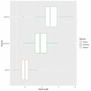
If you want vertical box plots, you will reverse the axes
ggplot(data = iris, aes(x = Species, y = Sepal.Length, color = Species))+
geom_boxplot()
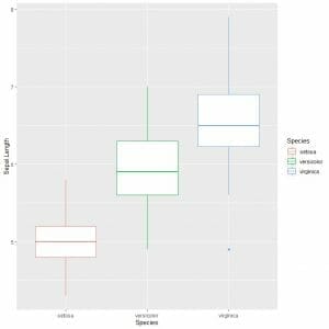
We can see that virginica species has the highest median sepal length and setosa species has the lowest median.
Example 3:
The diamonds data is a dataset containing the prices and other attributes of about 54,000 diamonds. It is part of the tidyverse package.
We begin our session by activating the tidyverse package using the library function.
Then, we load the diamonds data using the data function and examine it by the head function (to view the first 6 rows) and str function (to view its structure).
library(tidyverse)
data(“diamonds”)
head(diamonds)
## # A tibble: 6 x 10
## carat cut color clarity depth table price x y z
##
## 1 0.23 Ideal E SI2 61.5 55 326 3.95 3.98 2.43
## 2 0.21 Premium E SI1 59.8 61 326 3.89 3.84 2.31
## 3 0.23 Good E VS1 56.9 65 327 4.05 4.07 2.31
## 4 0.290 Premium I VS2 62.4 58 334 4.2 4.23 2.63
## 5 0.31 Good J SI2 63.3 58 335 4.34 4.35 2.75
## 6 0.24 Very Good J VVS2 62.8 57 336 3.94 3.96 2.48
str(diamonds)
## tibble [53,940 x 10] (S3: tbl_df/tbl/data.frame)
## $ carat : num [1:53940] 0.23 0.21 0.23 0.29 0.31 0.24 0.24 0.26 0.22 0.23 …
## $ cut : Ord.factor w/ 5 levels “Fair”<“Good”<..: 5 4 2 4 2 3 3 3 1 3 …
## $ color : Ord.factor w/ 7 levels “D”<“E”<“F”<“G”<..: 2 2 2 6 7 7 6 5 2 5 …
## $ clarity: Ord.factor w/ 8 levels “I1″<“SI2″<“SI1″<..: 2 3 5 4 2 6 7 3 4 5 …
## $ depth : num [1:53940] 61.5 59.8 56.9 62.4 63.3 62.8 62.3 61.9 65.1 59.4 …
## $ table : num [1:53940] 55 61 65 58 58 57 57 55 61 61 …
## $ price : int [1:53940] 326 326 327 334 335 336 336 337 337 338 …
## $ x : num [1:53940] 3.95 3.89 4.05 4.2 4.34 3.94 3.95 4.07 3.87 4 …
## $ y : num [1:53940] 3.98 3.84 4.07 4.23 4.35 3.96 3.98 4.11 3.78 4.05 …
## $ z : num [1:53940] 2.43 2.31 2.31 2.63 2.75 2.48 2.47 2.53 2.49 2.39 …
The data is composed of 10 columns and 53,940 rows.
To plot a box plot of the price, we use ggplot function with argument data = diamonds, aes(x = price) to plot the price (of all 53940 diamonds) on the x-axis.
We add geom_boxplot function to draw the desired box plot.
ggplot(data = diamonds, aes(x = price))+
geom_boxplot()
We can deduce approximately the 5 summary statistics. We also see that many diamonds have outlying large prices.
Example of multiple box plots:
To compare the price distribution across the cut categories (Fair, Good, Very Good, Premium, Ideal), we follow the same code as before but change the ggplot arguments, aes(x = cut, y = price, color = cut).
That will produce vertical box plots with a different color for each cut category.
ggplot(data = diamonds, aes(x = cut, y = price, color = cut))+
geom_boxplot()
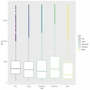
We see the strange relationship that ideal cut diamonds have the lowest median price and fair cut diamonds have the highest median price.
Practical questions
1. For the same diamonds data, plot box plots comparing price for different colors (color column). Which color has the highest median price?
2. For the same diamonds data, plot box plots comparing length (x column) for different colors (color column). Which color has the highest median length?
3. The infert data contains infertility data after spontaneous and induced abortion.
We can examine it using str and head functions
str(infert)
## ‘data.frame’: 248 obs. of 8 variables:
## $ education : Factor w/ 3 levels “0-5yrs”,”6-11yrs”,..: 1 1 1 1 2 2 2 2 2 2 …
## $ age : num 26 42 39 34 35 36 23 32 21 28 …
## $ parity : num 6 1 6 4 3 4 1 2 1 2 …
## $ induced : num 1 1 2 2 1 2 0 0 0 0 …
## $ case : num 1 1 1 1 1 1 1 1 1 1 …
## $ spontaneous : num 2 0 0 0 1 1 0 0 1 0 …
## $ stratum : int 1 2 3 4 5 6 7 8 9 10 …
## $ pooled.stratum: num 3 1 4 2 32 36 6 22 5 19 …
head(infert)
## education age parity induced case spontaneous stratum pooled.stratum
## 1 0-5yrs 26 6 1 1 2 1 3
## 2 0-5yrs 42 1 1 1 0 2 1
## 3 0-5yrs 39 6 2 1 0 3 4
## 4 0-5yrs 34 4 2 1 0 4 2
## 5 6-11yrs 35 3 1 1 1 5 32
## 6 6-11yrs 36 4 2 1 1 6 36
plot box plots comparing age (age column) for different education (education column). Which education category has the highest median age?
4. The UKgas data contains the quarterly UK gas consumption from 1960Q1 to 1986Q4, in millions of therms.
Use the following code and plot box plots comparing gas consumption (value column) for different quarters (quarter column).
Which quarter has the highest median gas consumption?
Which quarter has minimum gas consumption?
dat<- timetk::tk_tbl(UKgas) %>%
separate(index, into = c(“year”,”quarter”))
head(dat)
## # A tibble: 6 x 3
## year quarter value
##
## 1 1960 Q1 160.
## 2 1960 Q2 130.
## 3 1960 Q3 84.8
## 4 1960 Q4 120.
## 5 1961 Q1 160.
## 6 1961 Q2 125.
5. The txhousing data is part of the tidyverse package. It contains information about the housing market in Texas.
Use the following code and plot box plots comparing sales (sales column) for different cities (city column).
Which city has the highest median sales?
dat<- txhousing %>% filter(city %in% c(“Houston”,”Victoria”,”Waco”)) %>%
group_by(city, year) %>%
mutate(sales = median(sales, na.rm = T))
head(dat)
## # A tibble: 6 x 9
## # Groups: city, year [1]
## city year month sales volume median listings inventory date
##
## 1 Houston 2000 1 4313 381805283 102500 16768 3.9 2000
## 2 Houston 2000 2 4313 536456803 110300 16933 3.9 2000.
## 3 Houston 2000 3 4313 709112659 109500 17058 3.9 2000.
## 4 Houston 2000 4 4313 649712779 110800 17716 4.1 2000.
## 5 Houston 2000 5 4313 809459231 112700 18461 4.2 2000.
## 6 Houston 2000 6 4313 887396592 117900 18959 4.3 2000.
Answers
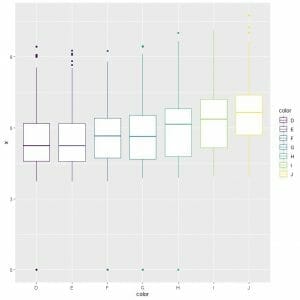
1. To compare the price distribution across the color categories, we use the ggplot arguments, data = diamonds, aes(x = color, y = price, color = color).
That will produce vertical box plots with a different color for each color category.
ggplot(data = diamonds, aes(x = color, y = price, color = color))+
geom_boxplot()
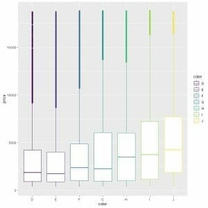
We see that the color “J” has the highest median price.
2. To compare the length distribution (x column) across the color categories, we use the ggplot arguments, data = diamonds, aes(x = color, y = x, color = color).
That will produce vertical box plots with a different color for each color category.
ggplot(data = diamonds, aes(x = color, y = x, color = color))+
geom_boxplot()
We see, also, that the color “J” has the highest median length.
3. To compare the age distribution (age column) across the education categories, we use the ggplot arguments, data = infert, aes(x = education, y = age, color = education).
That will produce vertical box plots with a different color for each education category.
ggplot(data = infert, aes(x = education, y = age, color = education))+
geom_boxplot()
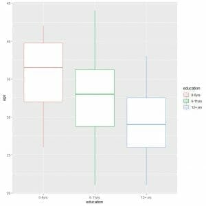
We see that the “0-5yrs” education category has the highest median age.
4. We will use the provided code to create the data frame.
To compare the gas consumption distribution (value column) across the different quarters, we use the ggplot arguments, data = dat, aes(x = quarter, y = value, color = quarter).
That will produce vertical box plots with a different color for each quarter.
dat<- timetk::tk_tbl(UKgas) %>%
separate(index, into = c(“year”,”quarter”))
ggplot(data = dat, aes(x = quarter, y = value, color = quarter))+
geom_boxplot()
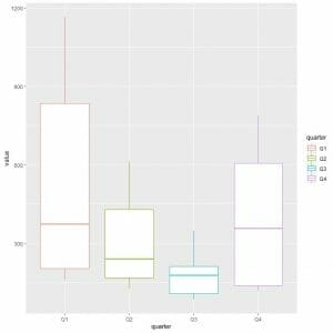
The first quarter or Q1 has the highest median gas consumption.
To find the quarter with minimum gas consumption, we look at the lowest whisker of the different box plots. We see that the third quarter has the lowest whisker or the smallest gas consumption value.
5. We will use the provided code to create the data frame.
To compare the sales distribution (sales column) across the different cities, we use the ggplot arguments, data = dat, aes(x = city, y = sales, color = city).
That will produce vertical box plots with a different color for each city.
dat<- txhousing %>% filter(city %in% c(“Houston”,”Victoria”,”Waco”)) %>%
group_by(city, year) %>%
mutate(sales = median(sales, na.rm = T))
ggplot(data = dat, aes(x = city, y = sales, color = city))+
geom_boxplot()
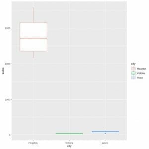
We see that Houston had the highest median sales.
The other two cities had box plots of lines. This means that the minimum, first quartile, median, third quartile, and maximum have similar values, for Victoria and Waco, which cannot be differentiated at this y-axis scale of thousands.