JUMP TO TOPIC
Histogram – Explanation & Examples
 The definition of a histogram is:
“The histogram is a graphical display of numerical data using adjacent bars of different heights”.
In this topic, we will discuss the histogram from the following aspects:
- What is a histogram?
- How to make a histogram?
- When to use a histogram?
- Frequency histograms and relative frequency histograms.
- Practical questions.
- Answers.
What is a histogram?
A histogram is a graphical display of numerical data using bars of different heights.
The bars group the numerical data into chosen ranges or intervals.
The height of each bar shows how many data fall into each range.
As such, the histogram shows the shape and spread of numerical data (or the data distribution).
How to make a histogram?
We will walk through different examples.
Example 1
The following are the heights in cm of 50 persons.
178.0 155.0 161.0 162.0 165.0 162.0 160.0 155.0 172.5 162.0 177.0 149.2 175.0 169.0 150.0 163.0 165.0 159.5 157.0 159.0 153.0 170.0 173.0 170.0 168.0 161.3 179.0 164.0 164.0 157.0 168.0 146.5 164.0 150.0 177.0 155.5 164.0 157.0 163.0 160.0 162.0 160.2 163.0 171.0 165.0 178.0 170.0 170.0 158.0 165.0.
To make a histogram:
- Determine the number of bins (classes) you need.
Use the formula, log(number of observations)/log(2), and round up the number to the next integer.
In this data, the number of bins = log(50)/log(2) = 5.6 will be rounded up to become 6.
- Sort the data and subtract the minimum data value from the maximum data value to get the data range.
146.5 149.2 150.0 150.0 153.0 155.0 155.0 155.5 157.0 157.0 157.0 158.0 159.0 159.5 160.0 160.0 160.2 161.0 161.3 162.0 162.0 162.0 162.0 163.0 163.0 163.0 164.0 164.0 164.0 164.0 165.0 165.0 165.0 165.0 168.0 168.0 169.0 170.0 170.0 170.0 170.0 171.0 172.5 173.0 175.0 177.0 177.0 178.0 178.0 179.0.
The minimum value is 146.5 and the maximum value is 179, so the range = 179 – 146.5 = 32.5.
- Divide the data range in Step 2 by the number of bins you get in Step 1.
Round the number you get up to a whole number to get the class width.
Class width = 32.5 / 6 = 5.4. Rounded up to 6.
- Add the class width,6, sequentially (6 times because 6 is the number of bins) to the minimum value to create the different 6 bins.
146.5 + 6 = 152.5, so the first bin is 146.5-152.5.
152.5 + 6 = 158.5, so the second bin is 152.5-158.5.
158.5 + 6 = 164.5, so the third bin is 158.5-164.5.
164.5 + 6 = 170.5, so the fourth bin is 164.5-170.5.
170.5 + 6 = 176.5, so the fifth bin is 170.5-176.5.
176.5 + 6 = 182.5, so the sixth bin is 176.5-182.5.
- Draw a table of 2 columns. The first column carries the different bins of our data that we created in step 4.
The second column will contain the frequency (count) of height values in each bin.
range | frequency |
146.5 – 152.5 | |
152.5 – 158.5 | |
158.5 – 164.5 | |
164.5 – 170.5 | |
170.5 – 176.5 | |
176.5 – 182.5 |
- The second column will contain the frequency of height values in each bin.
- The height bin “146.5-152.5” contains the heights from 146.5 to 152.5.
- The next height bin “152.5-158.5” contains heights larger than 152.5 till 158.5, and so on.
By looking at the sorted data in step 2, we see that:
- The first 4 numbers (146.5, 149.2, 150.0, 150.0) are within the first bin “146.5-152.5” so the frequency of this bin is 4.
- The next 8 numbers (153.0, 155.0, 155.0, 155.5, 157.0, 157.0, 157.0, 158.0) are within the second bin “152.5-158.5” so the frequency of this bin is 8.
- The next 18 numbers (159.0, 159.5, 160.0, 160.0, 160.2, 161.0, 161.3, 162.0, 162.0, 162.0, 162.0, 163.0, 163.0, 163.0, 164.0, 164.0, 164.0, 164.0) are within the third bin “158.5-164.5” so the frequency of this bin is 18.
- And so on till completing the frequency of all bins.
range | frequency |
146.5 – 152.5 | 4 |
152.5 – 158.5 | 8 |
158.5 – 164.5 | 18 |
164.5 – 170.5 | 11 |
170.5 – 176.5 | 4 |
176.5 – 182.5 | 5 |
If you sum these frequencies, you will get 50 which is the total number of data.
4+8+18+11+4+5 = 50.
- Use this bin frequency table to plot a histogram, where the data bins or ranges on the x-axis and the frequency or count on the y-axis.
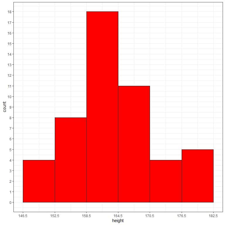
From the histogram, we can see that:
- Each bar height corresponds to the frequency (count) of that bin or interval in the previous bin frequency table.
For example, the first bin “146.5-152.5” has a frequency = 4, so the height of its bar is 4, while the next bin “152.5-158.5” has a frequency of 8, so the height of its bar is 8.
- The most frequent bin is “158.5-164.5” with 18 frequency so the height of its bar is 18.
- The data is nearly normally distributed with no skewed data or outliers. Values closer to the central region are more frequent than values far from the central region.
Example 2
The following is the area diameter of 60 storms rounded to the nearest integer.
0 0 0 0 0 0 0 0 0 0 0 0 0 0 58 58 58 58 63 75 86 92 98 104 104 109 109 109 109 109 109 98 92 92 81 75 75 75 69 69 75 81 81 86 81 0 0 0 0 0 0 0 0 0 0 0 23 23 35 46.
To make a histogram:
- Determine the number of bins you need.
In this data, the number of bins = log(60)/log(2) = 5.9 will be rounded up to become 6.
- Sort the data and subtract the minimum data value from the maximum data value to get the data range.
0 0 0 0 0 0 0 0 0 0 0 0 0 0 0 0 0 0 0 0 0 0 0 0 0 23 23 35 46 58 58 58 58 63 69 69 75 75 75 75 75 81 81 81 81 86 86 92 92 92 98 98 104 104 109 109 109 109 109 109.
In our data, the minimum value is 0 and the maximum value is 109, so the range = 109 – 0 = 109.
- Divide the data range in Step 2 by the number of classes you get in Step 1. Round the number you get up to a whole number to get the class width.
Class width = 109 / 6 = 18.2. Rounded up to 19.
- Add the class width, 19, sequentially (6 times because 6 is the number of bins) to the minimum value to create the different 6 bins.
0 + 19 = 19 so the first bin is 0-19.
19 + 19 = 38 so the second bin is 19-38.
38 + 19 = 57 so the third bin is 38-57.
57 + 19 = 76 so the fourth bin is 57-76.
76 + 19 = 95 so the fifth bin is 76-95.
95 + 19 = 114 so the sixth bin is 95-114.
- We draw a table of 2 columns. The first column carries the different bins of our data that we created in step 4.
The second column will contain the frequency of diameter values in each bin.
range | frequency |
0 – 19 | |
19 – 38 | |
38 – 57 | |
57 – 76 | |
76 – 95 | |
95 – 114 |
- The second column will contain the frequency of diameter values in each bin.
- The bin “0-19” contains the diameters from 0 to 19.
- The next bin “19-38” contains diameters larger than 19 to 38, and so on.
By looking at the sorted data in step 2, we see that:
- The first 25 numbers are all zeros (0, 0, 0, 0, 0, 0, 0, 0, 0, 0, 0, 0, 0, 0, 0, 0, 0, 0, 0, 0, 0, 0, 0, 0, 0), and are within the first bin “0-19” so the frequency of this bin is 25.
- The next 3 numbers (23, 23, 35) are within the second bin “19-38” so the frequency of this bin is 3.
- The next number (46) is within the third bin “38-57” so the frequency of this bin is 1.
- And so on till completing the frequency of all bins.
range | frequency |
0 – 19 | 25 |
19 – 38 | 3 |
38 – 57 | 1 |
57 – 76 | 12 |
76 – 95 | 9 |
95 – 114 | 10 |
If you sum these frequencies, you will get 60 which is the total number of data.
25+3+1+12+9+10 = 60.
- Use this bin frequency table to plot a histogram, where the data bins or ranges on the x-axis and the frequency or count on the y-axis.
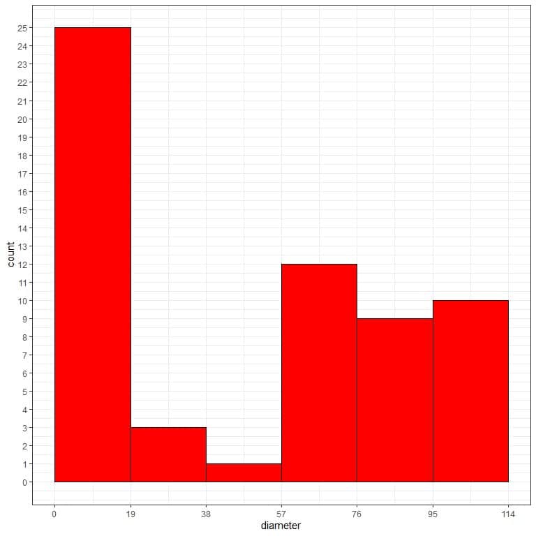
From the histogram, we can see that:
- Each bar height corresponds to the frequency (count) of that bin or interval in the previous bin frequency table.
- The most frequent bin is “0-19” with 25 frequency.
- The data is somewhat right-skewed with large outliers. Values cluster at the left side of the numerical scale with low frequent larger values on the right side.
Example 3
The following are the solar radiation measurements for 146 different days in New York in 1973.
190 118 149 313 299 99 19 194 256 290 274 65 334 307 78 322 44 8 320 25 92 66 266 13 252 223 279 286 287 242 186 220 264 127 273 291 323 259 250 148 332 322 191 284 37 120 137 150 59 91 250 135 127 47 98 31 138 269 248 236 101 175 314 276 267 272 175 139 264 175 291 48 260 274 285 187 220 7 258 295 294 223 81 82 213 275 253 254 83 24 77 255 229 207 222 137 192 273 157 64 71 51 115 244 190 259 36 255 212 238 215 153 203 225 237 188 167 197 183 189 95 92 252 220 230 259 236 259 238 24 112 237 224 27 238 201 238 14 139 49 20 193 145 191 131 223.
To make a histogram:
- Determine the number of bins you need.
In this data, the number of bins = log(146)/log(2) = 7.2 will be rounded up to become 8.
- Sort the data and subtract the minimum data value from the maximum data value to get the data range.
7 8 13 14 19 20 24 24 25 27 31 36 37 44 47 48 49 51 59 64 65 66 71 77 78 81 82 83 91 92 92 95 98 99 101 112 115 118 120 127 127 131 135 137 137 138 139 139 145 148 149 150 153 157 167 175 175 175 183 186 187 188 189 190 190 191 191 192 193 194 197 201 203 207 212 213 215 220 220 220 222 223 223 223 224 225 229 230 236 236 237 237 238 238 238 238 242 244 248 250 250 252 252 253 254 255 255 256 258 259 259 259 259 260 264 264 266 267 269 272 273 273 274 274 275 276 279 284 285 286 287 290 291 291 294 295 299 307 313 314 320 322 322 323 332 334.
The minimum value is 7 and the maximum value is 334, so the range = 334 – 7 = 327.
- Divide the data range in Step 2 by the number of classes you get in Step 1. Round the number you get up to a whole number to get the class width.
Class width = 327 / 8 = 40.9. Rounded up to 41.
- Add the class width, 41, sequentially (8 times because 8 is the number of bins) to the minimum value to create the different 8 bins.
7 + 41 = 48 so the first bin is 7-48.
48 + 41 = 89 so the second bin is 48-89.
89 + 41 = 130 so the third bin is 89-130.
130 + 41 = 171 so the fourth bin is 130-171.
171 + 41 = 212 so the fifth bin is 171-212.
212 + 41 = 253 so the sixth bin is 212-253.
253 + 41 = 294 so the seventh bin is 253-294.
294 + 41 = 335 so the eighth bin is 294-335.
- We draw a table of 2 columns. The first column carries the different bins of our data that we created in step 4.
The second column will contain the frequency of solar measurements in each bin as shown in the previous examples.
range | frequency |
7 – 48 | |
48 – 89 | |
89 – 130 | |
130 – 171 | |
171 – 212 | |
212 – 253 | |
253 – 294 | |
294 – 335 |
- The second column will contain the frequency of solar values in each bin.
By looking at the sorted data in step 2, we see that:
- The first 16 numbers (7, 8, 13, 14, 19, 20, 24, 24, 25, 27, 31, 36, 37, 44, 47, 48) are within the first bin “7-48” so the frequency of this bin is 16.
- The next 12 numbers (49, 51, 59, 64, 65, 66, 71, 77, 78, 81, 82, 83) are within the second bin “48-89” so the frequency of this bin is 12.
- The next 13 numbers (91, 92, 92, 95, 98, 99, 101, 112, 115, 118, 120, 127, 127) are within the third bin “89-130” so the frequency of this bin is 13.
- And so on till completing the frequency of all bins.
range | frequency |
7 – 48 | 16 |
48 – 89 | 12 |
89 – 130 | 13 |
130 – 171 | 14 |
171 – 212 | 20 |
212 – 253 | 29 |
253 – 294 | 31 |
294 – 335 | 11 |
If you sum these frequencies, you will get 146 which is the total number of data.
16+12+13+14+20+29+31+11 = 146.
- Use this bin frequency table to plot a histogram, where the data bins or ranges on the x-axis and the frequency or count on the y-axis.
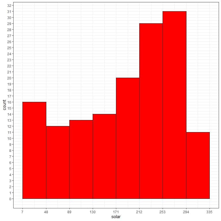
From the histogram, we can see that:
- Each bar height corresponds to the frequency (count) of that bin or interval in the previous bin frequency table.
- The most frequent bin is “253-294” with 31 frequency.
- The data is somewhat left-skewed with small outliers. Values cluster at the right side of the numerical scale with low frequent smaller values on the left side.
When to use a histogram?
- Histograms are used to show the distribution of numerical data. The data distribution means the different values of the data and the frequency (count) of these different values.
- There are 2 types of numerical data:
1.Continuous data that can take decimal values within a certain range.
- Examples: height, age, income, weight. A certain weight can be 70.5 kg.
- Continuous data usually have many different unique numbers.
2.Discrete data takes only integer values within a certain range. They cannot take decimal values.
- Examples are the count data: the number of fruits consumed every day or the number of patients in a hospital in a certain period.
- These values can not take decimal values so the number of patients cannot be 300.5 patients.
- Discrete data usually have a limited number of unique numbers.
- We use histograms to show the distribution of continuous numerical data. For discrete numerical data, a bar graph is used to plot these data.
- In the bar graph, we plot the individual discrete data values (not bins) on the horizontal x-axis and their count or frequency on the vertical y-axis. The count is represented by non-adjacent bars.
Example of continuous data
The following is the age (in years) of 40 participants from a certain survey.
participant | Age |
1 | 26 |
2 | 48 |
3 | 67 |
4 | 39 |
5 | 25 |
6 | 25 |
7 | 36 |
8 | 44 |
9 | 44 |
10 | 47 |
11 | 53 |
12 | 52 |
13 | 52 |
14 | 51 |
15 | 52 |
16 | 40 |
17 | 77 |
18 | 44 |
19 | 40 |
20 | 45 |
21 | 48 |
22 | 49 |
23 | 19 |
24 | 54 |
25 | 82 |
26 | 83 |
27 | 89 |
28 | 88 |
29 | 72 |
30 | 82 |
31 | 89 |
32 | 34 |
33 | 55 |
34 | 37 |
35 | 22 |
36 | 33 |
37 | 37 |
38 | 43 |
39 | 29 |
40 | 57 |
If we list the occurrences of these age values with the normal frequency table.
Age | frequency |
19 | 1 |
22 | 1 |
25 | 2 |
26 | 1 |
29 | 1 |
33 | 1 |
34 | 1 |
36 | 1 |
37 | 2 |
39 | 1 |
40 | 2 |
43 | 1 |
44 | 3 |
45 | 1 |
47 | 1 |
48 | 2 |
49 | 1 |
51 | 1 |
52 | 3 |
53 | 1 |
54 | 1 |
55 | 1 |
57 | 1 |
67 | 1 |
72 | 1 |
77 | 1 |
82 | 2 |
83 | 1 |
88 | 1 |
89 | 2 |
We have 30 different age values.
We can plot this table as a bar graph:
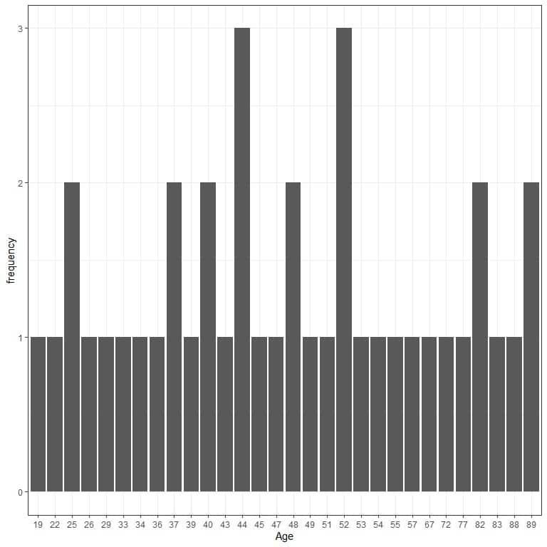
The bar graph does not provide any information about the distribution of age in this data.
If we plot this data as a histogram:
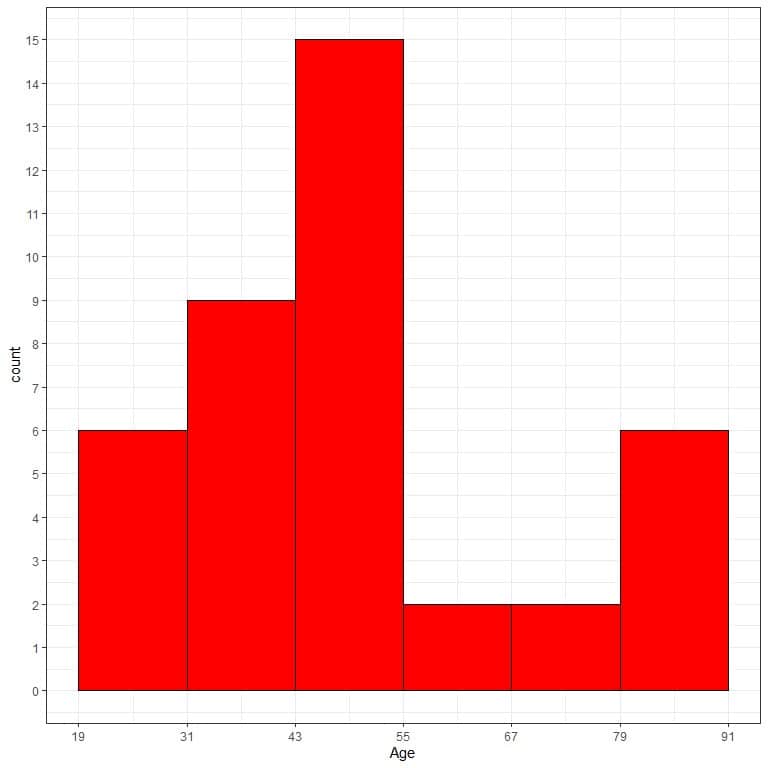
We can now get an idea about the data distribution. The histogram is better than the bar graph for this data.
Example of discrete data
The following is the number of cylinders for 32 different car models in 1973-1974.
Note that this is a count data.
Model | number of cylinders |
Mazda RX4 | 6 |
Mazda RX4 Wag | 6 |
Datsun 710 | 4 |
Hornet 4 Drive | 6 |
Hornet Sportabout | 8 |
Valiant | 6 |
Duster 360 | 8 |
Merc 240D | 4 |
Merc 230 | 4 |
Merc 280 | 6 |
Merc 280C | 6 |
Merc 450SE | 8 |
Merc 450SL | 8 |
Merc 450SLC | 8 |
Cadillac Fleetwood | 8 |
Lincoln Continental | 8 |
Chrysler Imperial | 8 |
Fiat 128 | 4 |
Honda Civic | 4 |
Toyota Corolla | 4 |
Toyota Corona | 4 |
Dodge Challenger | 8 |
AMC Javelin | 8 |
Camaro Z28 | 8 |
Pontiac Firebird | 8 |
Fiat X1-9 | 4 |
Porsche 914-2 | 4 |
Lotus Europa | 4 |
Ford Pantera L | 8 |
Ferrari Dino | 6 |
Maserati Bora | 8 |
Volvo 142E | 4 |
There are only 3 unique numbers in this data, 6, 4, or 8.
If we plot this data as a bar graph:
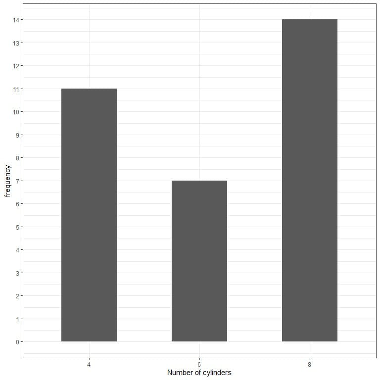
We see that the most frequent number is 8 with 14 occurrences.
If we plot this data as a histogram.
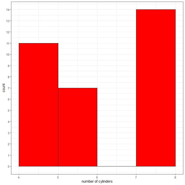
Plotting this data as a histogram is misleading:
- The first bin “4-5” contains values from 4 to 5, while it contains only 4.
- The second bin “5-6” contains values larger than 5 till 6, while it contains only 6.
- The third bin “7-8” contains values larger than 7 till 8, while it contains only 8.
- The bar graph is better than the histogram for showing the distribution of this data.
Frequency histograms and relative frequency histograms
- All the above histograms are examples of frequency histograms where we plot the data bins on the x-axis and their frequency or count on the y-axis.
- A relative frequency histogram is a modification of the frequency histogram. Instead of using the y-axis for the count of data values that fall into a specific bin, the y-axis is used to represent the proportion of data values that fall into this bin.
- In a relative frequency histogram, all bars must have a height from 0 to 1. Furthermore, the heights of all of the bars must sum to 1.
Example
We consider the above example of the solar radiation measurements for 146 different days in New York in 1973.
To make a relative frequency histogram:
- Follow the above steps till step 6 of creating a bin frequency table.
range | frequency |
7 – 48 | 16 |
48 – 89 | 12 |
89 – 130 | 13 |
130 – 171 | 14 |
171 – 212 | 20 |
212 – 253 | 29 |
253 – 294 | 31 |
294 – 335 | 11 |
If you sum these frequencies, you will get 146 which is the total number of data.
16+12+13+14+20+29+31+11 = 146.
- Add a third column for the relative frequency.
range | frequency | relative.frequency |
7 – 48 | 16 | 0.11 |
48 – 89 | 12 | 0.08 |
89 – 130 | 13 | 0.09 |
130 – 171 | 14 | 0.10 |
171 – 212 | 20 | 0.14 |
212 – 253 | 29 | 0.20 |
253 – 294 | 31 | 0.21 |
294 – 335 | 11 | 0.08 |
For example, the first bin “7-48” contains 16 data points or frequency, so the relative frequency of this bin = 16/146 = 0.11.
the second bin “48-89” contains 12 data points, so the relative frequency of this bin = 12/146 = 0.11.
If you sum these relative frequencies, you will get nearly 1 (due to rounding):
0.11+0.08+0.09+0.1+0.14+0.2+0.21+0.08 = 1.01.
- Use this bin frequency table to plot a frequency histogram, where the data bins or ranges on the x-axis and the frequency on the y-axis.

Use the same table to plot a relative frequency histogram, where the data bins or ranges on the x-axis and the relative frequency or proportions on the y-axis.
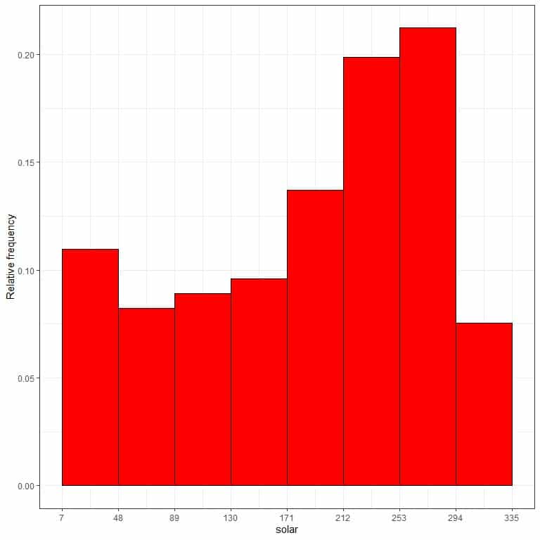
We see that:
- Both frequency histogram and relative frequency histogram are identical in shape.
- A frequency histogram focuses on the count of data values in each bin, while a relative frequency histogram focuses on the proportion of data values in the bin relative to other bins.
- In relative frequency histograms, the heights or proportions can be interpreted as probabilities. These probabilities can be used to determine the likelihood of certain results to occur within a given population.
- For example, the relative frequency of the “7-48” bin is 0.11, so the probability of solar radiation measurements to fall in this range is 0.11 or 11%. On the other hand, the relative frequency of the “253-294” bin is 0.21, so the probability of solar radiation measurements to fall in this range is 0.21 or 21%.
- This means that solar radiation measurements in the range “253-294” tend to occur more than the 7-48 measurements in New York City in that year.
Practical questions
- The following histogram is for 153 temperature measurements (in Fahrenheit) in New York in 1973.
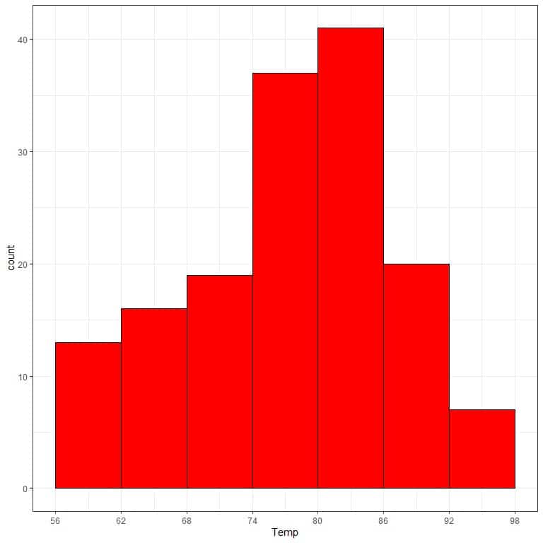
What is the most frequent temperature range?
What is the least frequent temperature range?
- The following is a histogram of the 50 murder arrests (per 100,000) of the 50 US states in 1973.
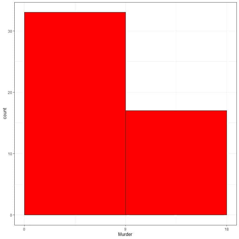
What is the most frequent bin?
What is wrong with this histogram?
- The following are two histograms of the 50 murder and rape arrests (per 100,000) of the 50 US states in 1973.
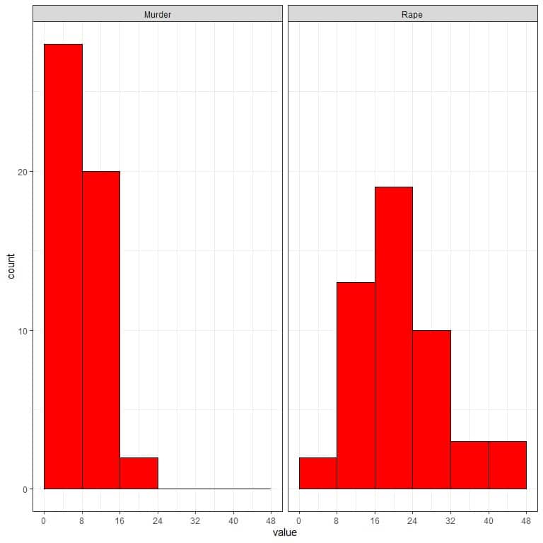
Which crime (murder or rape) has a higher arrest rate?
What is the most frequent arrest rate for murder and rape?
- The following is the relative frequency histogram for the price of 53940 diamonds with many horizontal lines to see the relative frequency of each bin.
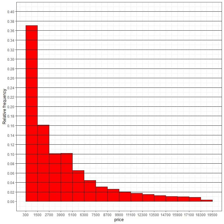
What is the probability that the diamonds’ price falls in the range 1500-2700?
What is the probability that the diamonds’ price falls in the range 9900-11100?
- The following is the relative frequency histogram for the HDL cholesterol (mg/dl) of 2225 participants in a certain survey.
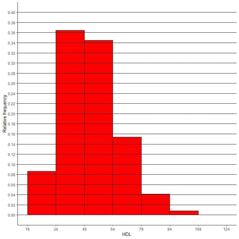
Different horizontal lines are drawn to see the relative frequency of each bin.
What is the probability that the participants’ HDL falls in the range 79-94?
What is the probability that the participants’ HDL falls in the range 94-109?
Answers
- The most frequent temperature range is “80-86” with more than 40 frequency. The least frequent temperature range is “92-98”.
- The most frequent bin is “0-9” with more than 30 occurrences. There are only 2 bins that cannot be used to interpret the distribution of this data.
- Rape crimes have higher arrest rates because they have values in the 40-48 bin while murder crimes do not. The most frequent arrest rate for murder is 0-8, while the most frequent arrest rate for rape is 16-24.
- We see that the bar for the bin “1500-2700” touches the 0.16 line. So the probability of this range = 0.16 or 0.16 X 100 = 16%. Similarly, the probability of the “9900-11100” range is 0.02 or 2%.
- The probability of the range 79-94 is 0.04 or 4%. The probability of the range 94-109 is less than 0.02 or less than 2%.