JUMP TO TOPIC
Line graph – Explanation & Examples
 The definition of the line graph is:
“The line graph is a chart used to represent the change in numerical data over time using lines”
In this topic, we will discuss the line graph from the following aspects:
- What is the line graph?
- How to make a line graph?
- Types of line graphs
- How to read line graphs?
- How to make line graphs using R?
- Practical questions
- Answers
What is the line graph?
The line graph is a graph used to represent the change in numerical data over time using lines.
The horizontal x-axis is used to show time and the vertical y-axis is used to show the numerical data corresponding to each time point.
We draw points that correspond to the intersection of each time and its numerical data. By connecting these points, we get the line graph.
How to make a line graph?
Example: The following is the monthly totals of international airline passengers (in thousands) in 1960.
Month | Total |
January | 417 |
February | 391 |
March | 419 |
April | 461 |
May | 472 |
June | 535 |
July | 622 |
August | 606 |
September | 508 |
October | 461 |
November | 390 |
December | 432 |
So let’s make a line graph that shows the change in the total passengers over these months.
1. Draw a horizontal x-axis that includes all the time values (months), and draw a vertical y-axis that includes all the numerical values (total passengers).
We see that the x-axis includes all month values (from January to December).
The y axis includes all the numerical values of monthly totals (from minimum or 390 to maximum or 622).
2. Draw a point at the intersection of each numerical data with its time value.
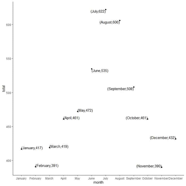
Each point is drawn at the intersection of its x-axis value (month) and its y-axis value (total).
3. Connect the points using line segments to draw the line graph.
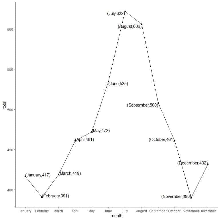
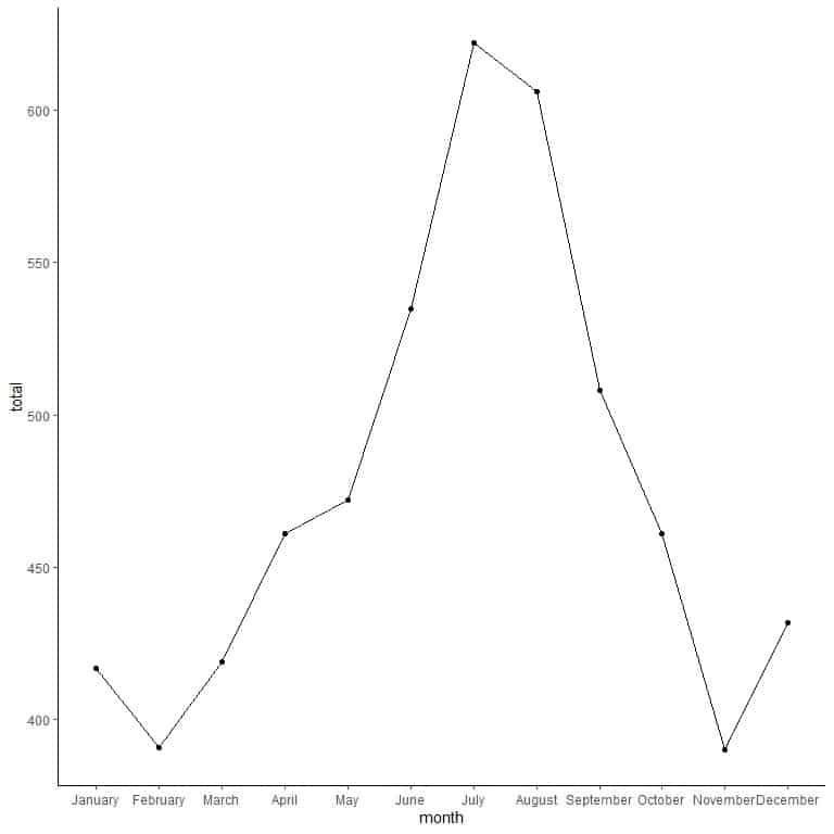
We can see that monthly totals have increased from February till July, then decreased till November and increased again in December.
Types of line graphs
1. Simple line graph
Where only one line is plotted on the graph and it represents a single numerical data.
An example is the above plot where the line represents the change in monthly totals of this single year (1960).
2. Multiple line graph
Where different lines are plotted on the same graph. Each line represents a single numerical data.
This is used to compare similar numerical data over the same period.
Example: The following are the monthly totals of international airline passengers (in thousands) in 1959 and 1960.
month | total | year |
January | 360 | 1959 |
February | 342 | 1959 |
March | 406 | 1959 |
April | 396 | 1959 |
May | 420 | 1959 |
June | 472 | 1959 |
July | 548 | 1959 |
August | 559 | 1959 |
September | 463 | 1959 |
October | 407 | 1959 |
November | 362 | 1959 |
December | 405 | 1959 |
January | 417 | 1960 |
February | 391 | 1960 |
March | 419 | 1960 |
April | 461 | 1960 |
May | 472 | 1960 |
June | 535 | 1960 |
July | 622 | 1960 |
August | 606 | 1960 |
September | 508 | 1960 |
October | 461 | 1960 |
November | 390 | 1960 |
December | 432 | 1960 |
We can plot this data as a multiple line plot.
1. Draw a horizontal x-axis that includes all the time values (months), and draw a vertical y-axis that includes all the numerical values (total passengers).
We see that the x-axis includes all month values (from January to December).
The y axis includes all the numerical values of monthly totals (from 342 to 622).
2. Draw a point at the intersection of each numerical data with its time value.
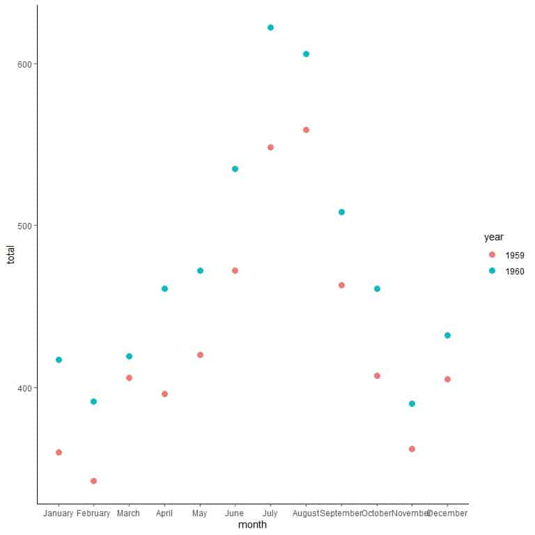
Each point is drawn at the intersection of its x-axis value (month) and its y-axis value (total).
Each point is colored differently according to its year (1959 or 1960).
3. Connect the points of the same year using line segments with a different line for each year to draw the multiple line graph.
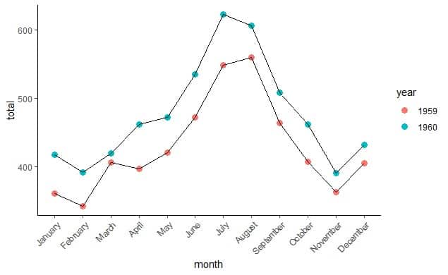
We can deduce several things from this graph:
- Monthly totals are higher for every month of the year 1960 than the year 1959.
- The monthly totals showed similar trends for the years 1959 and 1960. For example, the monthly totals showed an upward trend from February to July for both years.
- The maximum monthly totals for 1959 was in August, while for 1960 was in July.
3. Compound Line Graph
Where Lines are used to show the different parts of a total item.
The top line shows the total item and the different lines below it show parts of this total item.
The differences between the points on adjacent lines give the actual values.
Example: The following table is the United States personal expenditures (in billions of dollars) in the categories; food and tobacco, household operation, medical and health, personal care, and private education for the years 1940, 1945, 1950, 1955, and 1960 with the total for each year.
category | 1940 | 1945 | 1950 | 1955 | 1960 |
Food and Tobacco | 22.200 | 44.500 | 59.60 | 73.2 | 86.80 |
Household Operation | 10.500 | 15.500 | 29.00 | 36.5 | 46.20 |
Medical and Health | 3.530 | 5.760 | 9.71 | 14.0 | 21.10 |
Personal Care | 1.040 | 1.980 | 2.45 | 3.4 | 5.40 |
Private Education | 0.341 | 0.974 | 1.80 | 2.6 | 3.64 |
Total | 37.611 | 68.714 | 102.56 | 129.7 | 163.14 |
We will follow the same steps of multiple line graph but we add a line for the total of personal expenditures in each year.
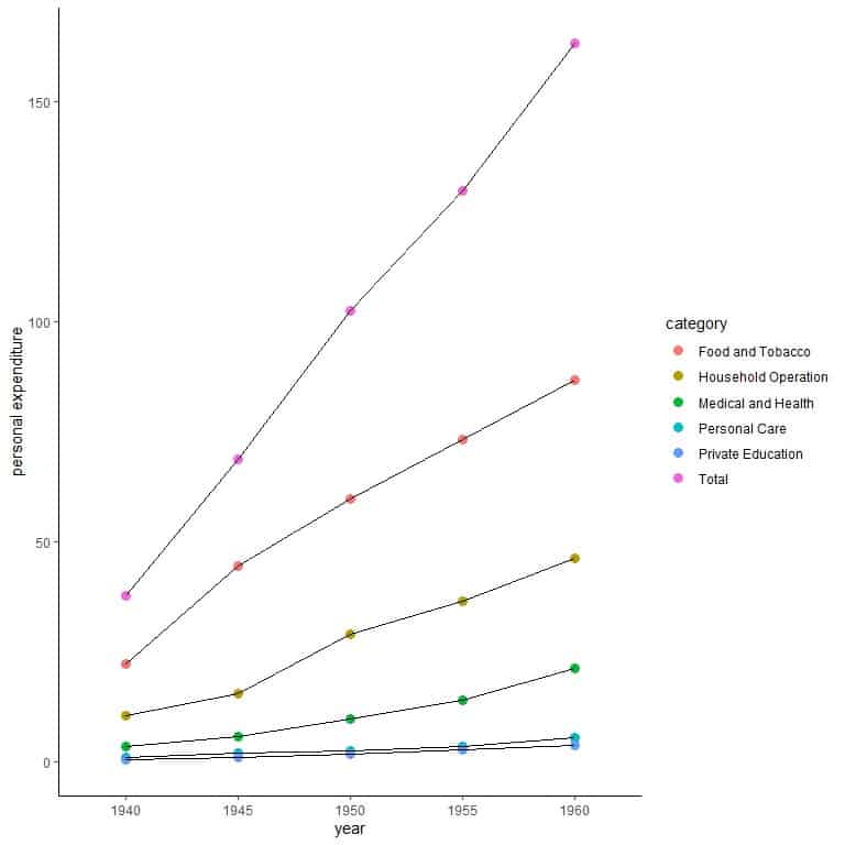
We can deduce several things from this graph:
- The total personal expenditure was increasing steadily over these years.
- The personal expenditure for food and tobacco was the highest personal expenditure category across all years.
- All categories of personal expenditure increased largely over these years except the personal care and private education categories.
How to make line graphs using R
R has an excellent package called tidyverse that contains many packages for data visualization (as ggplot2) and data analysis (as dplyr).
These packages allow us to draw different versions of line graphs for large datasets.
However, they require the supplied data to be a data frame which is a tabular form to store data in R. One column must be the time column and the other column(s) are the numerical data to visualize.
Example of a simple line graph: The births data frame is part of the babynames R package and contains two columns, the year column, and the live births column.
We begin our session by activating the tidyverse and the babynames packages using the library function.
Then, we load the births data using the data function and examine it by the head function (to view the first 6 rows) and str function (to view its structure).
library(tidyverse)
library(babynames)
data(“births”)
head(births)
## # A tibble: 6 x 2
## year births
##
## 1 1909 2718000
## 2 1910 2777000
## 3 1911 2809000
## 4 1912 2840000
## 5 1913 2869000
## 6 1914 2966000
str(births)
## tibble [109 x 2] (S3: tbl_df/tbl/data.frame)
## $ year : int [1:109] 1909 1910 1911 1912 1913 1914 1915 1916 1917 1918 …
## $ births: int [1:109] 2718000 2777000 2809000 2840000 2869000 2966000 2965000 2964000 2944000 2948000 …
The data is composed of 2 columns and 109 rows. One column for the year and 1 column for the number of live births.
We use ggplot function with argument data = births and aes with year on x-axis and births on the y-axis
We add geom_point function to draw a point at each intersection of year and birth number.
We add geom_line function with an argument, aes(group = 1), to connect a line through all these points. Group = 1 means that all these points belong to a single item.
ggplot(data = births, aes(x = year, y = births))+
geom_point()+ geom_line(aes(group = 1))
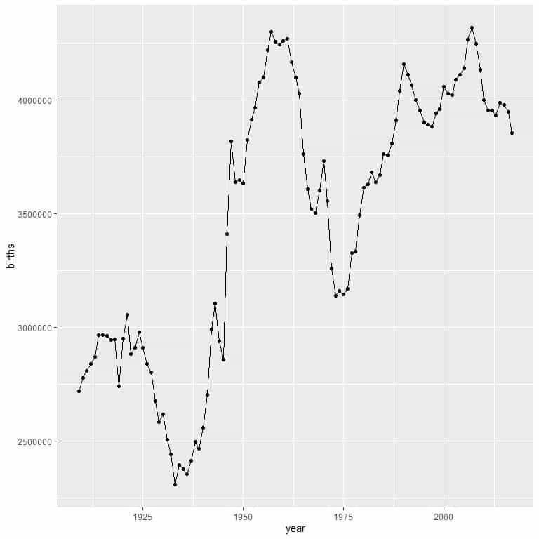
We can see the great troughs at about 1937 and 1975.
Example of a multiple line graph: The population data frame is part of the tidyverse R package and contains the yearly population data for different countries.
We begin our session by activating the tidyverse package using the library function.
Then, we load the population data using the data function and examine it by the head function (to view the first 6 rows) and str function (to view its structure).
library(tidyverse)
data(“population”)
head(population)
## # A tibble: 6 x 3
## country year population
##
## 1 Afghanistan 1995 17586073
## 2 Afghanistan 1996 18415307
## 3 Afghanistan 1997 19021226
## 4 Afghanistan 1998 19496836
## 5 Afghanistan 1999 19987071
## 6 Afghanistan 2000 20595360
str(population)
## tibble [4,060 x 3] (S3: tbl_df/tbl/data.frame)
## $ country : chr [1:4060] “Afghanistan” “Afghanistan” “Afghanistan” “Afghanistan” …
## $ year : int [1:4060] 1995 1996 1997 1998 1999 2000 2001 2002 2003 2004 …
## $ population: int [1:4060] 17586073 18415307 19021226 19496836 19987071 20595360 21347782 22202806 23116142 24018682 …
The data is composed of 3 columns and 4060 rows. One column for the country, 1 column for the year, and 1 column for the population number in that year.
There are 219 different countries in this data. We begin by filtering the data for Afghanistan and Kenya and called it dat.
dat<- population %>% filter(country %in% c(“Afghanistan”, “Kenya”))
str(dat)
## tibble [38 x 3] (S3: tbl_df/tbl/data.frame)
## $ country : chr [1:38] “Afghanistan” “Afghanistan” “Afghanistan” “Afghanistan” …
## $ year : int [1:38] 1995 1996 1997 1998 1999 2000 2001 2002 2003 2004 …
## $ population: int [1:38] 17586073 18415307 19021226 19496836 19987071 20595360 21347782 22202806 23116142 24018682 …
The dat data frame is now composed of only 38 rows.
We use the ggplot function with argument data = dat, and aes with year on x-axis and population on the y-axis.
We add geom_point function to draw a point at each intersection of year and population number. We add an argument, aes(color = country), to color points differently according to each country.
We add geom_line function with an argument, aes(group = country), to connect a different line through each country set of points.
ggplot(data = dat, aes(x = year, y = population))+
geom_point(aes(color = country))+ geom_line(aes(group = country))
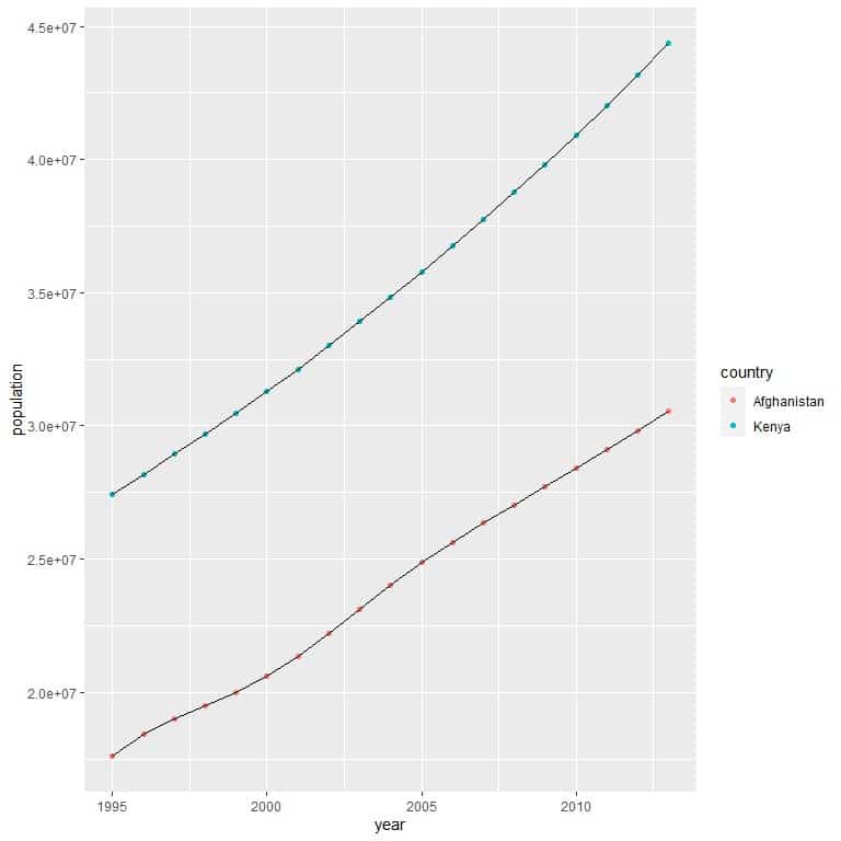
We can see that Afghanistan has a much lower population number than Kenya for all the years.
Both countries showed increasing population numbers over years.
Practical questions
1. For the same population data, use the same code to filter the data for Zambia, Spain, and Peru. Which country has the highest population across all the years?
dat<- population %>% filter(country %in% c(“Zambia”, “Spain”, “Peru”))
2. For the same population data, use the same code to filter the data for Iraq, Sudan, and Libya. Which country has the highest population across all years?
3. The JohnsonJohnson data contains quarterly earnings (dollars) per Johnson & Johnson share 1960–1980.
Use the following code and plot this data as a multiple line graph with year on the x-axis, value on the y-axis, and different line for each quarter.
Arrange the quarters according to earnings (value) in the last year, 1980.
dat<- timetk::tk_tbl(JohnsonJohnson) %>%
separate(index, into = c(“year”,”quarter”))
4. The UKgas data contains the quarterly UK gas consumption from 1960Q1 to 1986Q4, in millions of therms.
Use the following code and plot this data as a multiple line graph with year on the x-axis, value on the y-axis, and different line for each quarter.
Arrange the quarters according to gas consumption (value) in the last year, 1986, and in the first year, 1960.
dat<- timetk::tk_tbl(UKgas) %>%
separate(index, into = c(“year”,”quarter”))
5. The txhousing data is part of the tidyverse package. It contains information about the housing market in Texas.
Use the following code to filter the data for 3 cities (“Houston”, “Victoria”, “Waco”) and calculate the median sales for each city in each year.
plot this data as a multiple line graph with year on the x-axis, sales on the y-axis, and different line for each month.
What do you see from this graph?
dat<- txhousing %>% filter(city %in% c(“Houston”,”Victoria”,”Waco”)) %>%
group_by(city, year) %>%
mutate(sales = median(sales, na.rm = T))
Answers
1. We use the ggplot function with argument data = dat, and aes with year on x-axis and population on the y-axis. We add geom_point function and geom_line function to draw the multiple line graph.
library(tidyverse)
data(“population”)
dat<- population %>% filter(country %in% c(“Zambia”, “Spain”, “Peru”))
ggplot(data = dat, aes(x = year, y = population))+
geom_point(aes(color = country))+ geom_line(aes(group = country))
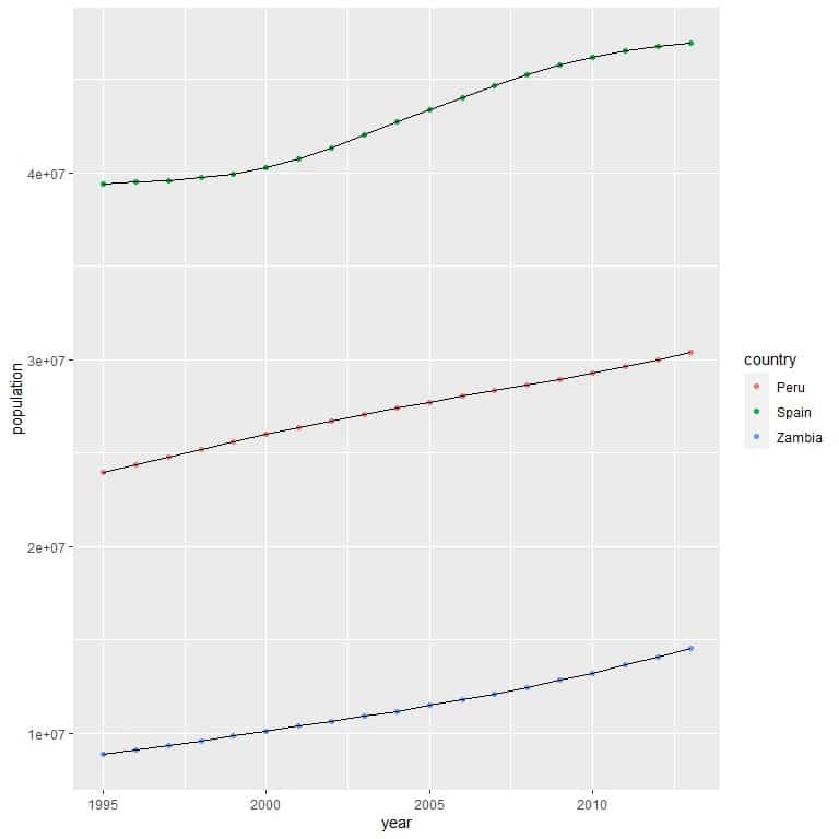
We see that Spain (green points) had the highest population across all years
2. As before,
library(tidyverse)
data(“population”)
dat<- population %>% filter(country %in% c(“Iraq”, “Sudan”, “Libya”))
ggplot(data = dat, aes(x = year, y = population))+
geom_point(aes(color = country))+ geom_line(aes(group = country))
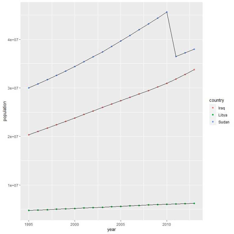
We see that Sudan (blue points) had the highest population across all years.
3. We use the provided code to create the data, then, we use the ggplot function with argument data = dat, and aes with year on x-axis and value on the y-axis.
We add geom_point function with an argument, aes(color = quarter), to color points differently according to each quarter.
We add geom_line function with an argument, aes(group = quarter), to connect a different line through each quarter set of points.
dat<- timetk::tk_tbl(JohnsonJohnson) %>%
separate(index, into = c(“year”,”quarter”))
ggplot(data = dat, aes(x = year, y = value))+
geom_point(aes(color = quarter))+ geom_line(aes(group = quarter))
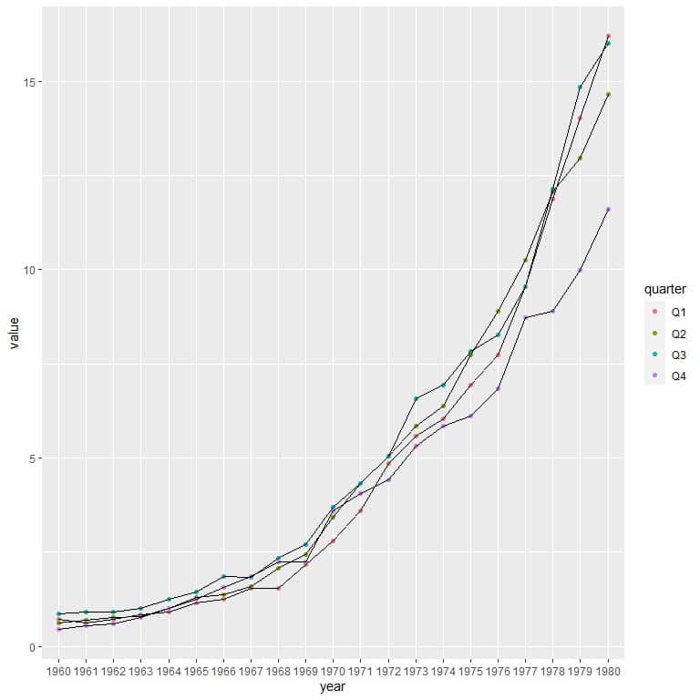
In the last year, 1980, we see that Q1 (red) is the highest point, followed by Q3 (blue), Q2 (green), and Q4 (purple).
So we can arrange the quarters according to their value in the last year as follows
Q1 > Q3 > Q2 > Q4
4. As in problem 3
dat<- timetk::tk_tbl(UKgas) %>%
separate(index, into = c(“year”,”quarter”))
ggplot(data = dat, aes(x = year, y = value))+
geom_point(aes(color = quarter))+ geom_line(aes(group = quarter))
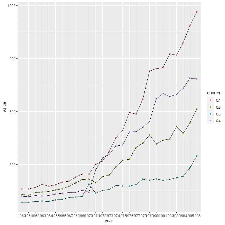
In the last year, 1986, we can arrange the quarters according to their value as follows
Q1 (red) > Q4 (purple) > Q2 (green) > Q3 (blue)
In the first year, 1960, Q1 > Q2 > Q4 > Q3
5. We use the ggplot function with argument data = dat, and aes with year on x-axis and sales on the y-axis.
We add geom_point function with an argument, aes(color = city), to color points differently according to each city.
We add geom_line function with an argument, aes(group = city), to connect a different line through each city set of points.
dat<- txhousing %>% filter(city %in% c(“Houston”,”Victoria”,”Waco”)) %>%
group_by(city, year) %>%
mutate(sales = median(sales, na.rm = T))
ggplot(data = dat, aes(x = year, y = sales))+
geom_point(aes(color = city))+ geom_line(aes(group = city))
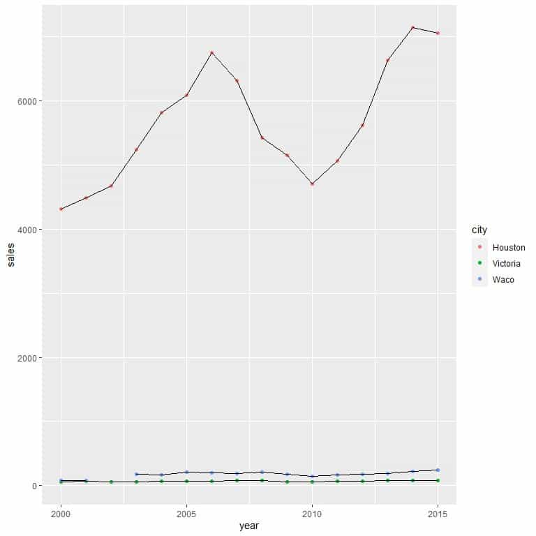
We see that Houston City has much higher median sales compared to the other 2 cities, Victoria and Waco, across all years.