JUMP TO TOPIC
Pictograph – Explanation & Examples
 The definition of the pictograph is:
“The pictograph is a chart used to represent your data using images”
In this topic, we will discuss the pictograph from the following aspects:
- What is a pictograph?
- How to make a pictograph?
- How to read a pictograph?
- The role of pictograph
- Practical questions
- Answers
What is a pictograph?
We use pictographs to count the frequencies of our data using symbols or images that are related to our data. Each image means a certain number of data.
How to make a pictograph?
We go through an example to illustrate the steps of making pictographs
The following table is the number of employees per different age categories in a certain company.
Age category | Number of employees |
20-30 | 20 |
31-40 | 30 |
41-50 | 15 |
51-60 | 30 |
60 or more | 25 |
- Pick a symbol or picture that accurately represents your data. In this example, we are drawing a pictograph to represent employees, then an icon of a businessman will be suitable. On the other hand, an icon of lemon juice will not be suitable.
- The symbol used can represent one or more than one frequency according to the data frequency. Whether the symbol represents one or more than one frequency, this representation must be written as a key at the bottom of the pictograph. In our example, we will choose that one symbol to represent 10 employees and half symbol to represent 5 employees.
- Draw a column that represents the categories of your data. In this example, the categories are the 20-30 age category, 31-40 age category, 41-50 age category, 51-60 age category, and 60 or more age category. Then, draw the symbols that represent the frequencies in the row of its corresponding category.
- There are 20 employees in the 20-30 age category, so this category is represented by two full symbols.
- There are 30 employees in the 31-40 age category, so it is represented by 3 full symbols.
- There are 15 employees in the 41-50 age category, so it is represented by one full and one-half symbols.
- There are 30 employees in the 51-60 age category, so it is represented by 3 full symbols.
- There are 25 employees in the 60 or more age category, so it is represented by two full and one-half symbols.
After finishing, the final pictograph will look like the below graph.
= 10 employees, = 5 employees
Note the key of pictograph at the bottom.
How to read a pictograph?
The pictograph is simply read by multiplying the images by their key indicator to determine the frequency of each data.
Example 1, the following is the pictograph for the gender distribution in a certain factory
= 10 males, = 10 females
From this pictograph, there are 10 male images so the number of males in this factory = 10 x 10 = 100.
There are 5 female images so the number of females in this factory = 5 X 10 = 50.
Example 2, the following pictograph is the number of lemon juices sold per month
= 10 lemon juices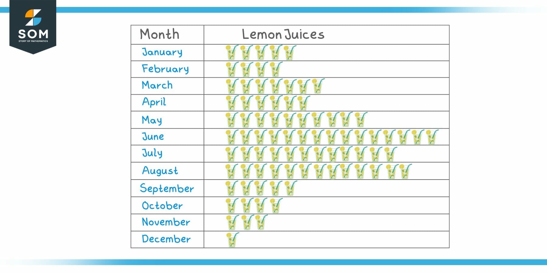
From this figure, we can conclude that:
- There is 1 lemon juice image in December, so the number of lemon juices sold in December = 1 X 10 = 10.
- There are 3 lemon juice images in November, so the number of lemon juices sold in November = 3 X 10 = 30.
- Similarly, we can count the images per other months to get the following frequency table.
Month | Frequency |
January | 50 |
February | 40 |
March | 70 |
April | 60 |
May | 100 |
June | 150 |
July | 120 |
August | 130 |
September | 50 |
October | 40 |
November | 30 |
December | 10 |
We can see that June had the highest sales with 150 lemon juices sold, while December had the lowest sales with only 10 lemon juices sold.
The role of pictographs
Pictographs give us the different frequencies of our data categories.
By looking at the symbols or images, we can detect quickly the most frequent and the least frequent item in our data.
Pictographs are used to represent categorical data. The most frequent value or category is known as the mode.
The mode is a type of summary statistics that gives important information about a certain data or population.
For the example of lemon juice above, the most frequent value was June because there are 150 lemon juices sold in this month, so June is the mode of this data.
On the other hand, December has only 10 lemon juices sold and this month is the lowest month in selling lemon juices.
To determine the sales in other months, we can count their corresponding images.
Practical questions
1.The following is a pictograph of the number of TV sets sold per month
= 10,000 TV sets
Which month has the minimum and which month has the maximum sales? How many sales in these two months?
2.The following is a pictograph of the number of cigarettes smoked by some friends per day
= 5 cigarettes
Who is the heaviest smoking person? How many cigarettes did he smoke per day?
3.The following is a pictograph for the number of employees per department in a small company
= 1 employee
Create a frequency table for the number of employees per department.
4.The following is a pictograph for the gender distribution for some departments of a certain company
= 10 males, = 10 females
Which department has the highest representation of males? And which department has the highest representation of females?
5.The following is the number of footballs sold on certain days
= 10 footballs, = 5 footballs
Which day has the highest sales?
Answers
- The month with minimum sales was April with 1 image only.
The month with maximum sales was January with 10 images.
Each image represents 10,000 TV sets.
The number of TV sets sold in April = 1 image X 10,000 = 10,000 TV sets.
The number of TV sets sold in January = 10 images X 10,000 = 100,000 TV sets.
- The heaviest smoking person was Smith with 10 images.
Each image represents 5 cigarettes.
The number of cigarettes smoked by Smith per day = 10 images X 5 = 50 cigarettes.
- Each image represents 1 employee, for example:
- The Administration department has 1 image or 1 image X 1 = 1 employee
- Marketing department has 2 images or 2 images X 1 = 2 employees
- Shipping department has 7 images or 7 images X 1 = 7 employees, and so on till producing the following frequency table.
Department | Frequency |
Administration | 1 |
Marketing | 2 |
Purchasing | 6 |
Sales | 1 |
Human resources | 2 |
Shipping | 7 |
IT | 5 |
Finance | 6 |
Accounting | 2 |
- Each image of a male represents 10 males, and each image of a female represents 10 females.
Purchasing department has the highest representation of males with 5 images or 5 images X 10 = 50 males. Other departments have 1 image only for males or 10 males (Sales or Marketing).
Sales department has the highest representation of females with 2 images or 2 images X 10 = 20 females. Other departments have 1 image only for females or 10 females (Purchasing or Marketing).
- Each full image represents 10 footballs sold and each half image represents 5 footballs sold.
Sunday has the highest sales with 2 full images and 1 half image, so the number of footballs sold on Sunday = 2X10 + 1X5 = 25 footballs.