JUMP TO TOPIC
Pie chart – Explanation & Examples
 The definition of the pie chart is:
“The pie chart is a circular chart used to represent categorical data using circle slices”
In this topic, we will discuss the bar graph from the following aspects:
- What is a pie chart?
- How to make a pie chart?
- How to read a pie chart?
- How to make a pie chart using R?
- Practical questions
- Answers
What is a pie chart?
The pie chart is a circular chart used to represent categorical data using circle slices.
The circle slices show the relative proportion of each category.
The central angles or the areas of slices is proportional to the value of the corresponding categories.
How to make a pie chart?
1. Add up all the values of categories to get a total.
2. Divide each category value by the total to get a proportion.
3. A Full Circle has 360 degrees, so multiply each proportion by 360° to get the angle that will represent each category.
4. Draw a circle and use your protractor to draw the slices of different categories. Color each slice differently and give it a label.
For example, A survey of smoking habits for 10 individuals has shown the following table
Smoking habit | Count |
Never smoker | 5 |
Current smoker | 2 |
Former smoker | 3 |
To plot this data as a pie chart, we will follow the above steps:
1. Add up all the values of categories to get a total.
Total = 5+2+3 = 10.
2. Divide each category value by the total to get a proportion. This will produce the following table.
Smoking habit | Count | proportion |
Never smoker | 5 | 0.5 |
Current smoker | 2 | 0.2 |
Former smoker | 3 | 0.3 |
3. A Full Circle has 360 degrees, so multiply each proportion by 360° to get the angle that will represent each category.
Smoking habit | Count | proportion | angle |
Never smoker | 5 | 0.5 | 180 |
Current smoker | 2 | 0.2 | 72 |
Former smoker | 3 | 0.3 | 108 |
4. Draw a circle and use your protractor to draw the slices of different categories. Color each slice differently and give it a label.

We can also label with percentage (proportion X 100) to give a more informative pie chart.
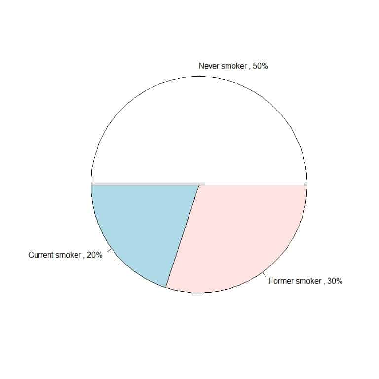
We see that the Never smoker slice is occupying half of the complete circle as it represents 50% of our data (5/10 = 0.5).
Similarly, the former smoker slice is occupying 30% of the circle and the current smoker slice is occupying 20% of the circle.
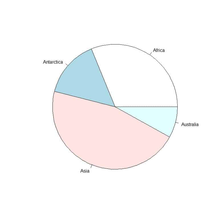
Example 2: The following table is the landmass area of 4 continents (Africa, Antarctica, Asia, and Australia) in thousands of square miles.
Location | Area |
Africa | 11506 |
Antarctica | 5500 |
Asia | 16988 |
Australia | 2968 |
To plot this data as a pie chart, we will follow the above steps:
1. Add up all the values of categories to get a total.
Total = 11506+5500+16988+2968 = 36962.
2. Divide each category value by the total to get a proportion. This will produce the following table.
Location | Area | proportion |
Africa | 11506 | 0.31 |
Antarctica | 5500 | 0.15 |
Asia | 16988 | 0.46 |
Australia | 2968 | 0.08 |
3. A Full Circle has 360 degrees, so multiply each proportion by 360° to get the angle that will represent each category.
Location | Area | proportion | angle |
Africa | 11506 | 0.31 | 112 |
Antarctica | 5500 | 0.15 | 54 |
Asia | 16988 | 0.46 | 165 |
Australia | 2968 | 0.08 | 29 |
4. Draw a circle and use your protractor to draw the slices of different categories. Color each slice differently and give it a label.
We can also label with a percentage to give a more informative pie chart.
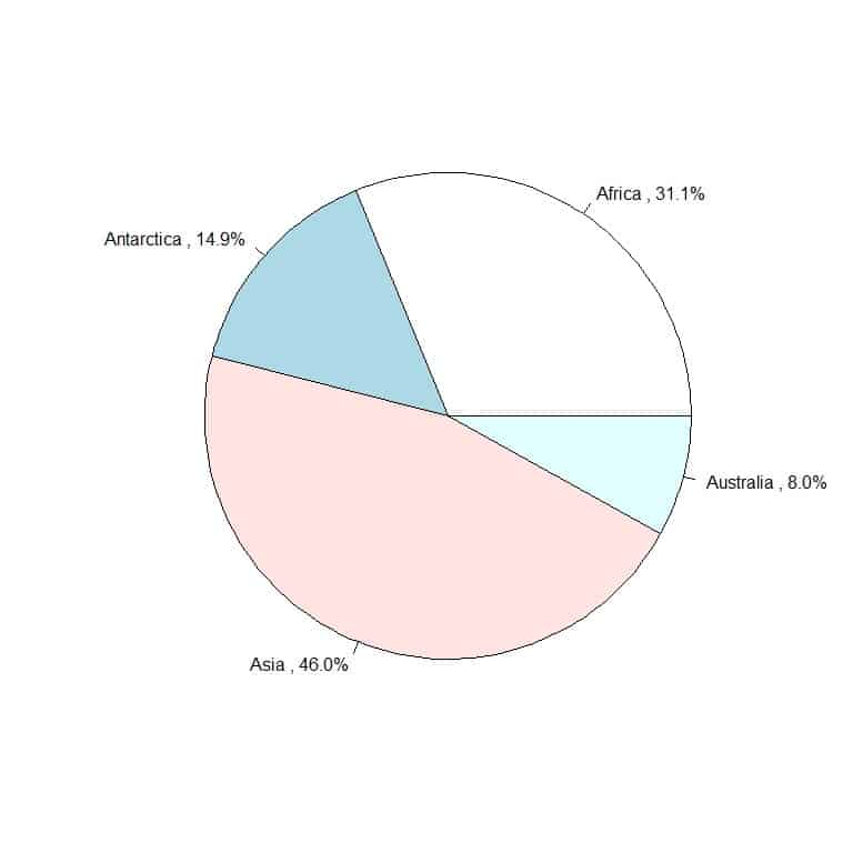
We see that the Asia slice is the largest as its area represents 46% of the total areas, so the Asia slice represents 46% of the complete circle area.
On the other hand, Australia is the smallest slice as its area represents only 8% of the total area, so Australia slice represents 8% of the complete circle area.
How to read a pie chart?
We read the pie chart by looking at the central angle or the area of each slice to determine the relative proportion of each category.
In the example of smoking habits, the Never smoker category has the largest slice, so we can deduce that never smokers have the highest count in our survey.
In the example of continents’ areas, Asia has the largest slice followed by Africa, Antarctica, Australia. Therefore, we can arrange these continents according to their area in the following descending order:
Asia > Africa > Antarctica > Australia
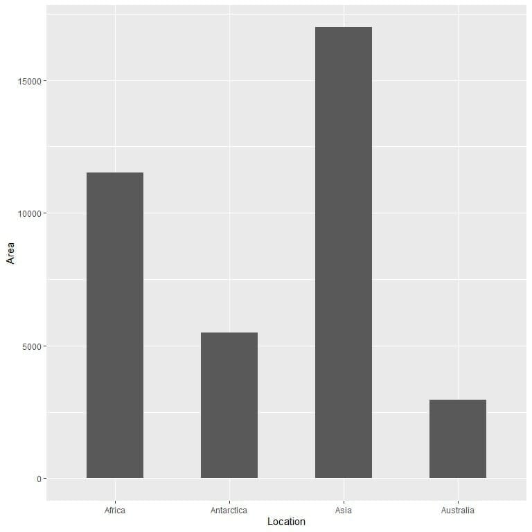
However, pie charts are not recommended by many visualization experts, because it is difficult for the human eye to compare between areas or angles. Comparing the data through heights in bar graphs is much easier for the human eye.
Example of comparing data using the pie chart and bar graph
we have the following table of the landmass area of 10 different locations in thousands of square miles.
Location | Area |
Vancouver | 12 |
Hainan | 13 |
Prince of Wales | 13 |
Timor | 13 |
Kyushu | 14 |
Taiwan | 14 |
New Britain | 15 |
Spitsbergen | 15 |
Axel Heiberg | 16 |
Melville | 16 |
If we plot this data as a pie chart, we will get
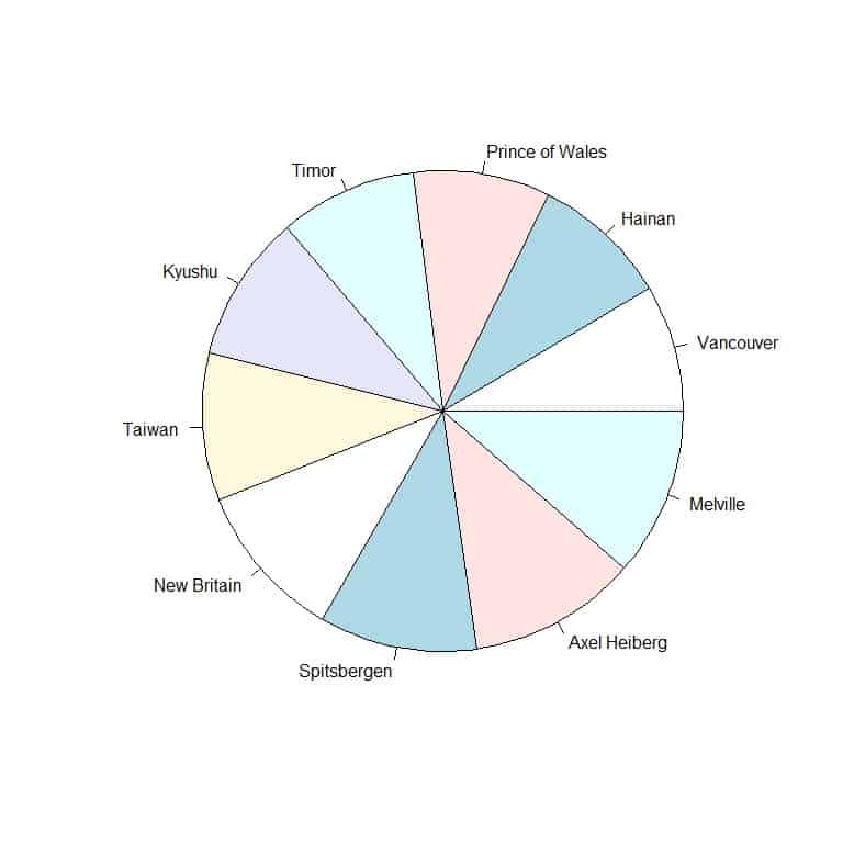
It is hard to see which location has the largest landmass area.
If we plot the data as a bar graph
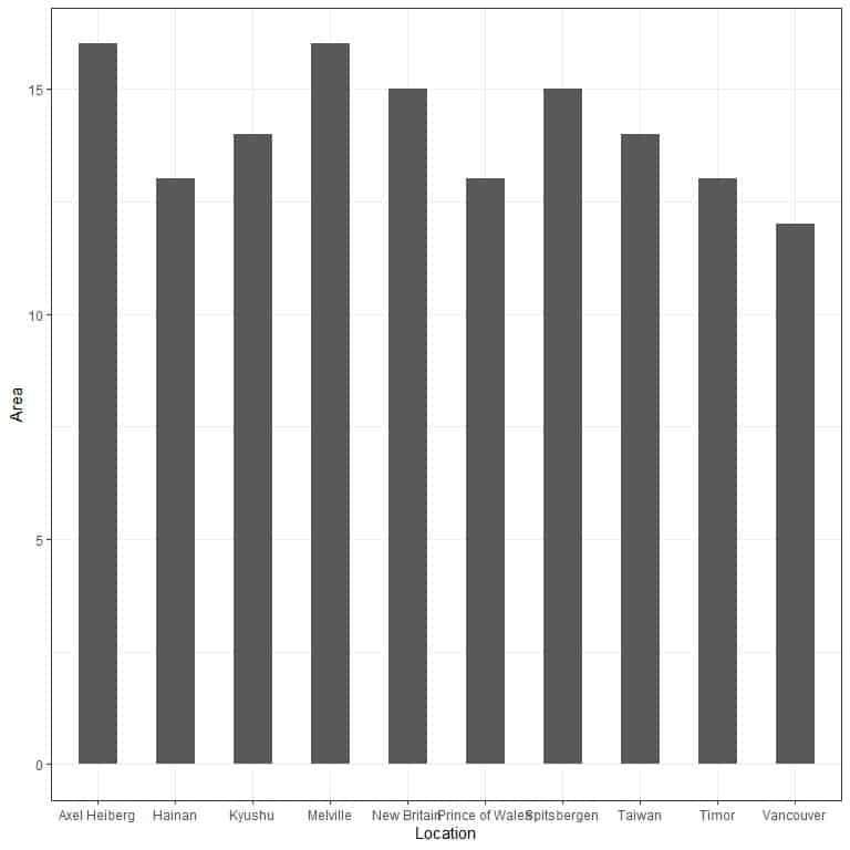
We see that the highest landmass area was for Axel Heiberg and Melville.
How to make a pie chart using R?
R has a function called pie that is used to create pie charts.
The pie function has two important arguments. The first argument is for the numerical values we want to represent and the second argument for the slices’ labels.
Example: The relig_income data frame is part of the tidyverse package and contains data related to the Pew religion and income survey.
We begin our session by activating the tidyverse package using the library function.
Then, we load the relig_income data using the data function and examine it by typing its name.
library(tidyverse)
data(relig_income)
relig_income
## # A tibble: 18 x 11
## religion `<$10k` `$10-20k` `$20-30k` `$30-40k` `$40-50k` `$50-75k` `$75-100k`
##
## 1 Agnostic 27 34 60 81 76 137 122
## 2 Atheist 12 27 37 52 35 70 73
## 3 Buddhist 27 21 30 34 33 58 62
## 4 Catholic 418 617 732 670 638 1116 949
## 5 Don’t k~ 15 14 15 11 10 35 21
## 6 Evangel~ 575 869 1064 982 881 1486 949
## 7 Hindu 1 9 7 9 11 34 47
## 8 Histori~ 228 244 236 238 197 223 131
## 9 Jehovah~ 20 27 24 24 21 30 15
## 10 Jewish 19 19 25 25 30 95 69
## 11 Mainlin~ 289 495 619 655 651 1107 939
## 12 Mormon 29 40 48 51 56 112 85
## 13 Muslim 6 7 9 10 9 23 16
## 14 Orthodox 13 17 23 32 32 47 38
## 15 Other C~ 9 7 11 13 13 14 18
## 16 Other F~ 20 33 40 46 49 63 46
## 17 Other W~ 5 2 3 4 2 7 3
## 18 Unaffil~ 217 299 374 365 341 528 407
## # … with 3 more variables: `$100-150k` , `>150k` , `Don’t
## # know/refused`
The data is composed of 11 columns, 1 column for 18 religion categories, and 10 columns for different income categories.
To plot a pie chart showing the relative proportion of each religion for the number of persons who earn <$10k.
We use the column <$10k for the x argument and the column religion for the labels argument.
We use the dollar sign to get the required column from the relig_income data frame.
pie(relig_income