JUMP TO TOPIC
Probability Density Function – Explanation & Examples
 The definition of probability density function (PDF) is:
“The PDF describes how the probabilities are distributed over the different values of the continuous random variable.”
In this topic, we will discuss the probability density function (PDF) from the following aspects:
- What is a probability density function?
- How to calculate the probability density function?
- Probability density function formula.
- Practice questions.
- Answer key.
What is a probability density function?
The probability distribution for a random variable describes how the probabilities are distributed over the random variable’s different values.
In any probability distribution, the probabilities must be >= 0 and sum to 1.
For the discrete random variable, the probability distribution is called the probability mass function or PMF.
For example, when tossing a fair coin, the probability of head = probability of tail = 0.5.
For the continuous random variable, the probability distribution is called the probability density function or PDF. PDF is the probability density over some intervals.
Continuous random variables can take an infinite number of possible values within a certain range.
For example, a certain weight can be 70.5 kg. Still, with increasing balance accuracy, we can have a value of 70.5321458 kg. So the weight can take infinite values with infinite decimal places.
Since there is an infinite number of values in any interval, it is not meaningful to talk about the probability that the random variable will take on a specific value. Instead, the probability that a continuous random variable will lie within a given interval is considered.
Suppose the probability density around a value x is large. In that case, that means the random variable X is likely to be close to x. If, on the other hand, the probability density = 0 in some interval, then X will not be in that interval.
In general, to determine the probability that X is in any interval, we add up the densities’ values in that interval. By “add up,” we mean to integrate the density curve within that interval.
How to calculate the probability density function?
– Example 1
The following are the weights of 30 individuals from a certain survey.
54 53 42 49 41 45 69 63 62 72 64 67 81 85 89 79 84 86 101 104 103 108 97 98 126 129 123 119 117 124.
Estimate the probability density function for these data.
1. Determine the number of bins you need.
The number of bins is log(observations)/log(2).
In this data, the number of bins = log(30)/log(2) = 4.9 will be rounded up to become 5.
2. Sort the data and subtract the minimum data value from the maximum data value to get the data range.
The sorted data will be:
41 42 45 49 53 54 62 63 64 67 69 72 79 81 84 85 86 89 97 98 101 103 104 108 117 119 123 124 126 129.
In our data, the minimum value is 41, and the maximum value is 129, so:
The range = 129 – 41 = 88.
3. Divide the data range in Step 2 by the number of classes you get in Step 1. Round the number, you get up to a whole number to get the class width.
Class width = 88 / 5 = 17.6. Rounded up to 18.
4. Add the class width, 18, sequentially (5 times because 5 is the number of bins) to the minimum value to create the different 5 bins.
41 + 18 = 59 so the first bin is 41-59.
59 + 18 = 77 so the second bin is 59-77.
77 + 18 = 95 so the third bin is 77-95.
95 + 18 = 113 so the fourth bin is 95-113.
113 + 18 = 131 so the fifth bin is 113-131.
5. We draw a table of 2 columns. The first column carries the different bins of our data that we created in step 4.
The second column will contain the frequency of weights in each bin.
range | frequency |
41 – 59 | 6 |
59 – 77 | 6 |
77 – 95 | 6 |
95 – 113 | 6 |
113 – 131 | 6 |
The bin “41-59” contains the weights from 41 to 59, the next bin “59-77” contains the weights larger than 59 till 77, and so on.
By looking at the sorted data in step 2, we see that:
- The first 6 numbers (41, 42, 45, 49, 53, 54) are within the first bin, “41-59,” so this bin’s frequency is 6.
- The next 6 numbers (62, 63, 64, 67, 69, 72) are within the second bin, “59-77,” so this bin’s frequency is 6 too.
- All bins have a frequency of 6.
- If you sum these frequencies, you will get 30 which is the total number of data.
6. Add a third column for the relative frequency or probability.
Relative frequency = frequency/total data number.
range | frequency | relative.frequency |
41 – 59 | 6 | 0.2 |
59 – 77 | 6 | 0.2 |
77 – 95 | 6 | 0.2 |
95 – 113 | 6 | 0.2 |
113 – 131 | 6 | 0.2 |
- Any bin contains 6 data points or frequency, so the relative frequency of any bin = 6/30 = 0.2.
If you sum these relative frequencies, you will get 1.
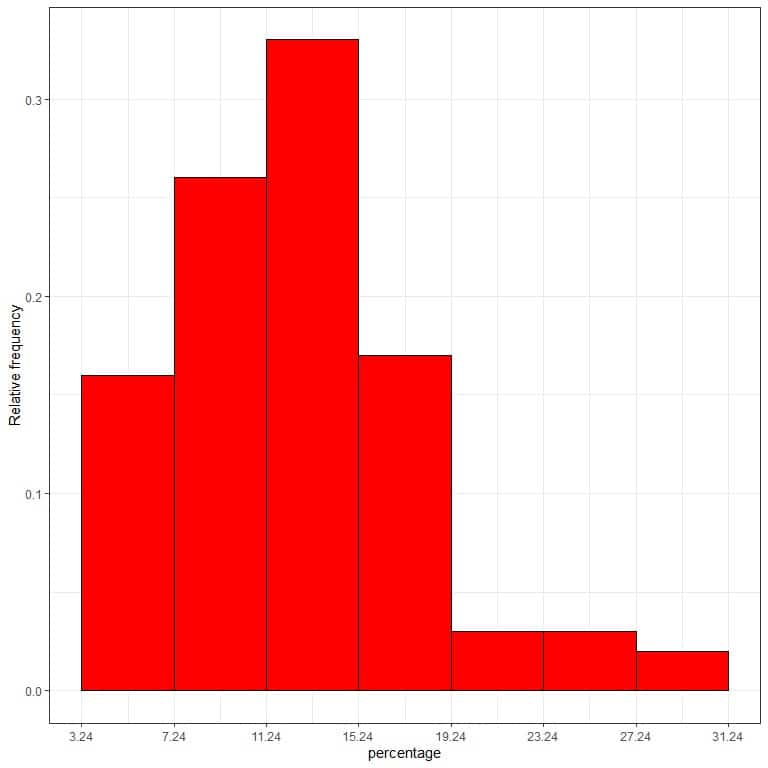
7. Use the table to plot a relative frequency histogram, where the data bins or ranges on the x-axis and the relative frequency or proportions on the y-axis.
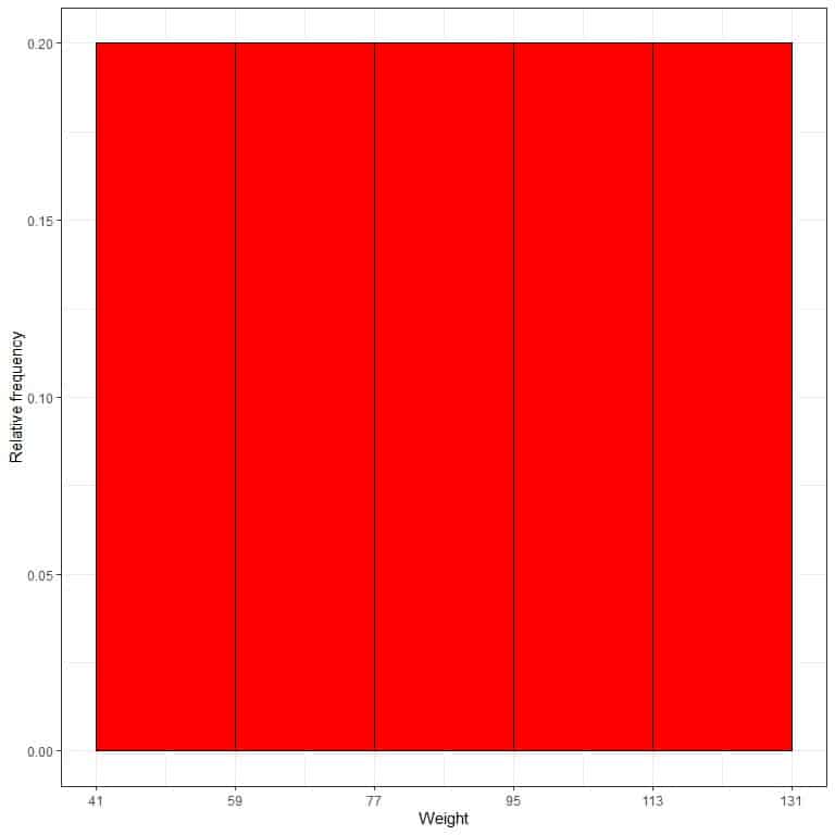
- In relative frequency histograms, the heights or proportions can be interpreted as probabilities. These probabilities can be used to determine the likelihood of certain results occurring within a given interval.
- For example, the relative frequency of the “41-59” bin is 0.2, so the probability of weights falling in this range is 0.2 or 20%.
8. Add another column for the density.
Density = relative frequency/class width = relative frequency/18.
range | frequency | relative.frequency | density |
41 – 59 | 6 | 0.2 | 0.011 |
59 – 77 | 6 | 0.2 | 0.011 |
77 – 95 | 6 | 0.2 | 0.011 |
95 – 113 | 6 | 0.2 | 0.011 |
113 – 131 | 6 | 0.2 | 0.011 |
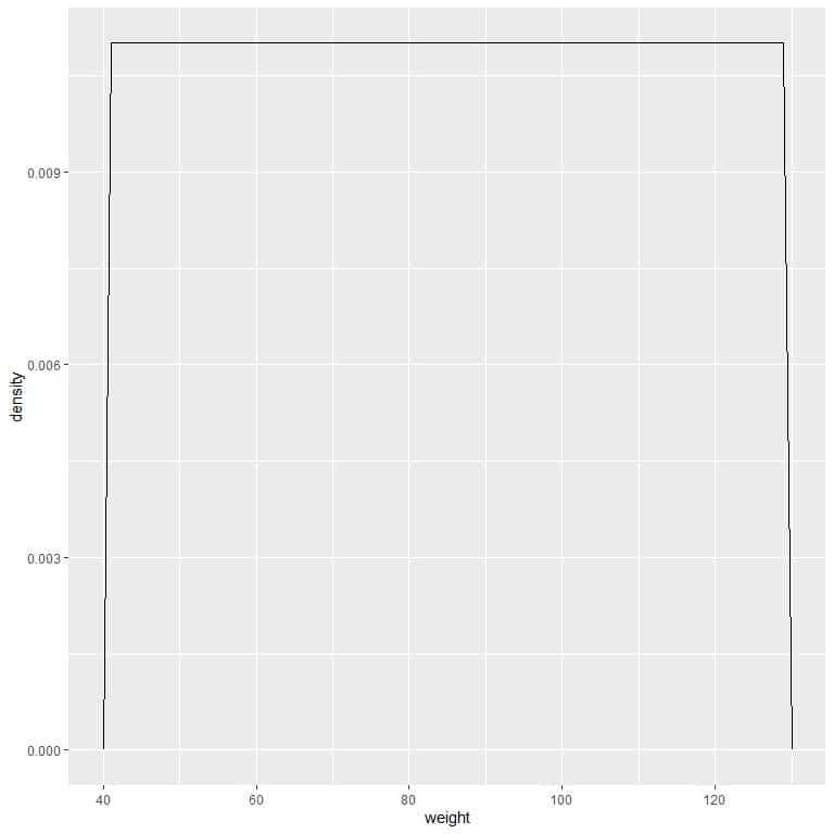
9. Suppose we decreased the intervals more and more. In that case, we could represent the probability distribution as a curve by connecting the “dots” at the tops of the tiny, tiny, tiny rectangles:
 We can write this density function as:
f(x)={■(0.011&”if ” 41≤x≤131@0&”if ” x<41,x>131)┤
It means that the probability density = 0.011 if the weight is between 41 and 131. The density is 0 for all weights outside that range.
It is an example of uniform distribution where the density of weight for any value between 41 and 131 is 0.011.
However, unlike probability mass functions, the probability density function’s output is not a probability value but gives a density.
To get the probability from a probability density function, we need to integrate the area under the curve for a certain interval.
The probability= Area under the curve = density X interval length.
In our example, the interval length = 131-41 = 90 so the area under the curve = 0.011 X 90 = 0.99 or ~1.
It means that the probability of weight that lies between 41-131 is 1 or 100%.
For the interval, 41-61, the probability = density X interval length = 0.011 X 20 = 0.22 or 22%.
We can plot this as follows:
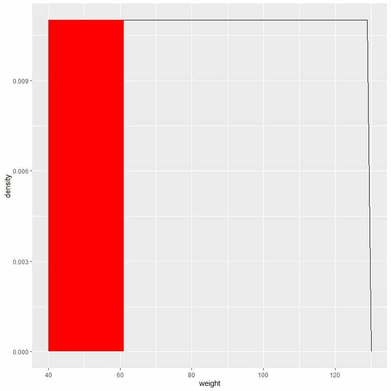
The red shaded area represents 22% of the total area, so the probability of weight in the interval 41-61 = 22%.
– Example 2
The following are the below poverty percentages for 100 counties from the midwest region of the USA.
12.90 12.51 10.22 17.25 12.66 9.49 9.06 8.99 14.16 5.19 13.79 10.48 13.85 9.13 18.16 15.88 9.50 20.54 17.75 6.56 11.40 12.71 13.62 15.15 13.44 17.52 17.08 7.55 13.18 8.29 23.61 4.87 8.35 6.90 6.62 6.87 9.47 7.20 26.01 16.00 7.28 12.35 13.41 12.80 6.12 6.81 8.69 11.20 14.53 25.17 15.51 11.63 15.56 11.06 11.25 6.49 11.59 14.64 16.06 11.30 9.50 14.08 14.20 15.54 14.23 17.80 9.15 11.53 12.08 28.37 8.05 10.40 10.40 3.24 11.78 7.21 16.77 9.99 16.40 13.29 28.53 9.91 8.99 12.25 10.65 16.22 6.14 7.49 8.86 16.74 13.21 4.81 12.06 21.21 16.50 13.26 11.52 19.85 6.13 5.63.
Estimate the probability density function for these data.
1. Determine the number of bins you need.
The number of bins is log(observations)/log(2).
In this data, the number of bins = log(100)/log(2) = 6.6 will be rounded up to become 7.
2. Sort the data and subtract the minimum data value from the maximum data value to get the data range.
The sorted data will be:
3.24 4.81 4.87 5.19 5.63 6.12 6.13 6.14 6.49 6.56 6.62 6.81 6.87 6.90 7.20 7.21 7.28 7.49 7.55 8.05 8.29 8.35 8.69 8.86 8.99 8.99 9.06 9.13 9.15 9.47 9.49 9.50 9.50 9.91 9.99 10.22 10.40 10.40 10.48 10.65 11.06 11.20 11.25 11.30 11.40 11.52 11.53 11.59 11.63 11.78 12.06 12.08 12.25 12.35 12.51 12.66 12.71 12.80 12.90 13.18 13.21 13.26 13.29 13.41 13.44 13.62 13.79 13.85 14.08 14.16 14.20 14.23 14.53 14.64 15.15 15.51 15.54 15.56 15.88 16.00 16.06 16.22 16.40 16.50 16.74 16.77 17.08 17.25 17.52 17.75 17.80 18.16 19.85 20.54 21.21 23.61 25.17 26.01 28.37 28.53.
In our data, the minimum value is 3.24, and the maximum value is 28.53, so:
The range = 28.53-3.24 = 25.29.
3. Divide the data range in Step 2 by the number of classes you get in Step 1. Round the number you get up to a whole number to get the class width.
Class width = 25.29 / 7 = 3.6. Rounded up to 4.
4. Add the class width, 4, sequentially (7 times because 7 is the number of bins) to the minimum value to create the different 7 bins.
3.24 + 4 = 7.24 so the first bin is 3.24-7.24.
7.24 + 4 = 11.24 so the second bin is 7.24-11.24.
11.24 + 4 = 15.24 so the third bin is 11.24-15.24.
15.24 + 4 = 19.24 so the fourth bin is 15.24-19.24.
19.24 + 4 = 23.24 so the fifth bin is 19.24-23.24.
23.24 + 4 = 27.24 so the sixth bin is 23.24-27.24.
27.24 + 4 = 31.24 so the seventh bin is 27.24-31.24.
5. We draw a table of 2 columns. The first column carries the different bins of our data that we created in step 4.
The second column will contain the frequency of percentages in each bin.
range | frequency |
3.24 – 7.24 | 16 |
7.24 – 11.24 | 26 |
11.24 – 15.24 | 33 |
15.24 – 19.24 | 17 |
19.24 – 23.24 | 3 |
23.24 – 27.24 | 3 |
27.24 – 31.24 | 2 |
If you sum these frequencies, you will get 100 which is the total number of data.
16+26+33+17+3+3+2 = 100.
6. Add a third column for the relative frequency or probability.
Relativefrequency=frequency/totaldatanumber.
range | frequency | relative.frequency |
3.24 – 7.24 | 16 | 0.16 |
7.24 – 11.24 | 26 | 0.26 |
11.24 – 15.24 | 33 | 0.33 |
15.24 – 19.24 | 17 | 0.17 |
19.24 – 23.24 | 3 | 0.03 |
23.24 – 27.24 | 3 | 0.03 |
27.24 – 31.24 | 2 | 0.02 |
The first bin, “3.24-7.24,” contains 16 data points or frequency, so the relative frequency of this bin = 16/100 = 0.16.
It means that the probability of below poverty percentage to lie in the interval 3.24-7.24 is 0.16 or 16%.
If you sum these relative frequencies, you will get 1.
0.16+0.26+0.33+0.17+0.03+0.03+0.02 = 1.
7. Use the table to plot a relative frequency histogram, where the data bins or ranges on the x-axis and the relative frequency or proportions on the y-axis.
 8. Add another column for the density.
Density = relative frequency/class width = relative frequency/4.
range | frequency | relative.frequency | density |
3.24 – 7.24 | 16 | 0.16 | 0.040 |
7.24 – 11.24 | 26 | 0.26 | 0.065 |
11.24 – 15.24 | 33 | 0.33 | 0.082 |
15.24 – 19.24 | 17 | 0.17 | 0.043 |
19.24 – 23.24 | 3 | 0.03 | 0.007 |
23.24 – 27.24 | 3 | 0.03 | 0.007 |
27.24 – 31.24 | 2 | 0.02 | 0.005 |
We can write this density function as:
f(x)={■(0.04&”if ” 3.24≤x≤[email protected]&”if ” 7.24≤x≤[email protected]&”if ” 11.24≤x≤[email protected]&”if ” 15.24≤x≤[email protected]&”if ” 19.24≤x≤[email protected]&”if ” 23.24≤x≤[email protected]&”if ” 27.24≤x≤31.24)┤
9. Suppose we decreased the intervals more and more. In that case, we could represent the probability distribution as a curve by connecting the “dots” at the tops of the tiny, tiny, tiny rectangles:
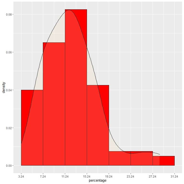
It is an example of normal distribution in which the probability density is greatest at the data center and fades away as we move away from the center.
However, unlike probability mass functions, the probability density function’s output is not a probability value but gives a density.
To convert density to probability, we integrate the density curve within a certain interval (or multiply the density by the interval width).
Probability = The area under the curve (AUC) = density X interval length.
In our example, to find the probability that the below poverty percentage falls in the “11.24-15.24” interval, the interval length = 4 so the area under the curve = probability = 0.082 X 4 = 0.328 or 33%.
The shaded area in the following plot is that area or probability.
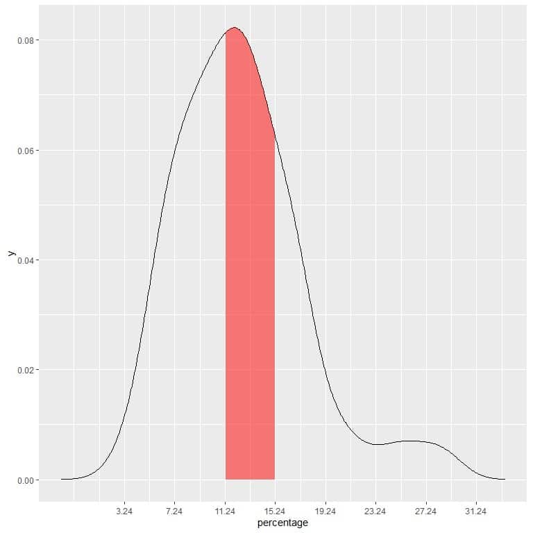
The red shaded area represents 33% of the total area, so the probability of the below poverty percentage to be in the interval 11.24-15.24 = 33%.
Probability density function formula
The probability that a random variable X takes on values in the interval a≤ X ≤b is:
P(a≤X≤b)=∫_a^b▒f(x) dx
Where:
P is the probability. This probability is the area under the curve (or the integration of the density function f(x)) from x = a to x = b.
f(x) is the probability density function that satisfies the following conditions:
1. f(x)≥0 for all x. Our Random variable X can take many x values.
∫_(-∞)^∞▒f(x) dx=1
2. So the integration of the full density curve must be equal to 1.
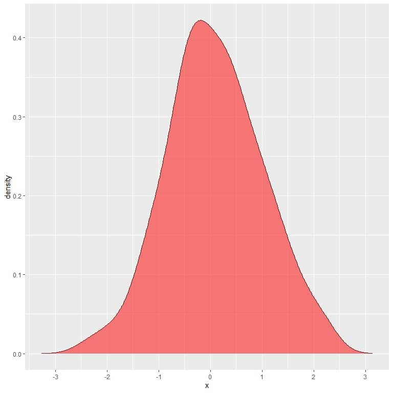
In the following plot, the shaded area is the probability that random variable X can lie in the interval between 1 and 2.
Note that random variable X can take positive or negative values, but density (on the y-axis) can take only positive values.
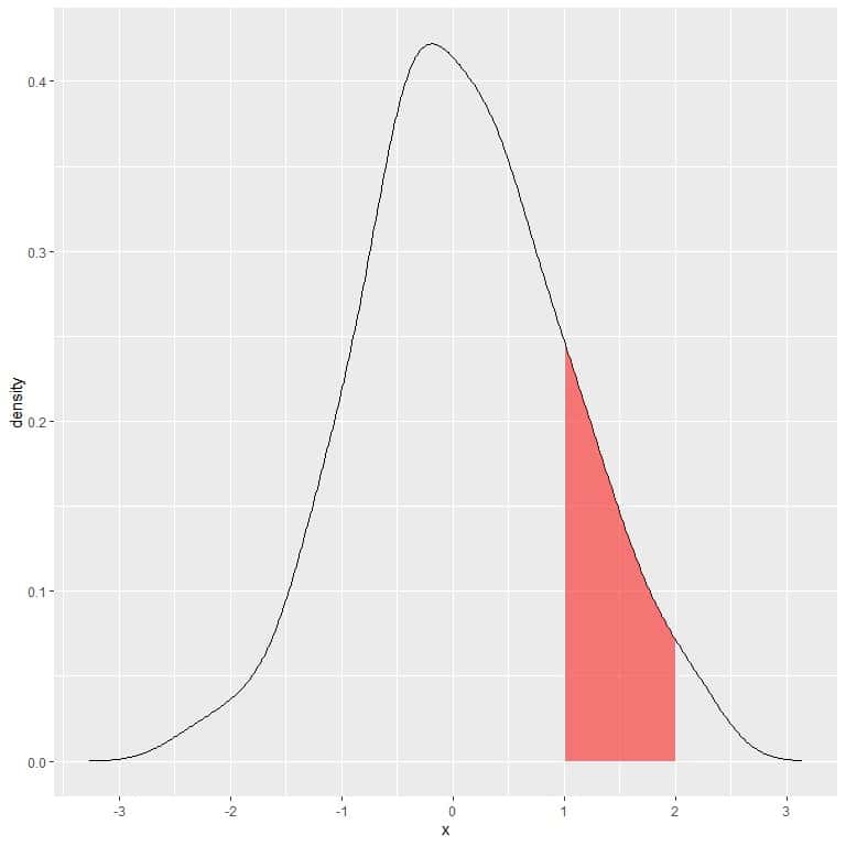
If we full shaded the whole area under the density curve, this equals 1.
 – Example 1
 – Example 1
The following is the probability density plot for the systolic blood pressure measurements from a certain population.
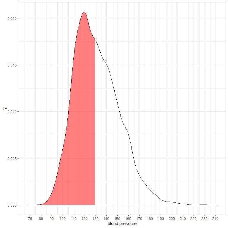 The shaded area represents half of the area, and it extends from 80 to 130.
As the total area is 1 so half of this area is 0.5. Therefore, the probability that this population’s systolic blood pressure will lie in the interval 80-130 = 0.5 or 50%.
It indicates a high-risk population where half of the population has a systolic blood pressure larger than the normal level of 130 mmHg.
If we shade another two areas of this density plot:
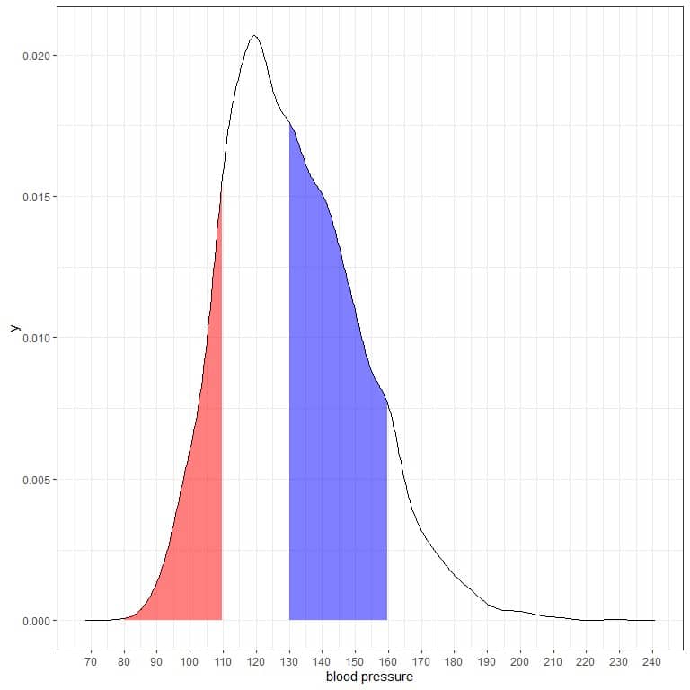
The red shaded area extends from 80 to 110 mmHg, while the blue shaded area extends from 130 to 160 mmHg.
Although the two areas represent the same length interval, 110-80 = 160-130, the blue shaded area is larger than the red shaded area.
We conclude that the probability of systolic blood pressure to be within 130-160 is higher than the probability of lying within 80-110 from this population.
– Example 2
The following is the density plot for heights of females and males from a certain population.
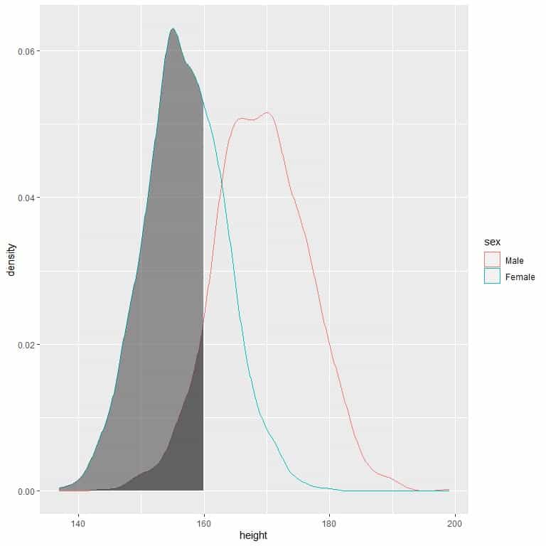 The shaded area extends from 130 to 160 cm but occupies a higher area in the density plot for females than for males.
The probability of females’ height to be between 130-160 cm is higher than the probability for males’ heights from this population.
Practice questions
1. The following is the frequency table for the diastolic blood pressure from a certain population.
range | frequency |
40 – 50 | 5 |
50 – 60 | 71 |
60 – 70 | 391 |
70 – 80 | 826 |
80 – 90 | 672 |
90 – 100 | 254 |
100 – 110 | 52 |
110 – 120 | 7 |
120 – 130 | 2 |
What is the total size of this population?
What is the probability that the diastolic blood pressure will be between 80-90?
What is the probability density that the diastolic blood pressure will be between 80-90?
2. The following is the frequency table for the total cholesterol level (in mg/dl or milligram per deciliter) from a certain population.
range | frequency |
90 – 130 | 29 |
130 – 170 | 266 |
170 – 210 | 704 |
210 – 250 | 722 |
250 – 290 | 332 |
290 – 330 | 102 |
330 – 370 | 29 |
370 – 410 | 6 |
410 – 450 | 2 |
450 – 490 | 1 |
What is the probability that the total cholesterol will be between 80-90 in this population?
What is the probability that the total cholesterol will be more than 450 mg/dl in this population?
What is the probability density of the total cholesterol between 290-370 mg/dl in this population?
3. The following are the density plots for the heights of 3 different populations.
 Compare the probability of height to be less than 150 cm in the 3 populations?
4. The following are the density plots for the weights of fair and ideal cut diamonds.
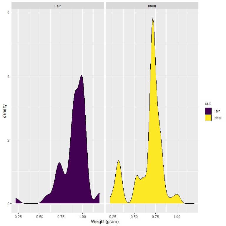 Which cut has a higher density for weights less than 0.75 grams?
5. Normal triglyceride levels in the blood are less than 150mg per deciliter (mg/dl). Borderline levels are between 150-200 mg/dl. High-levels of triglycerides (greater than 200 mg/dl) is associated with an increased risk of atherosclerosis, coronary artery disease, and stroke.
The following is the density plot for the triglyceride level of males and females from a certain population. A reference line at 200 mg/dl is drawn.
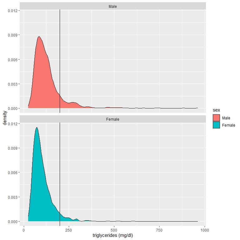 Which gender has the highest probability of triglyceride level greater than 200 mg/dl?
Answer key
1. The size of this population = sum of frequency column = 5+71+391+826+672+254+52+7+2 = 2280.
The probability that the diastolic blood pressure will be between 80-90 = relative frequency = frequency/total data number = 672/2280 = 0.295 or 29.5%.
The probability density that the diastolic blood pressure will be between 80-90 = relative frequency/class width = 0.295/10 = 0.0295.
2. The probability that the total cholesterol will be between 80-90 in this population = frequency/total data number.
Total data number = 29+266+704+722+332+102+29+6+2+1 = 2193.
We note that the interval 80-90 is not represented in the frequency table, so we conclude that the probability for this interval = 0.
The probability that the total cholesterol will be more than 450 mg/dl in this population = probability for intervals greater than 450 = probability for interval 450-490 = frequency/total data number = 1/2193 = 0.0005 or 0.05%.
The probability density that the total cholesterol will be between 290-370 mg/dl = relative frequency/class width = ((102+29)/2193)/80 = 0.00075.
3. If we draw a vertical line at 150:
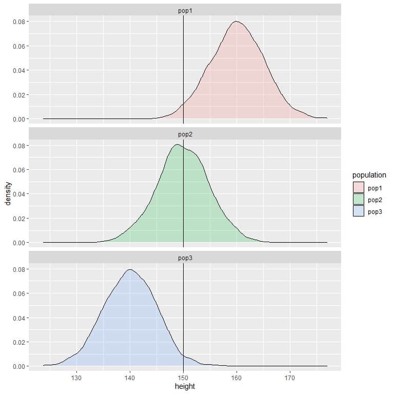 we see that:
For population 1, most of the curve area is larger than 150, so the probability of height in this population to be less than 150 cm is small or negligible.
For population 2, about half of the curve area is less than 150, so the probability of height in this population to be less than 150 cm is about 0.5 or 50%.
For population 3, most of the curve area is less than 150, so the probability of height in this population to be less than 150 cm is nearly 1 or 100%.
4. If we draw a vertical line at 0.75:
 we see that:
For fair-cut diamonds, most of the curve area is larger than 0.75, so the density of weight to be less than 0.75 is small.
On the other hand, for ideal-cut diamonds, about half of the curve area is less than 0.75, so the ideal-cut diamonds have a higher density for weights less than 0.75 grams.
5. The density plot area (red curve) for males that are larger than 200 is greater than the corresponding area for females (blue curve).
The means that the probability for males’ triglycerides to be larger than 200 mg/dl is higher than the probability for females’ triglycerides from this population.
Consequently, males are more susceptible to atherosclerosis, coronary artery disease, and stroke in this population.