JUMP TO TOPIC
Venn diagram – Explanation & Examples
 The definition of the Venn diagram is:
“Venn diagram is an illustration that shows the relation between two or more groups using overlapping circles.”
In this topic, we will discuss the Venn diagram from the following aspects:
- What is a Venn diagram?
- Venn diagram components
- How to read a Venn diagram?
- Practical questions
- Answers
What is a Venn diagram?
A Venn diagram is an illustration that uses overlapping circles to show the relationships among different groups of things.
The circles that overlap have common items, while circles that do not overlap do not share common items.
Venn diagrams help to visually represent the similarities and differences between different groups of data.
Venn diagrams are named after John Venn, an English logician and philosopher who introduced Venn diagrams in 1800.
Venn diagram components
A Venn diagram consists of overlapping circles. Each circle includes one group of items. When some items are common to different circles or groups, they are shown in the circles’ overlapping area. When some items are not common to different circles or groups, they are shown in their circles outside the overlapping area.
Example 1 of categorical data groups
If we have 1 group of 3 state names of the US called names1, “Alabama,” “Alaska,” “Arizona.”
We have another group of 3 state names of the US called names2, “West Virginia,” “Wisconsin,” “Wyoming.”
We can plot these two groups of names as a Venn diagram.
- The Venn diagram shows two non-overlapping circles, red and blue.
- The two circles are named names1 and names2.
- There are no common items between the two groups, so they are represented as two non-overlapping circles.
- Each circle contains the number 3, which means that each group has 3 elements.
- This data can be plotted as another Venn diagram with the percentage.
- The Venn diagram shows two non-overlapping circles named names1 and names2.
- We have a total of 3+3 = 6 items in the Venn diagram.
- names1 or red circle has 3 items, and names2 or blue circle has another 3 items.
- The 3 items in names1 constitute 50% of our data, and the other 3 items in names2 constitute the other 50% of our data.
- There are no common items between the two groups.
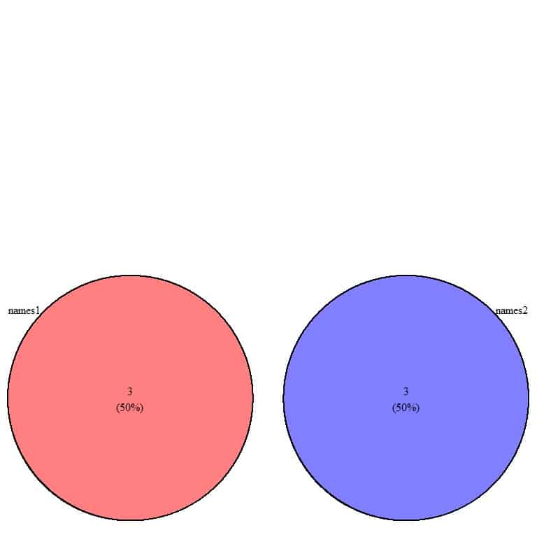
Example 2 of categorical data groups
If we have 1 group of 3 state names of the United States called names1, “Alabama,” “Alaska,” “Arizona.”
We have another group of 3 state names of the United States called names2, “Alabama,” “Alaska,” “Arkansas.”
We can plot these two groups as a Venn diagram.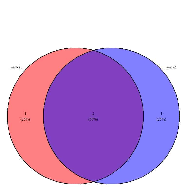
- Here, the Venn diagram shows two overlapping circles, named names1 and names2.
- We have a total of 1+2+1 = 4 items in the Venn diagram.
- The Venn diagram is separating the data into 3 areas
- 2 in the overlapping area. These are common items to the two groups.
- 1 item in the clear red circle or names1. This item is present in names1 but is not present in names2 (blue circle). This item is “Arizona.”
- 1 item in the clear blue circle or names2. This item is present in names2 but is not present in names1 (red circle). This item is “Arkansas.”
- There are (1+2) = 3 elements in names1 and (2+1) = 3 elements in names2.
- The 2 common items constitute (2/4) = 50% of the total 4 in the Venn diagram.
- The similarity between the two groups (50%) is larger than the difference (25%).
- This means that the part of the group that is identical to the other group is larger than the non-identical part.
Example 3 of categorical data groups
If we have 1 group of 3 state names of the United States called names1, “Alabama,” “Alaska,” “Arizona.”
We have another group of 3 state names of the United States called names2, “Alabama,” “Alaska,” “Arizona.”
We can plot these two groups as a Venn diagram.
- The Venn diagram shows 1 circle, named names1 and names2.
- We have a total of 3+3 = 6 items in the Venn diagram.
- The Venn diagram is locating all the data in this 1 circle.
- Each group has a total of 3 items, and these 3 items are the same as the other group.
- The similarity between the two groups (100%) meaning complete similarity or coincidental.
Example 4 of numerical data groups
If we have a group of student scores called scores1, 95,97,98,99.
We have another group of student scores called scores2, 90,91,94,93.
These two groups can be plotted as a Venn diagram.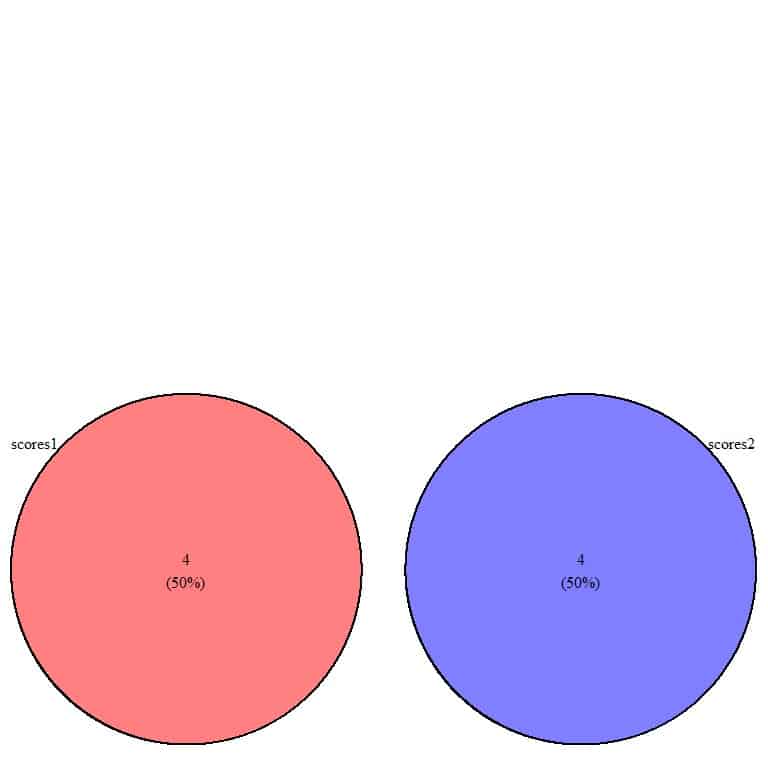
- Venn diagram shows two non-overlapping circles named scores1 and scores2.
- We have a total of 4+4 = 8 items in the Venn diagram.
- scores1 or red circle has 4 items, and scores2 or blue circle has another 4 items.
- The 4 items in scores1 constitute 50% of our data, and the other 4 items in scores2 constitute the other 50% of our data.
- There are no common items between the two groups.
Example 5 of numerical data groups
If we have a group of student scores called scores1, 95,97,98,99.
We have another group of student scores called scores2, 90,91,94,95.
We can plot these two groups as a Venn diagram.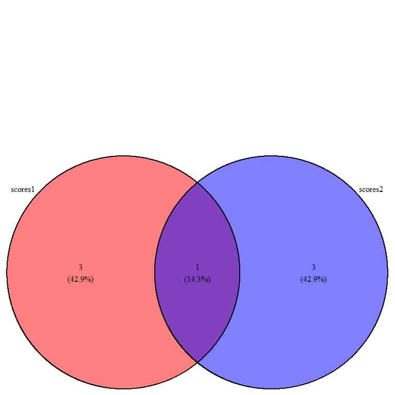
- Venn diagram shows two overlapping circles, named scores1 and scores2.
- We have a total of 3+1+3 = 7 items in the Venn diagram.
- The Venn diagram is separating the data into 3 areas
- 1 item in the overlapping area. This one item is a common item to the two groups. It is the score of 95.
- 3 items in the clear red circle or scores1. These items are present in scores1 but are not present in the scores2 (blue circle).
- 3 items in the clear blue circle or scores2. These items are present in scores2 but are not present in the scores1 (red circle).
- There are (3+1) = 4 elements in scores1 and (1+3) = 4 elements in scores2.
- The 1 common item constitutes (1/7) = 14.3% of the total 7 items in the Venn diagram.
- The similarity between the two groups (14.3%) is smaller than the difference (42.9%).
- This means that the part of one group that is identical to the other group is smaller than the non-identical part.
Example 6 of numerical data groups
If we have a group of student scores called scores1, 95,97,98,99.
We have another group of student scores called scores2, 93,94,95,97.
We can plot these two groups as a Venn diagram.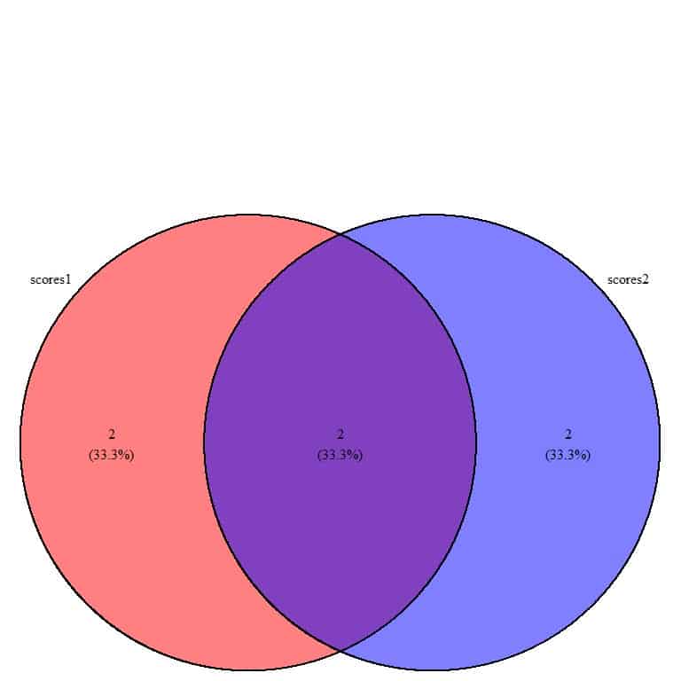
- Venn diagram shows two overlapping circles, named scores1 and scores2. The two circles are more overlapping than in the previous example.
- We have a total of 2+2+2 = 6 items in the Venn diagram.
- The Venn diagram is separating the data into 3 areas
- 2 items in the overlapping area. These items are common items to the two groups. These are the scores, 95 and 97.
- 2 items in the clear red circle or scores1. These items are present in scores1 but are not present in the scores2 (blue circle).
- 2 items in the clear blue circle or scores2. These items are present in scores2 but are not present in the scores1 (red circle).
- There are (2+2) = 4 elements in scores1 and (2+2) = 4 elements in scores2.
- The 2 common items constitute (2/6) = 33.3% of the total of 6 items in the Venn diagram.
- The similarity between the two groups (33.3%) is equal to the difference (33.3%).
- This means that one half of each group is identical to one half of the other group, but the other half is different.
How to read a Venn diagram?
All the above examples are for 2d or two dimensional Venn diagrams comparing two groups only.
3d Venn diagrams compare 3 groups, and 4d Venn diagrams compare 4 groups.
Example 1 2d Venn diagram
The following table shows the weight in Kg of 20 males and 20 females
Male | Female |
70.0 | 64.0 |
79.2 | 67.0 |
62.0 | 68.0 |
79.0 | 43.5 |
65.0 | 45.8 |
69.0 | 53.0 |
88.0 | 66.0 |
80.0 | 60.0 |
77.0 | 69.0 |
72.0 | 76.0 |
75.0 | 63.4 |
84.0 | 65.5 |
64.0 | 55.0 |
95.5 | 58.0 |
68.0 | 84.5 |
67.0 | 70.0 |
89.0 | 50.4 |
72.4 | 94.0 |
67.5 | 60.3 |
76.0 | 98.0 |
This data can be plotted as a Venn diagram.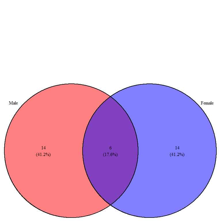
- The Venn diagram shows two overlapping circles, named Male and Female.
- We have a total of 14+6+14 = 34 items in the Venn diagram.
- The Venn diagram is separating the data into 3 areas
- 6 items in the overlapping area. These items are common items or weights to the two groups.
- 14 items in the clear red circle or Male. These items are present in Male but are not present in Female (blue circle).
- 14 items in the clear blue circle or Female. These items are present in Female but are not present in Male (red circle).
- There are (14+6) = 20 elements or weight values in Male and (6+14) = 20 elements in Female.
- The 6 common items constitute (6/34) = 17.6% of the total of 34 items in the Venn diagram.
- The similarity between the two groups (17.6%) is smaller than the difference (41.2%).
- This means that the part of one group that is identical to the other group is smaller than the non-identical part.
Note: the two groups need not be the same size
Example 2 2d Venn diagram
The following is the weight of 30 males in Kg.
62.0 64.0 65.0 65.0 67.0 67.0 67.5 68.0 69.0 70.0 72.0 72.4 73.0 75.0 75.0
76.0 77.0 79.0 79.0 79.2 80.0 80.0 84.0 84.6 85.0 88.0 88.0 89.0 89.0 95.5
and the weight of 20 females
43.5 45.8 50.4 53.0 55.0 58.0 60.0 63.4 64.0 65.5 66.0 67.0 68.0 69.0 69.0
70.0 76.0 76.0 84.5 94.0
The two groups are not of equal size.
This data can be plotted as a Venn diagram.
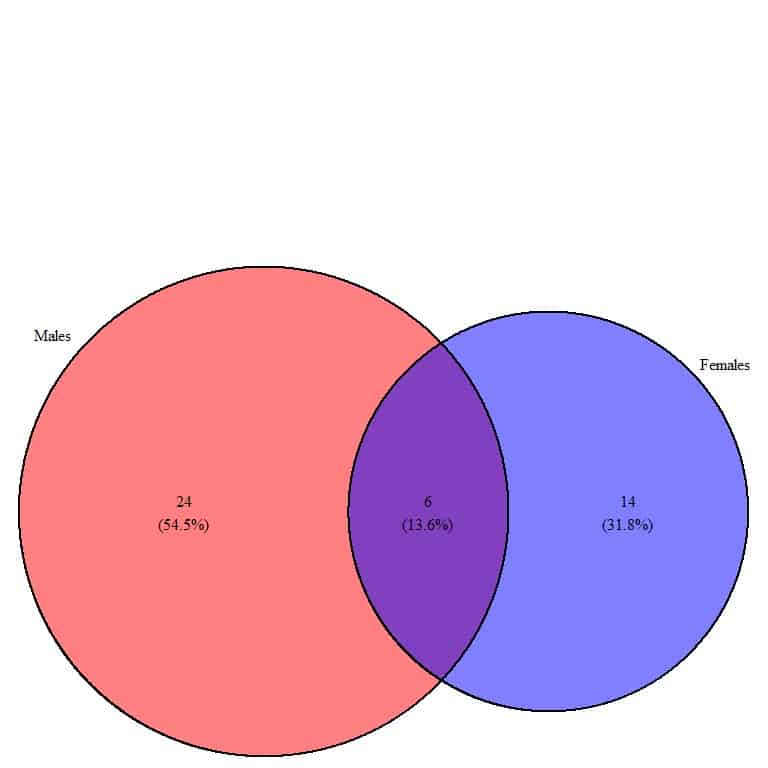
- The Venn diagram shows two overlapping circles, named Males and Females.
- The Males’ circle is larger than the Females circle because Males contain more data values than females.
- We have a total of 24+6+14 = 44 items in the Venn diagram.
- The Venn diagram is separating the data into 3 areas
- 6 items in the overlapping area. These items or weight values are common items to the two groups.
- 24 items in the clear red circle or Males. These items are present in Males but are not present in Females (blue circle).
- 14 items in the clear blue circle or Females. These items are present in Females but are not present in Males (red circle).
- There are (24+6) = 30 elements in Males and (6+14) = 20 elements in Females.
- The 6 common items constitute (6/44) = 13.6% of the total of 44 items in the Venn diagram.
- The similarity between the two groups (13.6%) is smaller than the difference for either the males or females (54.5% or 31.8% respectively).
- This means that the part of one group that is identical to the other group is smaller than the non-identical part.
Example 3 3d Venn diagram
The following is the total cholesterol values (mg/dl) of 30 persons who are never smokers
294 220 168 298 254 211 163 238 183 188 236 335 165 197 244 163 154 212 181
220 212 206 258 202 258 151 191 229 169 154
and the total cholesterol of 20 persons who are current smokers
245 116 162 218 209 231 198 192 169 261 178 205 148 225 210 214 260 190 234
223
and the total cholesterol of 15 persons who are former smokers
194 188 268 209 182 254 251 230 187 173 297 187 239 205 169
This data can be plotted as a Venn diagram
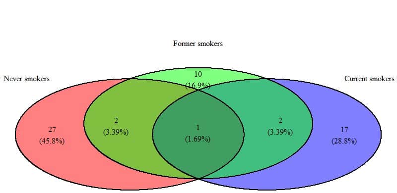
- The Venn diagram shows 3 overlapping circles named, never smokers, former smokers, and current smokers.
- We have a total of 27+2+10+1+2+17 = 59 items in the Venn diagram.
- The Venn diagram is separating the data into 6 areas
- 27 items in the clear red circle or Never smokers. These items or total cholesterol values are present in never smokers but are not present in former (green circle) or current smokers (blue circle).
- 10 items in the clear green circle or former smokers. These items are present in former smokers but are not present in never (red circle) or current smokers (blue circle).
- 17 items in the clear blue circle or current smokers. These items are present in current smokers but are not present in never (red circle) or former smokers (green circle).
- 2 items in the overlapping area between red and green circles. These items are common in never and former smokers but are not present in current smokers (blue circle).
- 2 items in the overlapping area between the green and blue circles. These items are common in former and current smokers but are not present in never smokers (red circle).
- 1 item in the overlapping area between the 3 circles. This item or data value is common in the 3 groups of smoking status. This value is 169 mg/dl.
- There are (27+2+1) = 30 elements in never smokers, (10+2+1+2) = 15 elements in former smokers, and (17+2+1) = 20 elements in current smokers.
- The group with the largest different proportion is never smokers (45.8%).
- This means that the current and former smokers are more similar to each other than to the never smokers group. This may be an indication of the long-lasting smoking effects for even former smokers.
Example 4 4d Venn diagram
We have the following table of student names in 4 different classes
class1 | class2 | class3 | class4 |
Catherine | Bertha | Lillie | Mabel |
Cora | Grace | Mattie | Josephine |
Florence | Jessie | Minnie | Lula |
Emma | Florence | Alice | Catherine |
Frances | Laura | Clara | Laura |
Lena | Lena | Ella | Lillie |
Louise | Lula | Nellie | Elizabeth |
Daisy | Clara | Ada | Ella |
Gertrude | Cora | Hattie | Minnie |
Julia | Lillian | Gertrude | Gertrude |
Hattie | Ida | Ethel | Fannie |
Minnie | Josephine | Maude | Eva |
Myrtle | Sarah | Cora | Lillian |
Edith | Bessie | Julia | Daisy |
Bertha | Hattie | Catherine | Bessie |
Mattie | Myrtle | Martha | Helen |
Alice | Daisy | Rose | Rose |
Eva | Eva | Margaret | Clara |
Ida | Margaret | Annie | Pearl |
Sarah | Gertrude | Pearl | Louise |
This data can be plotted as a Venn diagram.
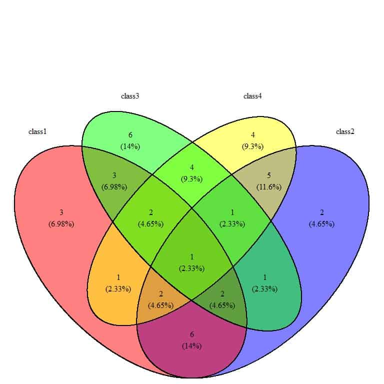
- Venn diagram shows 4 overlapping circles, named class1, class2, class3, and class4.
- The Venn diagram is separating the data into different areas, for example:
- 3 items in the clear red circle or class1. These items (or names) are present in class1 only and are not present in class3 (green circle), class4 (yellow circle), or class2 (blue circle).
- 6 items in the clear green circle or class3. These items are present in class3 but are not present in class1, 4, or 2.
- 4 items in the clear yellow circle or class4. These items are present in class4 only but are not present in class1,3, or 2.
- 2 items in the clear blue circle or class2. These items are present in class2 only but are not present in class1,3, or 4.
- 3 items in the overlapping area between the green and red circles or class 1 and 3. These items are common in class 1 and 3 but are not present in class 4 or 2.
- 1 item in the overlapping area between the 4 circles. This item or name is common in the 4 groups of the class name. This value is “Gertrude.”
- The class with the largest different proportion of names is class3 (14%).
- The class with the smallest different proportion of names is class2(4.65%). This means that this class contains names that are common in other classes.
Practical questions
1. We have the following Venn diagram of student names in 2 different classes
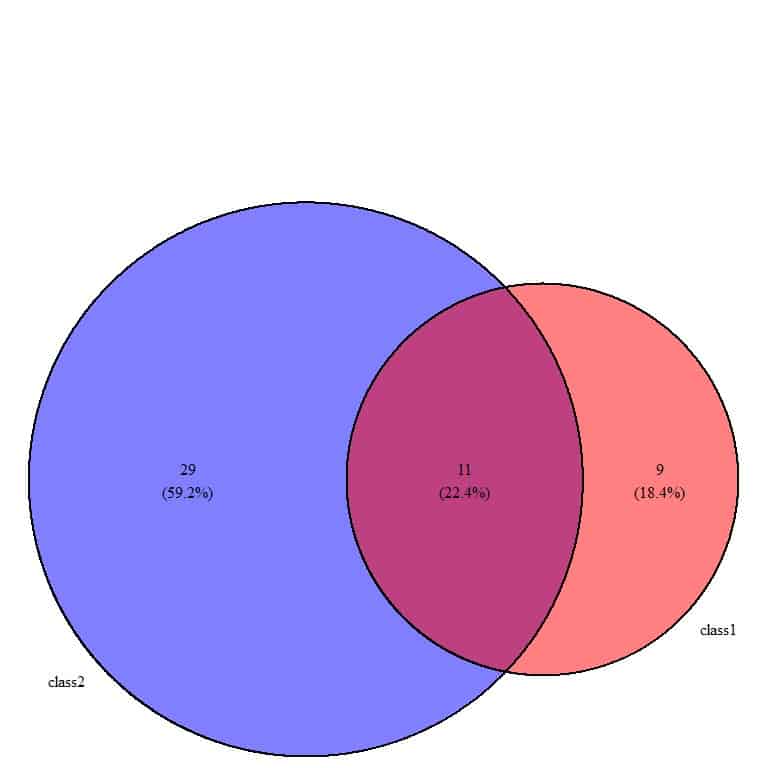
How many students are in class 1 and class 2?
How many names are common in the two classes?
Why is the circle of class2 larger than class1?
2. The following Venn diagram is for the income categories for 3 companies
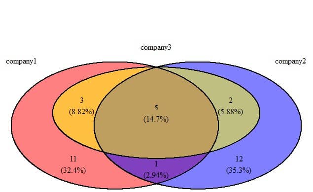
How many income categories are common in the 3 companies?
What is the most different company in its income categories?
3. The following is a Venn diagram for murder rates in different regions of the US
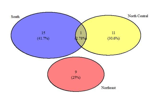
How many values are common in the South and North Central?
Why is the Northeast circle not overlapping with the other two circles?
4. The following is a Venn diagram for illiteracy rates in different regions of the US
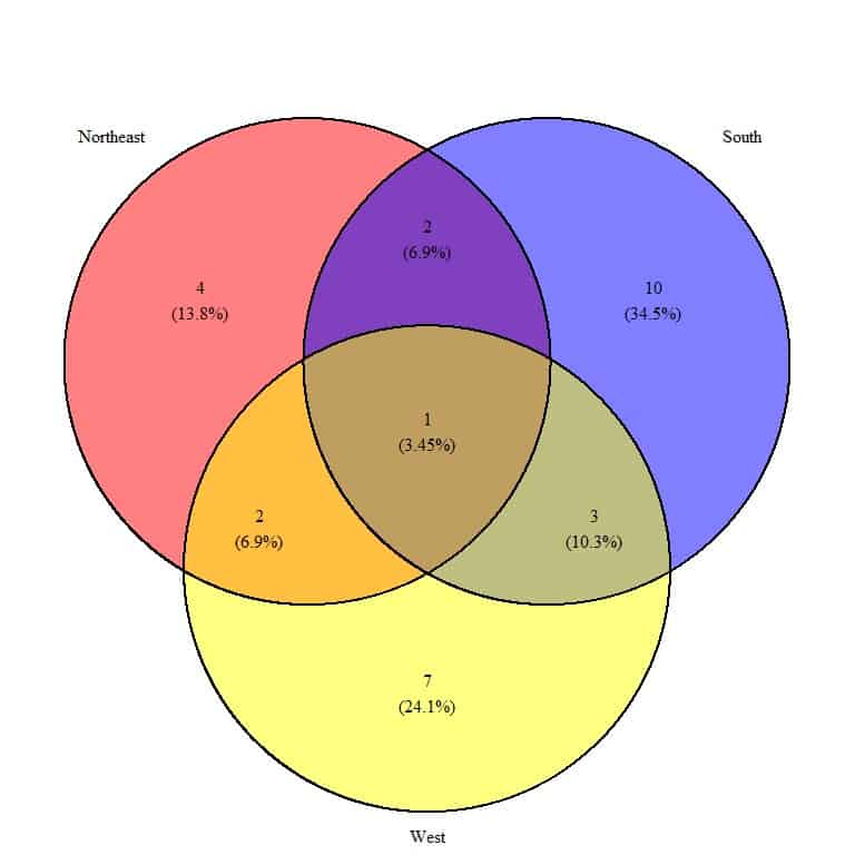
How many values are common in the 3 regions?
Which is the most different region in its illiteracy rate values?
5. The following is a Venn diagram for the marital status of 3 religion groups, Catholic, Protestant, and none, from some survey data.
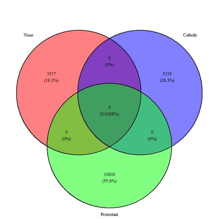
What is the sample size for the three groups?
How many marital statuses are common between the 3 groups?
Answers
1. There are 9+11 = 20 students in class1.
There are 29+11 = 40 students in class2.
The circle of class 2 is larger because class 2 has twice the number of students as class 1.
2. The overlapping area between the 3 circles contain 5, so 5 income categories are common between the 3 companies.
The most different company is company 2 or the blue circle because it has the largest difference percentage (35.3%).
3. One murder rate value is common between the South and North Central regions.
The Northeast circle is not overlapped with the South or North Central circles because all its murder rate values are not present in the South or North Central regions.
4. One illiteracy rate value is common among the 3 regions.
The most different region is South or the blue circle because it has the largest percentage (34.5%) difference.
5. The sample size for None religion = 3517+0+0+6 = 3523.
The sample size for Catholic religion = 5118+0+0+6 = 5124.
The sample size for Protestant religion = 10840+0+0+6 = 10846.
Six marital status are common between the 3 religions that are present in the overlapping area.