JUMP TO TOPIC
Bar Graph – Explanation & Examples
 The definition of the bar graph is:
“The bar graph is a chart used to represent categorical data using bars’ heights”
In this topic, we will discuss the bar graph from the following aspects:
- What is a bar graph?
- How to make a bar graph?
- How to read bar graphs?
- Vertical bar graph
- Horizontal bar graph
- Creating bar graphs with R
- Practical questions
- Answers
What is a bar graph?
The bar graph is a graph used to represent categorical data using bars of different heights.
The heights of the bars are proportional to the values or the frequencies of these categorical data.
How to make a bar graph?
The bar graph is made by plotting the categorical data on one axis and the values of these categorical data on the other axis.
Example 1, A survey of smoking habits for 10 individuals has shown the following table
Smoking habit | Count |
Never smoker | 5 |
Current smoker | 2 |
Former smoker | 3 |
By plotting this data as a bar graph, we will get.
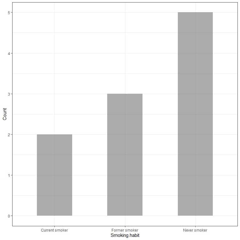
The x-axis or the horizontal axis has the categorical data and the y axis or the vertical axis has the counts of these categories.
The length of the Never smoker bar is 5, the length of the former smoker bar is 3, and the length of the current smoker bar is 2.
Each bar has a height that corresponds to the count of these smoking habits.
Example 2, the following table is the landmass area of 4 continents (Africa, Antarctica, Asia, and Australia) in thousands of square miles.
Location | Area |
Africa | 11506 |
Antarctica | 5500 |
Asia | 16988 |
Australia | 2968 |
If we plot this data as a bar graph, we will get.
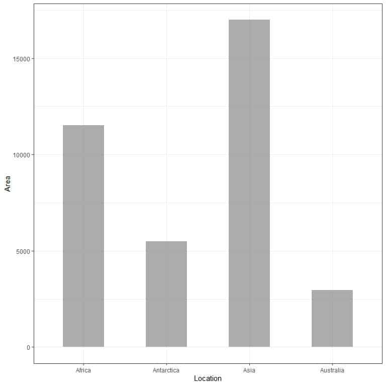
We see that the bar for Asia is the longest one followed by the bar for Africa and Antarctica. The bar corresponding to Australia has the lowest height.
In the second bar plot, we see that each bar’s height corresponds to the area of each continent.

How to read bar graphs?
we read the bar graph by looking at the bars’ heights to determine the category with highest and lowest values.
In the example of smoking habits, the Never smoker category has the longest bar so this category has the highest count in our survey.
The current smoker has the lowest height so this category has the lowest count in our survey.
In the example of continents’ areas, Asia has the longest bar followed by Africa, Antarctica, Australia. Therefore, we can arrange these continents according to their area in the following descending order
Asia > Africa > Antarctica > Australia
If we want the exact value of each category, we can extrapolate a line from the top of each bar to its value on the y axis.

We see that the line from the never smoker bar is extrapolated to 5, so the count of never smokers in our survey is 5.
Similarly, the count of former smokers is 3 and the count of current smokers is only 2.
In the plot of continents’ areas.
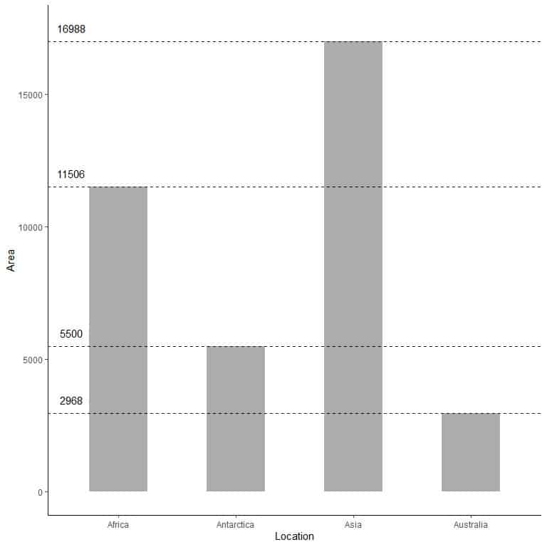
By extrapolating the lines from each bar top, we see that:
The area of Asia = 16,988,000 square miles.
The area of Africa = 11,506,000 square miles.
The area of Antarctica = 5,500,000 square miles.
The area of Australia = 2,968,000 square miles.
Vertical bar graph
All the above examples are examples of vertical bar plots where we have the categories on the x-axis or the horizontal axis and the categories’ values on the y- axis or the vertical axis.
We use vertical bar graphs when we have a low number of categories.
For example, we have the following table of the landmass area of different locations in thousands of square miles.
Location | Area |
Africa | 11506 |
Antarctica | 5500 |
Asia | 16988 |
Australia | 2968 |
Axel Heiberg | 16 |
Baffin | 184 |
Banks | 23 |
Borneo | 280 |
Britain | 84 |
Celebes | 73 |
Celon | 25 |
Cuba | 43 |
Devon | 21 |
Ellesmere | 82 |
Europe | 3745 |
Greenland | 840 |
Hainan | 13 |
Hispaniola | 30 |
Hokkaido | 30 |
Honshu | 89 |
Iceland | 40 |
Ireland | 33 |
Java | 49 |
Kyushu | 14 |
Luzon | 42 |
Madagascar | 227 |
Melville | 16 |
Mindanao | 36 |
Moluccas | 29 |
New Britain | 15 |
New Guinea | 306 |
New Zealand (N) | 44 |
New Zealand (S) | 58 |
Newfoundland | 43 |
North America | 9390 |
Novaya Zemlya | 32 |
Prince of Wales | 13 |
Sakhalin | 29 |
South America | 6795 |
Southampton | 16 |
Spitsbergen | 15 |
Sumatra | 183 |
Taiwan | 14 |
Tasmania | 26 |
Tierra del Fuego | 19 |
Timor | 13 |
Vancouver | 12 |
Victoria | 82 |
We have 48 different locations. If we plot this data as a vertical bar graph, we will get.
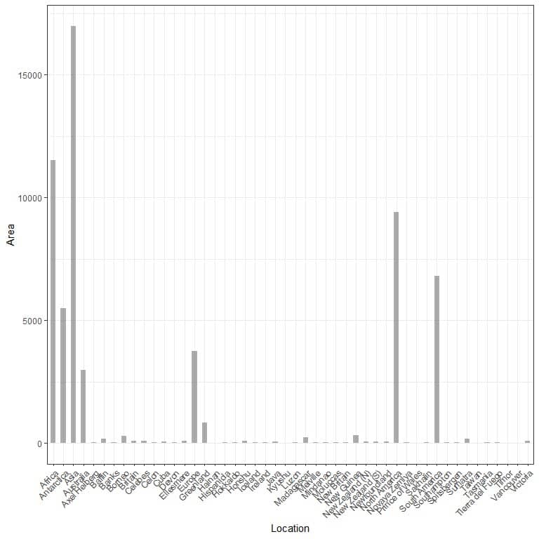
The categories are crowded together and difficult to discern.
One solution to that is using a horizontal bar graph.
Horizontal bar graph
We make the horizontal bar graph by reversing the positions of the categories and their values.
The categories are on the y axis and their values on the x-axis.
The horizontal bar graph for the 48 different locations.
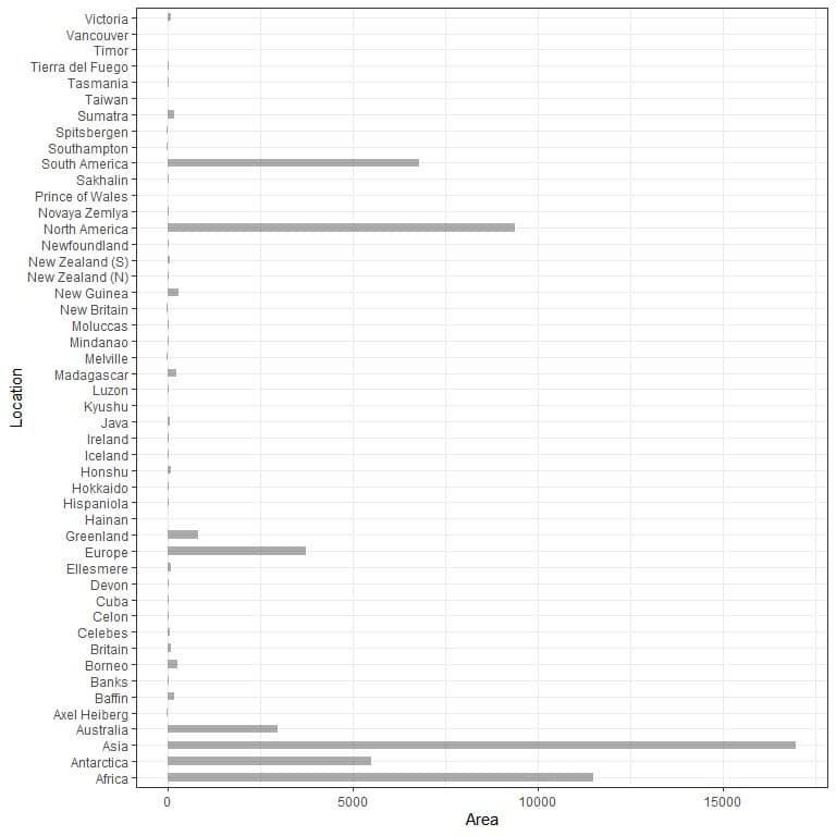
The categories are now more discerned than before.
Let’s look at another example.
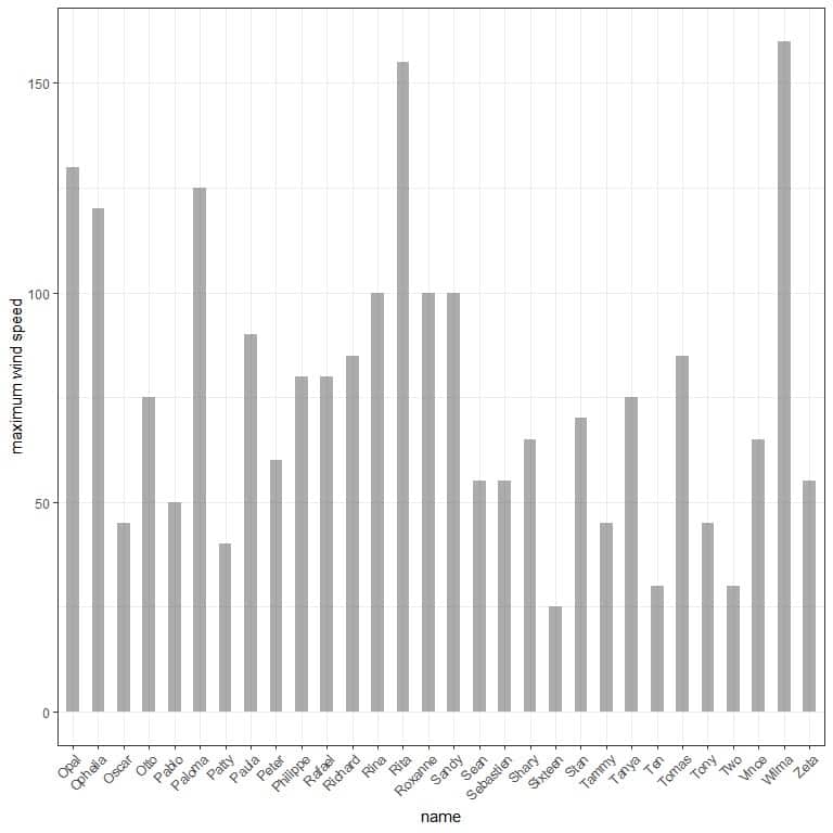
The following is a table for the maximum wind speed for 30 storms.
name | maximum wind speed |
Opal | 130 |
Ophelia | 120 |
Oscar | 45 |
Otto | 75 |
Pablo | 50 |
Paloma | 125 |
Patty | 40 |
Paula | 90 |
Peter | 60 |
Philippe | 80 |
Rafael | 80 |
Richard | 85 |
Rina | 100 |
Rita | 155 |
Roxanne | 100 |
Sandy | 100 |
Sean | 55 |
Sebastien | 55 |
Shary | 65 |
Sixteen | 25 |
Stan | 70 |
Tammy | 45 |
Tanya | 75 |
Ten | 30 |
Tomas | 85 |
Tony | 45 |
Two | 30 |
Vince | 65 |
Wilma | 160 |
Zeta | 55 |
We can plot this data as a vertical bar graph
or, more clearly, as a horizontal bar graph
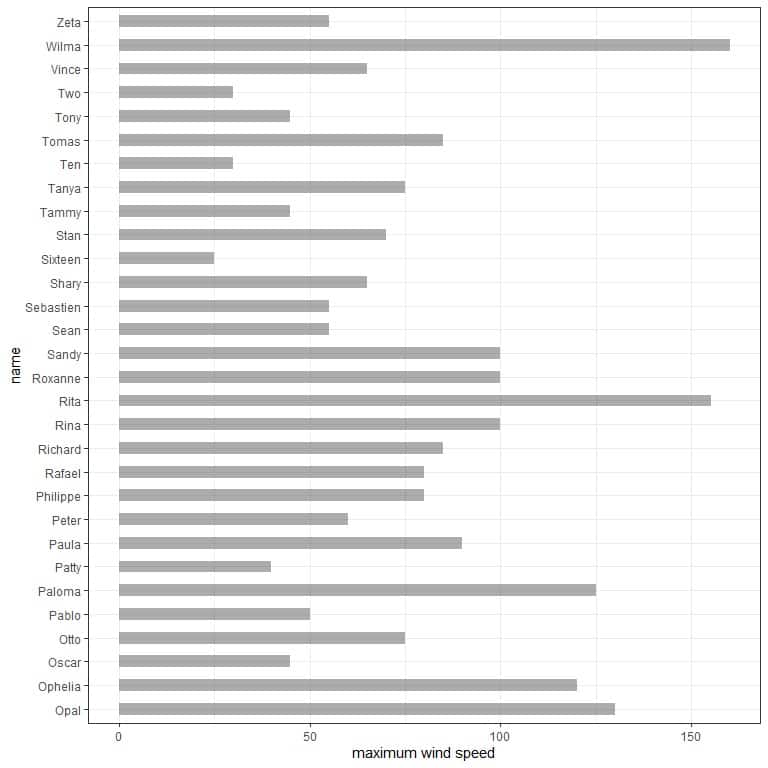
A more informative graph would be by arranging the different storms according to their maximum wind speed.
From this, we see that the storm with the highest maximum speed is Wilma and Sixteen has the lowest maximum wind speed.
Creating bar graphs with R
R has an excellent package called tidyverse that contains many packages for data visualization (as ggplot2) and data analysis (as dplyr).
These packages allow us to draw different versions of bar graphs for large datasets.
However, they require the supplied data to be a data frame which is a tabular form to store data in R.
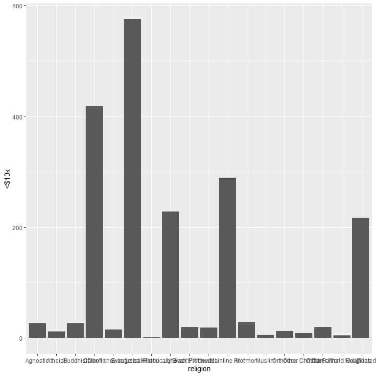
Example: The relig_income data frame is part of the tidyverse package and contains data related to the Pew religion and income survey.
We begin our session by activating the tidyverse package using the library function.
Then, we load the relig_income data using the data function and examine it by typing its name.
The data is composed of 11 columns, 1 column for 18 religion categories, and 10 columns for different income categories.
Finally, we use the ggplot function with argument data = relig_income, and religion on the x-axis and <$10k on the y-axis plus geom_col function to draw the bar graph for this income category.
This will plot a vertical bar graph showing the number of persons in this survey who earn <$10k for each religion.
library(tidyverse)
data(“relig_income”)
relig_income
## # A tibble: 18 x 11
## religion `<$10k` `$10-20k` `$20-30k` `$30-40k` `$40-50k` `$50-75k` `$75-100k`
##
## 1 Agnostic 27 34 60 81 76 137 122
## 2 Atheist 12 27 37 52 35 70 73
## 3 Buddhist 27 21 30 34 33 58 62
## 4 Catholic 418 617 732 670 638 1116 949
## 5 Don’t k~ 15 14 15 11 10 35 21
## 6 Evangel~ 575 869 1064 982 881 1486 949
## 7 Hindu 1 9 7 9 11 34 47
## 8 Histori~ 228 244 236 238 197 223 131
## 9 Jehovah~ 20 27 24 24 21 30 15
## 10 Jewish 19 19 25 25 30 95 69
## 11 Mainlin~ 289 495 619 655 651 1107 939
## 12 Mormon 29 40 48 51 56 112 85
## 13 Muslim 6 7 9 10 9 23 16
## 14 Orthodox 13 17 23 32 32 47 38
## 15 Other C~ 9 7 11 13 13 14 18
## 16 Other F~ 20 33 40 46 49 63 46
## 17 Other W~ 5 2 3 4 2 7 3
## 18 Unaffil~ 217 299 374 365 341 528 407
## # … with 3 more variables: `$100-150k` , `>150k` , `Don’t
## # know/refused`
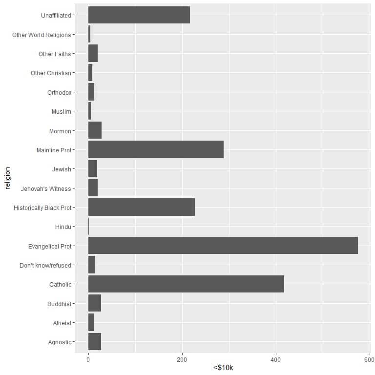
ggplot(data = relig_income, aes(x = religion, y = `<$10k`))+
geom_col()
The different religions are crowded together so we draw horizontal bar graph by adding the coord_flip function.
ggplot(data = relig_income, aes(x = religion, y = `<$10k`))+
geom_col()+ coord_flip()
An important information can be added by using geom_label function with argument, aes(label = income category).
This function will add the number of persons that corresponds to each religion at the top of each bar.
ggplot(data = relig_income, aes(x = religion, y = `<$10k`))+
geom_col()+ coord_flip()+ geom_label(aes(label = `<$10k`))
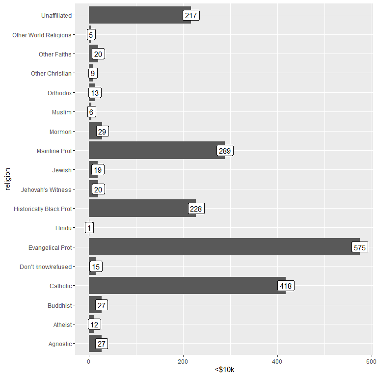
For the persons earning <$10k, the Evangelical Prot religion has the highest number of persons (575), while the Hindu religion has the lowest number of persons (only 1).
If we plot the highest income category (>150k)
ggplot(data = relig_income, aes(x = religion, y = `>150k`))+
geom_col()+ coord_flip()+ geom_label(aes(label = `>150k`))
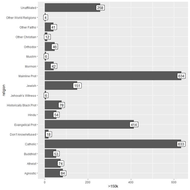
For the persons earning >$150k, the Mainline Prot religion has the highest number of persons (634), while the Other World Religions category has the lowest number of persons (only 4).
Practical questions
1. For the relig_income data, plot the $75-100k column, and determine which religion has the highest number of persons earning this amount?
2. For the relig_income data, plot the $30-40k column, and determine which religion has the lowest number of persons earning this amount?
3. The mtcars data contains some properties of 32 automobiles of 1973-1974 models.
We use the rownames_to_column to add another column containing the model names.
Plot this data and determine which model has the highest weight (wt column).
dat<- mtcars %>% rownames_to_column(var = “model”)
4. For the same mtcars data, plot the data as a bar graph and determine which model has the lowest number of carburetors (carb column)
5. The state.x77 is a matrix containing some data about the 50 states of the USA in the 1970s.
We use this function to convert it to a data frame and add a column for the state name
dat2<- state.x77 %>% data.frame() %>% rownames_to_column(var = “state”)
Use this data and plot it as a bar graph to determine which state has the lowest and highest murder rate (Murder column)
Answers
1. As before, we begin our session by activating the tidyverse package using the library function.
Then, we load the relig_income data using the data function and plotting the bar graph using the $75-100k column as the y argument, and label the bars using the same column.
library(tidyverse)
data(“relig_income”)
ggplot(data = relig_income, aes(x = religion, y = `$75-100k`))+
geom_col()+ coord_flip()+ geom_label(aes(label = `$75-100k`))
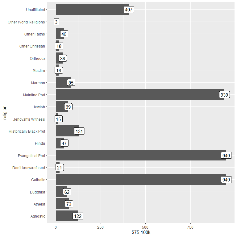
We see that both the Evangelical Prot and Catholic religions have the highest number of persons earning this income or 949 persons.
2. As before, but we use $30-40k as the y argument and for labeling the bars.
library(tidyverse)
data(“relig_income”)
ggplot(data = relig_income, aes(x = religion, y = `$30-40k`))+
geom_col()+ coord_flip()+ geom_label(aes(label = `$30-40k`))
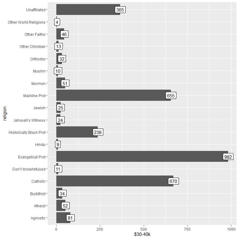
We see that the other world religions category has the lowest number of persons earning this amount (4 persons only).
3. We use the created dat data frame with model as x argument and wt as y argument and for labeling the bars.
ggplot(data = dat, aes(x = model, y = wt))+
geom_col()+ coord_flip()+ geom_label(aes(label = wt))
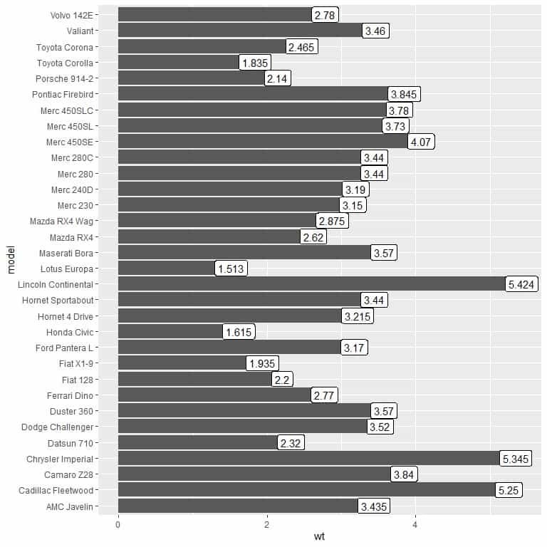
We see that the model “Lincoln Continental” has the largest weight or 5.424.
4. We use the created dat data frame with model as x argument and carb as y argument and for labeling the bars.
ggplot(data = dat, aes(x = model, y = carb))+
geom_col()+ coord_flip()+ geom_label(aes(label = carb))
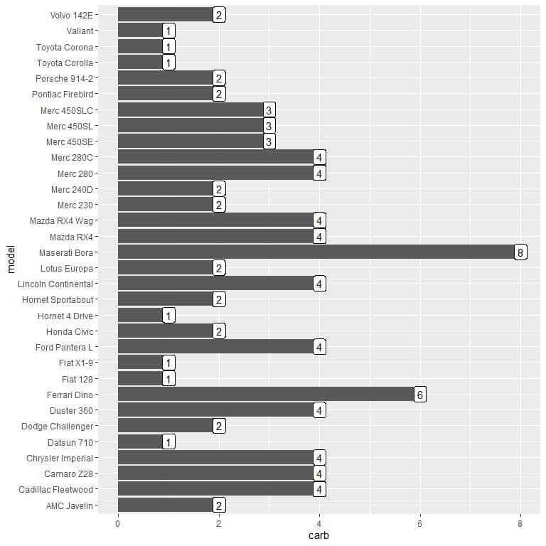
We see that different models have the lowest number of carburetors or 1 carburetor only. These models are “Datsun 710”, “Hornet 4 Drive”, “Valiant”, “Fiat 128”, “Toyota Corolla”, “Toyota Corona”, and “Fiat X1-9”.
5. We use the created dat2 data frame with state as x argument and Murder as y argument and for labeling the bars.
ggplot(data = dat2, aes(x = state, y = Murder))+
geom_col()+ coord_flip()+ geom_label(aes(label = Murder))
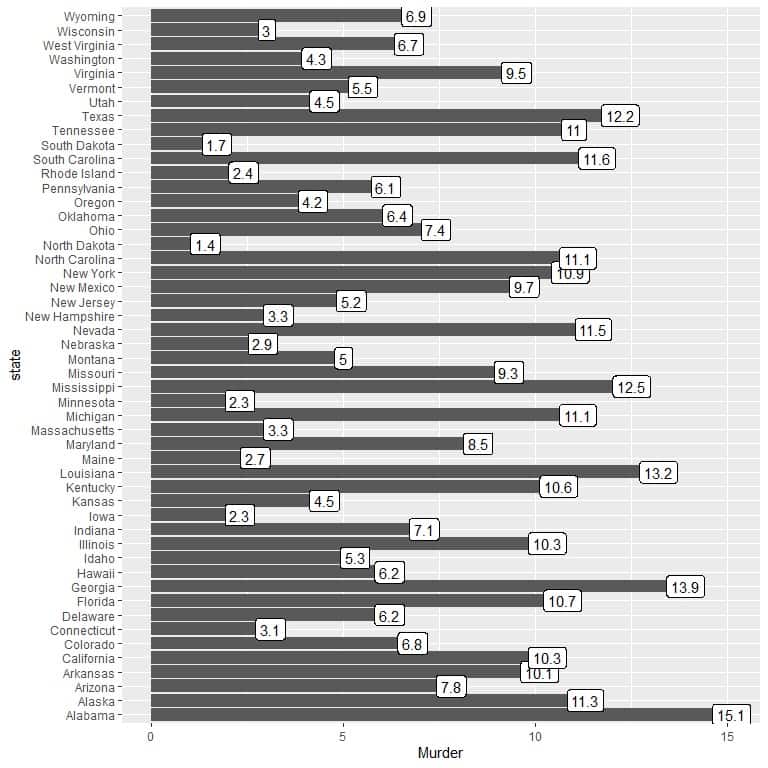
We see that the state with the highest murder rate was Alabama (15.1), and North Dakota was the state with the lowest murder rate (1.4).