JUMP TO TOPIC
Normal Probability Plot – Explanation & Examples
 The definition of the normal probability plot is:
“The normal probability plot is a plot used to assess the normal distribution of numerical data.”
In this topic, we will discuss the normal probability plot from the following aspects:
- What is a normal probability plot?
- How to make a normal probability plot?
- How to read a normal probability plot?
- Practice questions.
- Answer key.
1. What is a normal probability plot?
The normal probability plot is a plot used to assess the normal distribution of any numerical data.
Making a histogram of your data can help you decide whether or not a set of data is normal, but there is a more specialized type of plot you can create, called a normal probability plot.
If the data follow a normal distribution then a normal probability plot of the theoretical percentiles of the normal distribution on the x-axis versus the observed sample percentiles on the y-axis should be approximately linear.
The theoretical p% percentile of a normal distribution is the value such that p% of the values are lower than that value.
The sample p% percentile of any numerical data is the value such that p% of the measurements fall below that value.
For example, the 50% percentile or the median is the value so that 50% or half of your measurements fall below that value.
Another example, the 27% percentile is the value so that 27% of the data points in your numerical data fall below that value.
2. How to make a normal probability plot?
We will go through several examples.
– Example 1
The following are the weights (in kg) of 100 persons from a certain survey.
52.44 52.77 54.56 53.07 53.13 54.72 53.46 51.73 52.31 52.55 54.22 53.36 53.40 53.11 52.44 54.79 53.50 51.03 53.70 52.53 51.93 52.78 51.97 52.27 52.37 51.31 53.84 53.15 51.86 54.25 53.43 52.70 53.90 53.88 53.82 53.69 53.55 52.94 52.69 52.62 52.31 52.79 51.73 55.17 54.21 51.88 52.60 52.53 53.78 52.92 53.25 52.97 52.96 54.37 52.77 54.52 51.45 53.58 53.12 53.22 53.38 52.50 52.67 51.98 51.93 53.30 53.45 53.05 53.92 55.05 52.51 50.69 54.01 52.29 52.31 54.03 52.72 51.78 53.18 52.86 53.01 53.39 52.63 53.64 52.78 53.33 54.10 53.44 52.67 54.15 53.99 53.55 53.24 52.37 54.36 52.40 55.19 54.53 52.76 51.97.
Draw a normal probability plot of this data.
1. Order the numbers from smallest to largest number.
50.69 51.03 51.31 51.45 51.73 51.73 51.78 51.86 51.88 51.93 51.93 51.97 51.97 51.98 52.27 52.29 52.31 52.31 52.31 52.37 52.37 52.40 52.44 52.44 52.50 52.51 52.53 52.53 52.55 52.60 52.62 52.63 52.67 52.67 52.69 52.70 52.72 52.76 52.77 52.77 52.78 52.78 52.79 52.86 52.92 52.94 52.96 52.97 53.01 53.05 53.07 53.11 53.12 53.13 53.15 53.18 53.22 53.24 53.25 53.30 53.33 53.36 53.38 53.39 53.40 53.43 53.44 53.45 53.46 53.50 53.55 53.55 53.58 53.64 53.69 53.70 53.78 53.82 53.84 53.88 53.90 53.92 53.99 54.01 54.03 54.10 54.15 54.21 54.22 54.25 54.36 54.37 54.52 54.53 54.56 54.72 54.79 55.05 55.17 55.19.
2. Assign a rank to each value of your data.
weight | rank |
| 50.69 | 1 |
51.03 | 2 |
| 51.31 | 3 |
51.45 | 4 |
| 51.73 | 5 |
51.73 | 6 |
| 51.78 | 7 |
51.86 | 8 |
| 51.88 | 9 |
51.93 | 10 |
| 51.93 | 11 |
51.97 | 12 |
51.97 | 13 |
| 51.98 | 14 |
52.27 | 15 |
| 52.29 | 16 |
52.31 | 17 |
| 52.31 | 18 |
52.31 | 19 |
| 52.37 | 20 |
52.37 | 21 |
| 52.40 | 22 |
52.44 | 23 |
| 52.44 | 24 |
52.50 | 25 |
| 52.51 | 26 |
52.53 | 27 |
| 52.53 | 28 |
52.55 | 29 |
| 52.60 | 30 |
52.62 | 31 |
| 52.63 | 32 |
52.67 | 33 |
| 52.67 | 34 |
52.69 | 35 |
| 52.70 | 36 |
52.72 | 37 |
| 52.76 | 38 |
52.77 | 39 |
| 52.77 | 40 |
52.78 | 41 |
| 52.78 | 42 |
52.79 | 43 |
| 52.86 | 44 |
52.92 | 45 |
| 52.94 | 46 |
52.96 | 47 |
| 52.97 | 48 |
53.01 | 49 |
| 53.05 | 50 |
53.07 | 51 |
| 53.11 | 52 |
53.12 | 53 |
| 53.13 | 54 |
53.15 | 55 |
| 53.18 | 56 |
53.22 | 57 |
| 53.24 | 58 |
53.25 | 59 |
| 53.30 | 60 |
53.33 | 61 |
| 53.36 | 62 |
53.38 | 63 |
| 53.39 | 64 |
53.40 | 65 |
| 53.43 | 66 |
53.44 | 67 |
| 53.45 | 68 |
53.46 | 69 |
| 53.50 | 70 |
53.55 | 71 |
53.55 | 72 |
| 53.58 | 73 |
53.64 | 74 |
| 53.69 | 75 |
53.70 | 76 |
| 53.78 | 77 |
53.82 | 78 |
| 53.84 | 79 |
53.88 | 80 |
| 53.90 | 81 |
53.92 | 82 |
| 53.99 | 83 |
54.01 | 84 |
| 54.03 | 85 |
54.10 | 86 |
| 54.15 | 87 |
54.21 | 88 |
| 54.22 | 89 |
54.25 | 90 |
| 54.36 | 91 |
54.37 | 92 |
| 54.52 | 93 |
54.53 | 94 |
| 54.56 | 95 |
54.72 | 96 |
| 54.79 | 97 |
55.05 | 98 |
55.17 | 99 |
| 55.19 | 100 |
Note that repeated values or ties are ranked sequentially as usual.
The first (smallest) value is 50.69 so its rank is 1, the next value is 51.03 so its rank is 2.
The last (largest) value is 55.19 so its rank is 100.
3. Calculate the cumulative probability (pi) associated with each rank (i) using the following formula:
pi=(i-a)/(n+1-2a)
Where:
i = 1,2,3,…..n. n is the number of data points.
a = 3/8 for n ≤ 10, and = 0.5 for n > 10.
Since the number of data points = 100 which is larger than 10, so the formula reduces to:
pi=(i-0.5)/n
The following table will be produced:
weight | rank | pi |
| 50.69 | 1 | 0.005 |
51.03 | 2 | 0.015 |
| 51.31 | 3 | 0.025 |
51.45 | 4 | 0.035 |
51.73 | 5 | 0.045 |
| 51.73 | 6 | 0.055 |
51.78 | 7 | 0.065 |
| 51.86 | 8 | 0.075 |
51.88 | 9 | 0.085 |
| 51.93 | 10 | 0.095 |
| 51.93 | 11 | 0.105 |
51.97 | 12 | 0.115 |
| 51.97 | 13 | 0.125 |
51.98 | 14 | 0.135 |
| 52.27 | 15 | 0.145 |
52.29 | 16 | 0.155 |
| 52.31 | 17 | 0.165 |
52.31 | 18 | 0.175 |
| 52.31 | 19 | 0.185 |
52.37 | 20 | 0.195 |
| 52.37 | 21 | 0.205 |
52.40 | 22 | 0.215 |
| 52.44 | 23 | 0.225 |
52.44 | 24 | 0.235 |
| 52.50 | 25 | 0.245 |
52.51 | 26 | 0.255 |
| 52.53 | 27 | 0.265 |
52.53 | 28 | 0.275 |
| 52.55 | 29 | 0.285 |
52.60 | 30 | 0.295 |
| 52.62 | 31 | 0.305 |
52.63 | 32 | 0.315 |
| 52.67 | 33 | 0.325 |
52.67 | 34 | 0.335 |
| 52.69 | 35 | 0.345 |
52.70 | 36 | 0.355 |
| 52.72 | 37 | 0.365 |
52.76 | 38 | 0.375 |
| 52.77 | 39 | 0.385 |
52.77 | 40 | 0.395 |
| 52.78 | 41 | 0.405 |
52.78 | 42 | 0.415 |
52.79 | 43 | 0.425 |
| 52.86 | 44 | 0.435 |
52.92 | 45 | 0.445 |
| 52.94 | 46 | 0.455 |
52.96 | 47 | 0.465 |
52.97 | 48 | 0.475 |
| 53.01 | 49 | 0.485 |
53.05 | 50 | 0.495 |
| 53.07 | 51 | 0.505 |
53.11 | 52 | 0.515 |
| 53.12 | 53 | 0.525 |
53.13 | 54 | 0.535 |
| 53.15 | 55 | 0.545 |
53.18 | 56 | 0.555 |
| 53.22 | 57 | 0.565 |
53.24 | 58 | 0.575 |
53.25 | 59 | 0.585 |
| 53.30 | 60 | 0.595 |
53.33 | 61 | 0.605 |
| 53.36 | 62 | 0.615 |
53.38 | 63 | 0.625 |
| 53.39 | 64 | 0.635 |
53.40 | 65 | 0.645 |
| 53.43 | 66 | 0.655 |
53.44 | 67 | 0.665 |
| 53.45 | 68 | 0.675 |
53.46 | 69 | 0.685 |
| 53.50 | 70 | 0.695 |
53.55 | 71 | 0.705 |
| 53.55 | 72 | 0.715 |
53.58 | 73 | 0.725 |
| 53.64 | 74 | 0.735 |
53.69 | 75 | 0.745 |
53.70 | 76 | 0.755 |
53.78 | 77 | 0.765 |
| 53.82 | 78 | 0.775 |
53.84 | 79 | 0.785 |
| 53.88 | 80 | 0.795 |
53.90 | 81 | 0.805 |
| 53.92 | 82 | 0.815 |
53.99 | 83 | 0.825 |
54.01 | 84 | 0.835 |
54.03 | 85 | 0.845 |
| 54.10 | 86 | 0.855 |
54.15 | 87 | 0.865 |
| 54.21 | 88 | 0.875 |
54.22 | 89 | 0.885 |
| 54.25 | 90 | 0.895 |
54.36 | 91 | 0.905 |
| 54.37 | 92 | 0.915 |
54.52 | 93 | 0.925 |
| 54.53 | 94 | 0.935 |
54.56 | 95 | 0.945 |
| 54.72 | 96 | 0.955 |
| 54.79 | 97 | 0.965 |
55.05 | 98 | 0.975 |
| 55.17 | 99 | 0.985 |
55.19 | 100 | 0.995 |
4. Calculate the Z-score for each pi value (zi). The function qnorm of the R programming language finds the Z-score that is associated with each pi or probability.
For example, when pi = 0.5, the Z-score = 0.
qnorm(0.5)
## [1] 0
This is because the Z-score is for a normal distribution with mean = 0 and standard deviation = 1.
We know from the normal distribution properties that when the data value equals the mean or 0, the probability of data points < 0 = the probability of data points > 0 = 0.5.
As a result, the Z-score values are negative for every data point that has an associated p less than 0.5 and positive for those that have a p greater than 0.5.
The following table will be produced.
weight | rank | pi | zi |
| 50.69 | 1 | 0.005 | -2.58 |
51.03 | 2 | 0.015 | -2.17 |
| 51.31 | 3 | 0.025 | -1.96 |
51.45 | 4 | 0.035 | -1.81 |
| 51.73 | 5 | 0.045 | -1.70 |
51.73 | 6 | 0.055 | -1.60 |
| 51.78 | 7 | 0.065 | -1.51 |
51.86 | 8 | 0.075 | -1.44 |
| 51.88 | 9 | 0.085 | -1.37 |
51.93 | 10 | 0.095 | -1.31 |
| 51.93 | 11 | 0.105 | -1.25 |
51.97 | 12 | 0.115 | -1.20 |
| 51.97 | 13 | 0.125 | -1.15 |
51.98 | 14 | 0.135 | -1.10 |
| 52.27 | 15 | 0.145 | -1.06 |
52.29 | 16 | 0.155 | -1.02 |
| 52.31 | 17 | 0.165 | -0.97 |
52.31 | 18 | 0.175 | -0.93 |
| 52.31 | 19 | 0.185 | -0.90 |
52.37 | 20 | 0.195 | -0.86 |
| 52.37 | 21 | 0.205 | -0.82 |
52.40 | 22 | 0.215 | -0.79 |
| 52.44 | 23 | 0.225 | -0.76 |
52.44 | 24 | 0.235 | -0.72 |
| 52.50 | 25 | 0.245 | -0.69 |
52.51 | 26 | 0.255 | -0.66 |
| 52.53 | 27 | 0.265 | -0.63 |
52.53 | 28 | 0.275 | -0.60 |
| 52.55 | 29 | 0.285 | -0.57 |
52.60 | 30 | 0.295 | -0.54 |
| 52.62 | 31 | 0.305 | -0.51 |
52.63 | 32 | 0.315 | -0.48 |
| 52.67 | 33 | 0.325 | -0.45 |
52.67 | 34 | 0.335 | -0.43 |
52.69 | 35 | 0.345 | -0.40 |
| 52.70 | 36 | 0.355 | -0.37 |
52.72 | 37 | 0.365 | -0.35 |
| 52.76 | 38 | 0.375 | -0.32 |
52.77 | 39 | 0.385 | -0.29 |
| 52.77 | 40 | 0.395 | -0.27 |
52.78 | 41 | 0.405 | -0.24 |
| 52.78 | 42 | 0.415 | -0.21 |
52.79 | 43 | 0.425 | -0.19 |
| 52.86 | 44 | 0.435 | -0.16 |
52.92 | 45 | 0.445 | -0.14 |
| 52.94 | 46 | 0.455 | -0.11 |
52.96 | 47 | 0.465 | -0.09 |
| 52.97 | 48 | 0.475 | -0.06 |
53.01 | 49 | 0.485 | -0.04 |
| 53.05 | 50 | 0.495 | -0.01 |
53.07 | 51 | 0.505 | 0.01 |
| 53.11 | 52 | 0.515 | 0.04 |
53.12 | 53 | 0.525 | 0.06 |
| 53.13 | 54 | 0.535 | 0.09 |
53.15 | 55 | 0.545 | 0.11 |
| 53.18 | 56 | 0.555 | 0.14 |
53.22 | 57 | 0.565 | 0.16 |
| 53.24 | 58 | 0.575 | 0.19 |
53.25 | 59 | 0.585 | 0.21 |
| 53.30 | 60 | 0.595 | 0.24 |
53.33 | 61 | 0.605 | 0.27 |
| 53.36 | 62 | 0.615 | 0.29 |
53.38 | 63 | 0.625 | 0.32 |
| 53.39 | 64 | 0.635 | 0.35 |
53.40 | 65 | 0.645 | 0.37 |
| 53.43 | 66 | 0.655 | 0.40 |
53.44 | 67 | 0.665 | 0.43 |
| 53.45 | 68 | 0.675 | 0.45 |
53.46 | 69 | 0.685 | 0.48 |
| 53.50 | 70 | 0.695 | 0.51 |
53.55 | 71 | 0.705 | 0.54 |
| 53.55 | 72 | 0.715 | 0.57 |
53.58 | 73 | 0.725 | 0.60 |
| 53.64 | 74 | 0.735 | 0.63 |
53.69 | 75 | 0.745 | 0.66 |
| 53.70 | 76 | 0.755 | 0.69 |
53.78 | 77 | 0.765 | 0.72 |
| 53.82 | 78 | 0.775 | 0.76 |
53.84 | 79 | 0.785 | 0.79 |
| 53.88 | 80 | 0.795 | 0.82 |
53.90 | 81 | 0.805 | 0.86 |
| 53.92 | 82 | 0.815 | 0.90 |
53.99 | 83 | 0.825 | 0.93 |
| 54.01 | 84 | 0.835 | 0.97 |
54.03 | 85 | 0.845 | 1.02 |
| 54.10 | 86 | 0.855 | 1.06 |
54.15 | 87 | 0.865 | 1.10 |
| 54.21 | 88 | 0.875 | 1.15 |
54.22 | 89 | 0.885 | 1.20 |
| 54.25 | 90 | 0.895 | 1.25 |
54.36 | 91 | 0.905 | 1.31 |
| 54.37 | 92 | 0.915 | 1.37 |
54.52 | 93 | 0.925 | 1.44 |
54.53 | 94 | 0.935 | 1.51 |
| 54.56 | 95 | 0.945 | 1.60 |
54.72 | 96 | 0.955 | 1.70 |
| 54.79 | 97 | 0.965 | 1.81 |
55.05 | 98 | 0.975 | 1.96 |
| 55.17 | 99 | 0.985 | 2.17 |
55.19 | 100 | 0.995 | 2.58 |
5. Create an x-y scatter plot of your z-score values on the x-axis versus their corresponding data points on the y-axis.
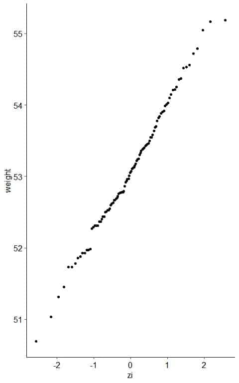
6. If the weight data are consistent with the normal percentiles from a normal distribution, the points should lie close to a straight line.
As a reference, a straight line can be added to the plot which passes through the first and third quartiles.
From the table, we see that the first quartile (at pi = 0.25) was about 52.50 kg and zi = -0.69 and third quartile (at pi = 0.75) was 53.69 kg and zi = 0.66.
The further the points vary from this line, the greater the indication of departure from normality.
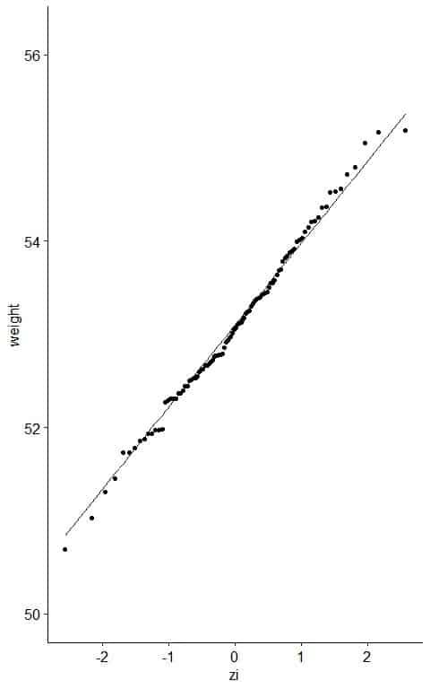
Nearly all the data are on the straight line, so it is normally distributed data.
– Example 2
The following is the ankle diameter in centimeters, measured as the sum of two ankles for 60 physically active individuals from a certain survey.
14.1 15.1 14.1 15.0 14.9 13.9 15.6 14.6 13.2 15.0 14.5 16.0 15.4 13.2 14.0 14.0 16.0 14.7 14.8 15.5 13.9 14.4 13.8 14.1 14.7 14.9 15.3 14.5 13.2 13.2 15.8 14.0 15.1 15.0 12.9 14.0 13.0 14.0 15.4 16.4 15.2 13.8 14.9 16.0 16.0 16.3 15.3 16.5 14.4 13.4 14.4 14.2 15.4 15.0 13.0 13.0 14.8 16.2 15.4 14.4.
Reference:
Heinz G, Peterson LJ, Johnson RW, Kerk CJ. 2003. Exploring Relationships in Body Dimensions. Journal of Statistics Education 11(2).
Draw a normal probability plot of this data.
1. Order the numbers from smallest to largest number.
12.9 13.0 13.0 13.0 13.2 13.2 13.2 13.2 13.4 13.8 13.8 13.9 13.9 14.0 14.0 14.0 14.0 14.0 14.1 14.1 14.1 14.2 14.4 14.4 14.4 14.4 14.5 14.5 14.6 14.7 14.7 14.8 14.8 14.9 14.9 14.9 15.0 15.0 15.0 15.0 15.1 15.1 15.2 15.3 15.3 15.4 15.4 15.4 15.4 15.5 15.6 15.8 16.0 16.0 16.0 16.0 16.2 16.3 16.4 16.5.
2. Assign a rank to each value of your data.
diameter | rank |
| 12.9 | 1 |
13.0 | 2 |
| 13.0 | 3 |
13.0 | 4 |
| 13.2 | 5 |
13.2 | 6 |
13.2 | 7 |
| 13.2 | 8 |
13.4 | 9 |
| 13.8 | 10 |
13.8 | 11 |
| 13.9 | 12 |
13.9 | 13 |
| 14.0 | 14 |
14.0 | 15 |
| 14.0 | 16 |
14.0 | 17 |
14.0 | 18 |
| 14.1 | 19 |
14.1 | 20 |
| 14.1 | 21 |
14.2 | 22 |
14.4 | 23 |
| 14.4 | 24 |
14.4 | 25 |
14.4 | 26 |
| 14.5 | 27 |
14.5 | 28 |
| 14.6 | 29 |
14.7 | 30 |
14.7 | 31 |
| 14.8 | 32 |
14.8 | 33 |
14.9 | 34 |
| 14.9 | 35 |
14.9 | 36 |
| 15.0 | 37 |
15.0 | 38 |
15.0 | 39 |
15.0 | 40 |
| 15.1 | 41 |
15.1 | 42 |
15.2 | 43 |
| 15.3 | 44 |
15.3 | 45 |
| 15.4 | 46 |
15.4 | 47 |
| 15.4 | 48 |
15.4 | 49 |
| 15.5 | 50 |
15.6 | 51 |
| 15.8 | 52 |
16.0 | 53 |
| 16.0 | 54 |
16.0 | 55 |
| 16.0 | 56 |
16.2 | 57 |
16.3 | 58 |
| 16.4 | 59 |
16.5 | 60 |
Note that repeated values or ties are ranked sequentially as usual.
The first (smallest) value is 12.9 cm so its rank is 1, the next value is 13.0 cm so its rank is 2.
The last (largest) value is 16.5 so its rank is 60.
3. Calculate the cumulative probability (pi) associated with each rank (I).
Since the number of data points = 60 which is larger than 10, so the formula reduces to:
pi=(i-0.5)/n
The following table will be produced:
diameter | rank | pi |
| 12.9 | 1 | 0.008 |
13.0 | 2 | 0.025 |
| 13.0 | 3 | 0.042 |
13.0 | 4 | 0.058 |
| 13.2 | 5 | 0.075 |
13.2 | 6 | 0.092 |
| 13.2 | 7 | 0.108 |
13.2 | 8 | 0.125 |
| 13.4 | 9 | 0.142 |
13.8 | 10 | 0.158 |
| 13.8 | 11 | 0.175 |
13.9 | 12 | 0.192 |
| 13.9 | 13 | 0.208 |
14.0 | 14 | 0.225 |
| 14.0 | 15 | 0.242 |
14.0 | 16 | 0.258 |
| 14.0 | 17 | 0.275 |
14.0 | 18 | 0.292 |
| 14.1 | 19 | 0.308 |
14.1 | 20 | 0.325 |
| 14.1 | 21 | 0.342 |
14.2 | 22 | 0.358 |
| 14.4 | 23 | 0.375 |
14.4 | 24 | 0.392 |
| 14.4 | 25 | 0.408 |
14.4 | 26 | 0.425 |
| 14.5 | 27 | 0.442 |
14.5 | 28 | 0.458 |
| 14.6 | 29 | 0.475 |
14.7 | 30 | 0.492 |
| 14.7 | 31 | 0.508 |
14.8 | 32 | 0.525 |
| 14.8 | 33 | 0.542 |
14.9 | 34 | 0.558 |
| 14.9 | 35 | 0.575 |
14.9 | 36 | 0.592 |
15.0 | 37 | 0.608 |
| 15.0 | 38 | 0.625 |
15.0 | 39 | 0.642 |
| 15.0 | 40 | 0.658 |
15.1 | 41 | 0.675 |
| 15.1 | 42 | 0.692 |
15.2 | 43 | 0.708 |
| 15.3 | 44 | 0.725 |
15.3 | 45 | 0.742 |
| 15.4 | 46 | 0.758 |
15.4 | 47 | 0.775 |
| 15.4 | 48 | 0.792 |
15.4 | 49 | 0.808 |
| 15.5 | 50 | 0.825 |
15.6 | 51 | 0.842 |
| 15.8 | 52 | 0.858 |
16.0 | 53 | 0.875 |
| 16.0 | 54 | 0.892 |
16.0 | 55 | 0.908 |
| 16.0 | 56 | 0.925 |
16.2 | 57 | 0.942 |
| 16.3 | 58 | 0.958 |
16.4 | 59 | 0.975 |
| 16.5 | 60 | 0.992 |
4. Calculate the Z-score for each pi value using the function qnorm of the R programming language.
diameter | rank | pi | zi |
| 12.9 | 1 | 0.008 | -2.41 |
13.0 | 2 | 0.025 | -1.96 |
| 13.0 | 3 | 0.042 | -1.73 |
13.0 | 4 | 0.058 | -1.57 |
| 13.2 | 5 | 0.075 | -1.44 |
13.2 | 6 | 0.092 | -1.33 |
| 13.2 | 7 | 0.108 | -1.24 |
13.2 | 8 | 0.125 | -1.15 |
| 13.4 | 9 | 0.142 | -1.07 |
13.8 | 10 | 0.158 | -1.00 |
| 13.8 | 11 | 0.175 | -0.93 |
13.9 | 12 | 0.192 | -0.87 |
13.9 | 13 | 0.208 | -0.81 |
| 14.0 | 14 | 0.225 | -0.76 |
14.0 | 15 | 0.242 | -0.70 |
| 14.0 | 16 | 0.258 | -0.65 |
14.0 | 17 | 0.275 | -0.60 |
14.0 | 18 | 0.292 | -0.55 |
| 14.1 | 19 | 0.308 | -0.50 |
14.1 | 20 | 0.325 | -0.45 |
| 14.1 | 21 | 0.342 | -0.41 |
14.2 | 22 | 0.358 | -0.36 |
| 14.4 | 23 | 0.375 | -0.32 |
14.4 | 24 | 0.392 | -0.27 |
| 14.4 | 25 | 0.408 | -0.23 |
14.4 | 26 | 0.425 | -0.19 |
| 14.5 | 27 | 0.442 | -0.15 |
14.5 | 28 | 0.458 | -0.11 |
14.6 | 29 | 0.475 | -0.06 |
| 14.7 | 30 | 0.492 | -0.02 |
14.7 | 31 | 0.508 | 0.02 |
| 14.8 | 32 | 0.525 | 0.06 |
14.8 | 33 | 0.542 | 0.11 |
| 14.9 | 34 | 0.558 | 0.15 |
14.9 | 35 | 0.575 | 0.19 |
| 14.9 | 36 | 0.592 | 0.23 |
15.0 | 37 | 0.608 | 0.27 |
| 15.0 | 38 | 0.625 | 0.32 |
15.0 | 39 | 0.642 | 0.36 |
| 15.0 | 40 | 0.658 | 0.41 |
15.1 | 41 | 0.675 | 0.45 |
| 15.1 | 42 | 0.692 | 0.50 |
15.2 | 43 | 0.708 | 0.55 |
| 15.3 | 44 | 0.725 | 0.60 |
15.3 | 45 | 0.742 | 0.65 |
| 15.4 | 46 | 0.758 | 0.70 |
15.4 | 47 | 0.775 | 0.76 |
| 15.4 | 48 | 0.792 | 0.81 |
15.4 | 49 | 0.808 | 0.87 |
| 15.5 | 50 | 0.825 | 0.93 |
15.6 | 51 | 0.842 | 1.00 |
| 15.8 | 52 | 0.858 | 1.07 |
16.0 | 53 | 0.875 | 1.15 |
| 16.0 | 54 | 0.892 | 1.24 |
16.0 | 55 | 0.908 | 1.33 |
| 16.0 | 56 | 0.925 | 1.44 |
16.2 | 57 | 0.942 | 1.57 |
| 16.3 | 58 | 0.958 | 1.73 |
16.4 | 59 | 0.975 | 1.96 |
| 16.5 | 60 | 0.992 | 2.41 |
5. Create an x-y scatter plot of your z-score values on the x-axis versus their corresponding data points on the y-axis.
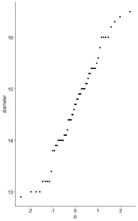 6. If the diameter data are consistent with the normal percentiles from a normal distribution, the points should lie close to a straight line.
As a reference, a straight line is plotted which passes through the first and third quartiles.
From the table, we see that the first quartile (at pi = 0.25) was about 14.0 cm and zi = -0.65 and third quartile (at pi = 0.75) was 15.4 cm and zi = 0.70.
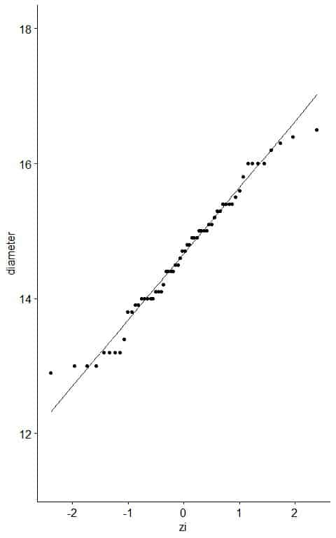
Nearly all the data are on the straight line, so it is normally distributed data.
3. How to read a normal probability plot?
The shape of a normal probability plot can tell you the distribution of your data.
– Example 1: normally-distributed variable
The following plot is the histogram and normal probability plot for heights in cm of 100 individuals.
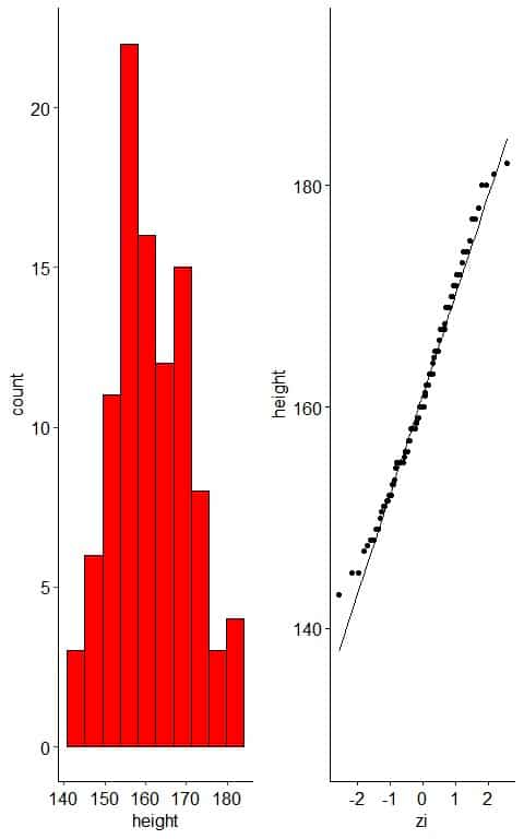
When the data is normally distributed, the histogram is nearly symmetric, unimodal, and bell-shaped.
The normal probability plot of normally distributed data will show nearly all the points on the reference straight line, at least when the few large and small values are ignored.
– Example 2: normally-distributed variable with one outlier
The following plot is the histogram and normal probability plot for heights in cm of 100 individuals.
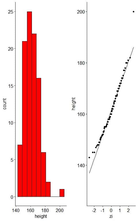
The histogram of the data will be the same except for a faraway bin for the outlier.
The normal probability plot will show that nearly all the points are near the straight line except the far away outlier point.
– Example 3: Right-skewed variable
The following plot is the histogram and normal probability plot for the Annual income of 100 individuals.
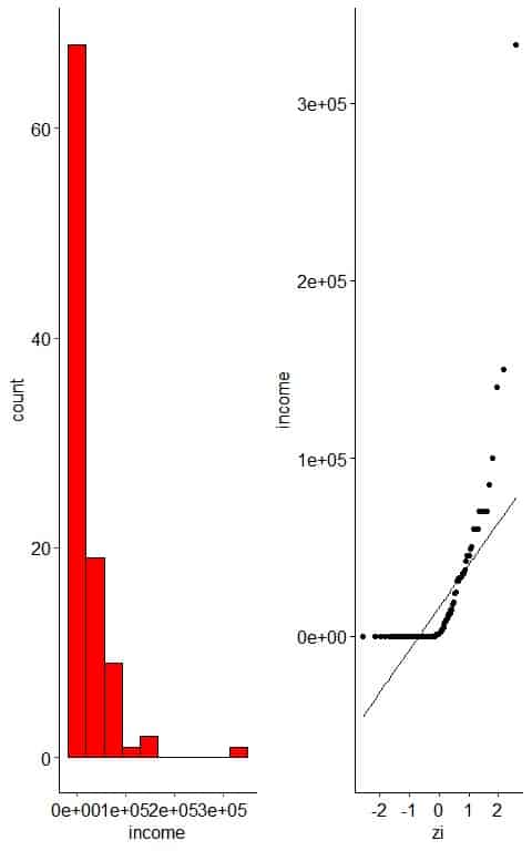
The histogram of right-skewed data looks unimodal with less frequent large values.
The normal probability plot of right-skewed data has an inverted C shape.
– Example 4: Left-skewed variable
The following plot is the histogram and normal probability plot for the Physical ability Lawyers’ ratings of state judges in the US Superior Court.
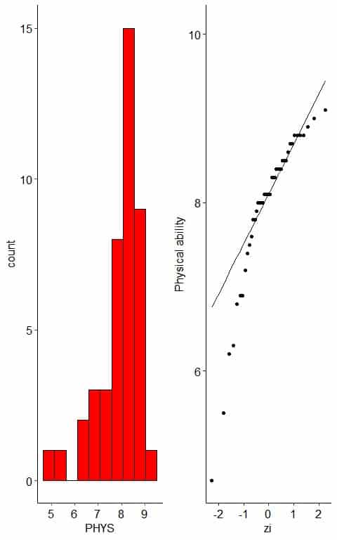
The histogram of left-skewed data looks unimodal with less frequent small values.
The normal probability plot of left-skewed data has a nearly C shape.
4. Practice questions
1. The following is the age in years for 20 participants from a certain survey.
26 48 67 39 25 25 36 44 44 47 53 52 52 51 52 40 77 44 40 45.
Draw a normal probability plot of this data.
2. The following normal probability plots for the weights (in kg) of males and females from a certain survey.
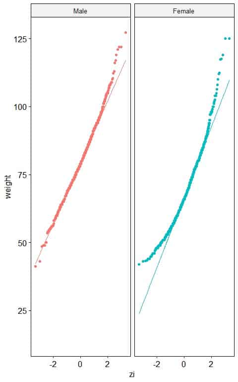 Which sex has a normally distributed weight?
3. The following normal probability plots for the total cholesterol (in mg/dl) of different smoking statuses from a certain survey.
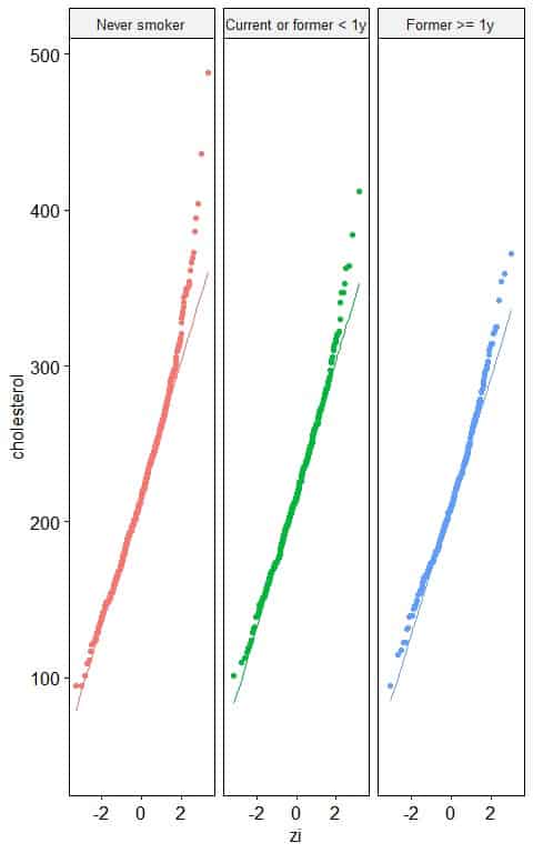 Which smoking status has a normally distributed total cholesterol level?
4. The following normal probability plots for the annual income (in USD) of different employment statuses from a certain survey.
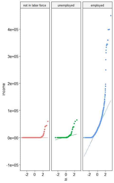
Which employment status has a normally distributed annual income?
5. The following normal probability plots for the air pressure (in millibars) of different storm classes (status).
Which storm class has a normally distributed pressure?
5. Answer key
1. Order the numbers from smallest to largest number.
25 25 26 36 39 40 40 44 44 44 45 47 48 51 52 52 52 53 67 77.
- Assign a rank to each value of your data.
Age | rank |
| 25 | 1 |
25 | 2 |
| 26 | 3 |
36 | 4 |
| 39 | 5 |
40 | 6 |
| 40 | 7 |
44 | 8 |
| 44 | 9 |
44 | 10 |
45 | 11 |
| 47 | 12 |
48 | 13 |
| 51 | 14 |
52 | 15 |
52 | 16 |
| 52 | 17 |
53 | 18 |
67 | 19 |
| 77 | 20 |
- Calculate the cumulative probability (pi) associated with each rank (I).
Since the number of data points = 20 which is larger than 10, so the formula reduces to:
pi=(i-0.5)/n
The following table will be produced:
Age | rank | pi |
| 25 | 1 | 0.025 |
25 | 2 | 0.075 |
26 | 3 | 0.125 |
| 36 | 4 | 0.175 |
39 | 5 | 0.225 |
| 40 | 6 | 0.275 |
40 | 7 | 0.325 |
44 | 8 | 0.375 |
| 44 | 9 | 0.425 |
44 | 10 | 0.475 |
45 | 11 | 0.525 |
| 47 | 12 | 0.575 |
48 | 13 | 0.625 |
| 51 | 14 | 0.675 |
52 | 15 | 0.725 |
52 | 16 | 0.775 |
| 52 | 17 | 0.825 |
53 | 18 | 0.875 |
| 67 | 19 | 0.925 |
77 | 20 | 0.975 |
- Calculate the Z-score for each pi value.
Age | rank | pi | zi |
| 25 | 1 | 0.025 | -1.96 |
25 | 2 | 0.075 | -1.44 |
| 26 | 3 | 0.125 | -1.15 |
36 | 4 | 0.175 | -0.93 |
| 39 | 5 | 0.225 | -0.76 |
40 | 6 | 0.275 | -0.60 |
| 40 | 7 | 0.325 | -0.45 |
44 | 8 | 0.375 | -0.32 |
| 44 | 9 | 0.425 | -0.19 |
44 | 10 | 0.475 | -0.06 |
| 45 | 11 | 0.525 | 0.06 |
47 | 12 | 0.575 | 0.19 |
| 48 | 13 | 0.625 | 0.32 |
51 | 14 | 0.675 | 0.45 |
52 | 15 | 0.725 | 0.60 |
| 52 | 16 | 0.775 | 0.76 |
52 | 17 | 0.825 | 0.93 |
| 53 | 18 | 0.875 | 1.15 |
67 | 19 | 0.925 | 1.44 |
| 77 | 20 | 0.975 | 1.96 |
- Create an x-y scatter plot of your z-score values on the x-axis versus their corresponding data points on the y-axis.
- As a reference, a straight line can be added to the plot which passes through the first and third quartiles.
Nearly all the points on the straight line except small and large values, so it is nearly normally distributed data.
2. Males have nearly normally distributed weights as nearly all the points are along the straight line.
In females, the normal probability plot shows an inverted C shape which means that the female weights are right-skewed.
3. All the smoking statuses have nearly normally distributed total cholesterol levels as nearly all the points are along the straight line, except for small and large values.
4. “not in labor force” and “unemployed” statuses have nearly normally distributed annual income as nearly all the points are along the straight line, except for large values.
“employed” status has right-skewed annual income as the normal probability plot takes an inverted C-shape.
5. Tropical depression storms have nearly normally distributed pressure as nearly all the points are along the straight line, except for large and small values.
Hurricane and tropical storms have left-skewed pressure values as the normal probability plot takes a C-shape.