JUMP TO TOPIC
Carroll diagram – Explanation & Examples
 The definition of the Carroll diagram is:
“Carroll diagram is a sorting diagram that group different items according to two characteristics”
In this topic, we will discuss the Venn diagram from the following aspects:
- What is a Carroll diagram?
- Carroll diagram components
- How to construct a Carroll diagram?
- How to read a Carroll diagram?
- Practical questions
- Answers
What is a Carroll diagram?
A Carroll diagram is a two-way table used to sort objects or numbers by two different characteristics in a yes/no fashion.
The Carroll diagram is a two-way table meaning that it contains 4 cells to show the four possible combinations of these two characteristics.
Carroll diagram was named after Lewis Carroll, an English writer of children’s fiction who wrote Alice’s Adventures Wonderland.
Carroll diagram components
The Carroll diagram is composed of a table with 4 cells, each cell has to follow two criteria.
Example 1: If we have a set of 4 numbers, 8, 14, 49, 15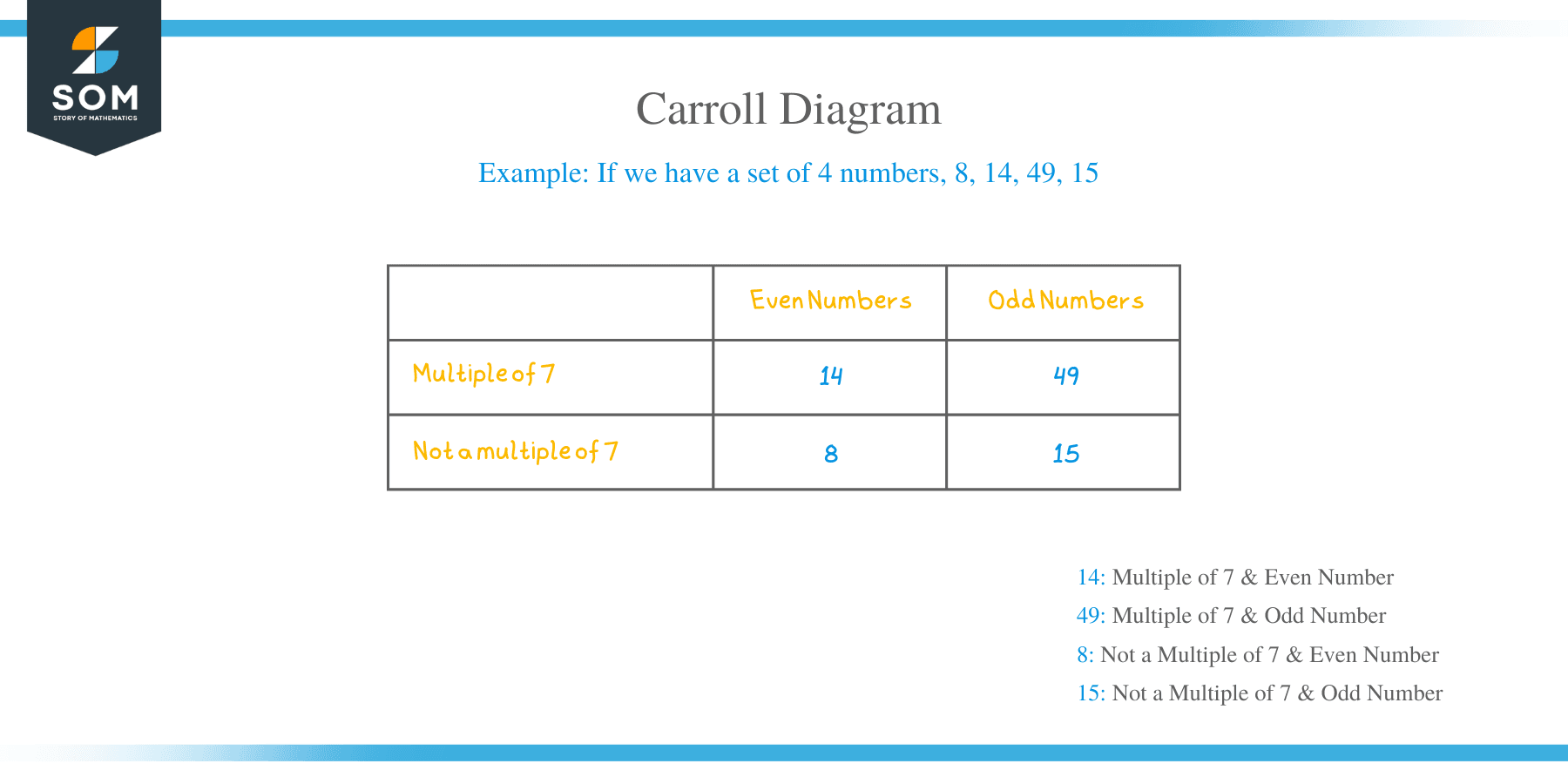
We can sort these numbers in the following Carroll diagram
Even number | Odd numbers | |
Multiple of 7 | 14 | 49 |
Not a multiple of 7 | 8 | 15 |
- The characteristic for rows sorts the number if it is a multiple of 7 or not.
- The characteristic for columns sorts the number if it is an even or odd number.
- The number in the upper-left cell must follow that the number is even and it is a multiple of 7. As 14 follows these two characteristics so it is put in this cell.
- The number in the upper-right cell must follow that the number is odd and it is a multiple of 7. The number 49 follows these two criteria so it is put in this cell.
- The number in the bottom-left cell must follow that the number is even and it is not a multiple of 7. The number 8 follows these two criteria so it is put in this cell.
- The number in the bottom-right cell must follow that the number is odd and it is not a multiple of 7. The number 15 follows these two criteria so it is put in this cell.
Example 2: If we have a set of student names,
“Jere”, “Gerianne”, “Amrit”, “Wardell”, “Carlon”, “Hugo”, “Sabrinia”, “Loran”,
“Lantz”, “Shayle”.
We can sort these names in the following Carroll diagram. We color the names in each cell differently so you can see the difference between them.
Names beginning with S | Names not beginning with S | |
Names ending with e | Shayle | Jere, Gerianne |
Names not ending with e | Sabrinia | Amrit, Wardell, Carlon, Hugo, Loran, Lantz |
- The characteristic for rows sorts the name if it ends with e or not.
- The characteristic for columns sorts the name if it starts with S or not.
- The names in the upper-left cell must follow that the name begins with S and ends with e. As the name, Shayle follows these two characteristics so it is put in this cell.
- The names in the upper-right cell must follow that the name does not begin with S and ends with e. As the names Jere, Gerianne follow these two characteristics so they are put in this cell.
- The names in the bottom-left cell must follow that the name begins with S and does not end with e. As the name, Sabrinia follows these two characteristics so it is put in this cell.
- The names in the bottom-right cell must follow that the name does not begin with S and does not end with e. As the names, Amrit, Wardell, Carlon, Hugo, Loran, Lantz follows these two characteristics so they are put in this cell.
Example 3
If we have the following data about some states of the US
State name | State region | Murder rate |
Alabama | South | 15.1 |
Alaska | West | 11.3 |
Arizona | West | 7.8 |
Arkansas | South | 10.1 |
California | West | 10.3 |
Colorado | West | 6.8 |
This data can be organized as a Carroll diagram according to the state region and the murder rate.
States in the South | States in the West | |
Murder rate larger than 11 | Alabama | Alaska |
Murder rate smaller than 11 | Arkansas | Arizona, California, Colorado |
- The characteristic for rows sorts the states if their murder rate is larger or smaller than 11.
- The characteristic for columns sorts the states if it is in the South or the West region.
- The states in the upper-left cell must be in the South region and its murder rate is larger than 11. As the state of Alabama follows these two characteristics so it is put in this cell.
- The states in the upper-right cell must be in the West region and its murder rate is larger than 11. As the state of Alaska follows these two characteristics so it is put in this cell.
- The states in the bottom-left cell must be in the South region and its murder rate is smaller than 11. As the state of Arkansas follows these two characteristics so it is put in this cell.
- The states in the bottom-right cell must be in the West region and its murder rate is smaller than 11. As the states, Arizona, California, and Colorado follow these two characteristics so they are put in this cell.
How to construct a Carroll diagram?
The Carroll diagram is constructed by setting the two characteristics as row and column headings. We will follow an example using some simple steps.
Example:
You have a set of numbers, 95, 88, 150, 800, 20, 255, 45, 934
Sort these numbers as, odd, even, larger than 100, and smaller than 100 using a Carroll diagram.
- Draw a two-way table with row headings and column headings.
Column heading 1 | Column heading 2 | |
Row heading 1 | ||
Row heading 2 |
- Set the column names as odd or even, and the row names as larger than 100, and smaller than 100, or vice versa.
Odd | Even | |
Larger than 100 | ||
Smaller than 100 |
OR
Larger than 100 | Smaller than 100 | |
Odd | ||
Even |
- Pick each number and put it into its correct cell. For the following table
Odd | Even | |
Larger than 100 | ||
Smaller than 100 |
The number 95 is an odd number and smaller than 100 so it is put in the bottom-left cell.
The number 88 is an even number and smaller than 100 so it is put in the bottom-right cell.
The number 150 is an even number and larger than 100 so it is put in the upper-right cell.
The number 255 is an odd number and larger than 100 so it is put in the upper-left cell.
- We continue with this till picking all the numbers and end with the following table
Odd | Even | |
Larger than 100 | 255 | 150,800,934 |
Smaller than 100 | 95,45 | 88,20 |
How to read a Carroll diagram?
We can read a Carroll diagram by looking at the row and column headings to know the characteristics of each cell’s elements.
Example
We have the following Carroll diagram about some countries
Asian countries | African Countries | |
Population larger than 80 million | China, India | Egypt, Ethiopia |
Population smaller than 80 million | Lebanon, Oman | Gabon, Gambia |
From this diagram, we can conclude that:
- Asian countries that have a population of more than 80 million are China and India.
- African countries that have a population of more than 80 million are Egypt and Ethiopia.
- Asian countries that have a population of less than 80 million are Lebanon and Oman.
- African countries that have a population of less than 80 million are Gabon and Gambia.
Example 2
We have the following Carroll diagram about the hypertension history and smoking habits of some individuals
Never smokers | Current smokers | |
Hypertension history | John, William | Robert |
No hypertension history | Mary, Linda | Jennifer |
From this diagram, we can conclude that:
- John and William have a hypertension history and are never smokers.
- Robert has a hypertension history and is a current smoker.
- Mary and Linda do not have a hypertension history and are never smokers.
- Jennifer does not have a hypertension history and is a current smoker.
Practical questions
- The following is the Carroll diagram for 10 temperature measurements.
May | June | |
Larger than 70 | 81,76,79 | 80,83,85 |
Smaller than 70 | 56,61 | 67,65 |
Which criteria are used to sort these temperature measurements?
How many values are in the June month and less than 70?
- The following table is the mean ozone and solar radiation measurements in some months
Month | mean ozone | mean solar |
5 | 23.6 | 181.2 |
6 | 29.4 | 190.1 |
7 | 59.1 | 216.4 |
8 | 59.9 | 171.8 |
9 | 31.4 | 167.4 |
Sort these months as, mean ozone < 40, mean ozone > 40, mean solar >200, and mean solar < 200 using a Carroll diagram.
- The following Carroll diagram sorts some states according to their region and population in 1975
South | West | |
Population < 3000 | Arkansas | Alaska, Arizona, Colorado |
Population > 3000 | Alabama | California |
Which state(s) in the South and have a population less than 3000?
Which state(s) in the West and have a population larger than 3000?
- The following Carroll diagram sorts some storms according to the storm wind speed and pressure
Pressure > 1000 | Pressure < 1000 | |
Wind speed = 50 | Philippe, Gert | Larry, Maria |
Wind speed < 50 | Tammy, Lorenzo | Alex, Andrea |
Which storm(s) has the largest wind speed and largest pressure according to this diagram?
- The following Carroll diagram sorts some provinces of Switzerland in 1888 according to the percentage of education (beyond primary school) and the percentage Catholic of the province population.
Education % > 10% | Education % < 10% | |
Catholic % > 80% | Sarine, Sion | Monthey, Sierre |
Catholic % < 80% | Neuchatel, Le Locle | Val de Ruz, ValdeTravers |
Which provinces have an education percentage < 10% and a Catholic percentage > 80%?
Answers
- The criteria used are whether these measurements are taken in May or June and whether they are larger or smaller than 70.
By looking at the bottom-right cell, there are only 2 measurements in June that are less than 70.
- By following the steps illustrated in the “How to construct a Carroll diagram” section, we build the following Carroll diagram.
mean ozone < 40 | mean ozone > 40 | |
mean solar > 200 | 7 | |
mean solar < 200 | 5,6,9 | 8 |
Note that the upper-left cell is empty as no month fits the criteria of this cell.
- By looking at the upper-left cell, Arkansas state is in the South and has a population of less than 3000.
By looking at the bottom-left cell, California state is in the West and has a population greater than 3000.
- The largest wind speed according to the Carroll diagram is equal to 50 and the largest pressure is > 1000, so both Philippe and Gert storms (in the upper-left cell) have these criteria.
- Looking at the upper-right cell, Monthey and Sierre are the provinces that have an education percentage < 10% and Catholic percentage > 80%.