JUMP TO TOPIC
Dot Plot – Definition and Examples
A dot plot is a graphical display of data that shows how often each data point or a range of data points occurs.A dot plot is great for emphasizing the overall shape and distribution of a data set. It displays the same general information as stem and leaf plots and histograms.Before moving forward with this section, make sure to review relative frequency.This section covers:- What is a Dot Plot?
- How to Make a Dot Plot
- How to Read a Dot Plot
- Dot Plot Definition
What Is a Dot Plot?
A dot plot is a graphical display of data that emphasizes the overall shape of quantitative data. It does this by listing all possible data values on the bottom and showing one dot above the value for each time that data value occurs.In some cases, the dot plot lists the values on the left, with the dots extending to the right. Additionally, the values listed at the bottom may be ranges or in increments smaller than one depending on the data. For example, a dot plot showing body temperature may vary in increments of $0.1$ degrees Fahrenheit.In any case, the values will increase from left to right or top to bottom in dot plots.Despite the name, some dot plots may use other images instead of dots. For example, a wildlife researcher may use a small graphic of an animal.This display works well for small to medium-sized data sets. Using a dot plot makes it easy to see outliers, clusters, and the mode of a data set.How to Make a Dot Plot
To make a dot plot, first look at the data gathered.Is the data continuous? What is its range?It may be better to have a dot plot with a range for continuous data or data with very large ranges. Otherwise, use discrete values as the data points. These can be tens, whole numbers, numbers measured to the nearest tenth, numbers measured to the nearest hundredth, etc.List these values or ranges from least to greatest left to right.Next, find out how often each data point occurs. Create a corresponding number of markings (dots) above each data point.That’s it! Next, it’s time to analyze the display.How to Read a Dot Plot
Read a dot plot by first looking at the overall shape of the data.A dot plot that is relatively bell-shaped will indicate a “normal distribution.” One that is skewed to the left or right indicates outliers. A dot plot with no overall shape may show true randomness in the observed data.Why is this important?Sometimes traditional methods of summarizing data, including mean, median, and mode, may not give the whole picture.For example, consider the following data sets:5, 5, 5, 5, 50, 5, 5, 5, 10.These two data sets have the same mean, median, and mode (5). Yet, something very different is happening in the second data set. There is greater variation in the data, but that’s only clear when looking at the individual points.A dot plot would be a good display for this data.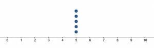
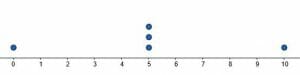 Compare the two displays. One shows uniformity, while the other shows some variance.Dot plots are also a great way to notice data clusters. For example, they would make it easy to spot that a teacher gives lots of B’s, even if their average grade was a C.
Dot Plot Definition
A dot plot is a statistical display that charts the frequency of the occurrence of data values in a data set. It is used to show the distribution of the data and to identify outliers and clusters.Dot plots work best for numerical data in small to medium data sets. They may be shown alone or in conjunction with other charts and summary statistics.Examples
This section covers common examples of problems involving dot plots and their step-by-step solutionsExample 1
Describe the overall shape of the dot plot shown. What can you conclude about the data from this display?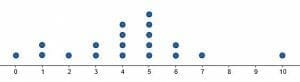
Solution
The data is roughly clustered around the center.Why? Because the two numbers with the most dots are right in the middle. Four has $4$ data points, and five has $5$.This means that the value of four occurs four times in the set. Similarly, the value of five occurs five times.Additionally, more numbers fall below the mode ($5$) than above it.There is also a clear outlier with the number $10$. The next highest number to occur is $7$, and there are few gaps in the data.Example 2
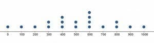
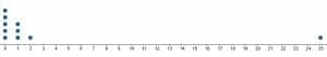
Use the dot plot shown to find the summary statistics for the data set. That is, find the range, median, mode, and mean.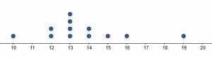
Solution
One of the convenient things about dot plots is that they show individual data values. In fact, it is possible to derive the data set from a discrete dot plot.In this case, each dot corresponds to one data point. Therefore, the set is:$10, 12, 12, 13, 13, 13, 13, 14, 14, 15, 16, 19$.This data set is already in order from least to greatest. It makes it easy to find the median. The two middle numbers in the data set are both $13$, so the average of the two is also $13$.The mode is also $13$. It can be seen in the graphical display since $13$ has the most dots. Alternatively, it is clear from the data set since it is the number listed the most.The range is the difference between the highest and lowest values in the data set. In this case, $19$ is the highest value, and $10$ is the lowest. Therefore, the range is $19-10=9$.Finally, it is required to find the mean or average. Recall that this is the sum of all the data points divided by the number of data points.First, count the number of points. There are $12$ in total. Therefore, $12$ will be the denominator.Next, find the sum of those $12$ points. $10+12+12+13+13+13+13+14+14+15+16+19 = 164$.Then, $\frac{164}{12}=\frac{41}{3}$. This is approximately $13.67$.Therefore, the summary statistics are:Median: $13$.Mode: $13$.Range: $9$.Mean: approximately $13.67$ or $\frac{41}{3}$.Example 3
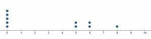
Create a dot plot for the given data set.(1, 1, 4, 5, 5, 5, 6, 6, 6, 7, 7, 7, 7, 8, 8, 9, 10)Solution
The range of this data set is $9$ with the lowest value being $1$ and the highest value being $10$. Therefore, first, create a number line that extends from $1$ to $10$.Then put dots above each number corresponding to the number of times each number appears in the data set. $1$ appears twice, so put two dots. $4$ occurs once. $5$ and $6$ appear three times, while $7$ appears $4$ times. $8$ only occurs twice, and $9$ and $10$ both occur once.Therefore, the dot plot will look like this.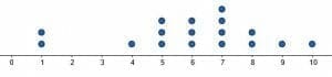
Example 4
Create dot plots for the two given data sets. Then, use the shape of the dot plots to compare them.Data set 1: (1.2, 1.2, 1.2, 1.2, 1.2, 1.3, 1.3, 1.3, 1.4, 1.4, 1.5, 1.6, 1.8)Data set 2: (1.2, 1.3, 1.4, 1.4, 1.5, 1.5, 1.5, 1.6, 1.6, 1.7, 1.8)Solution
Since all of the data points in both sets are between $1.2$ and $1.8$ with increments of $0.1$, the number line in the dot plot should reflect this. That is, the number line should extend from $1.2$ to $1.8$ in increments of $0.1$.Then, note how many times each number occurs in each data set.In the first, $1.2$ occurs $5$ times. $1.3$ and $1.4$ both appear twice, while $1.5, 1.6$, and $1.8$ appear once. Therefore, the dot plot will look like this.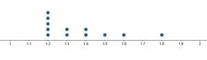 In the second data set, $1.2, 1.3, 1.7,$ and $1.8$ appear once each. $1.4$ and $1.6$ appear twice each, and $1.5$ appears three times. Therefore, its dot plot looks like this.
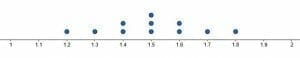 The dot plots show that the first data set is skewed to the left. That is, most of its points are clustered around the lower end. In the second data set, the data is more normally distributed (bell-shaped). Most of the data points are in the center, with a few on either side.
Example 5
Create dot plots for the two given data sets. Then, find the summary statistics for both. That is, find range, median, mode, and mean. Then, compare the two sets based on the shape and the summary statistics.Data set 1: (1, 2, 3, 4, 5, 6, 7, 8, 9, 10)Data set 2: (1, 3, 3, 5, 5, 5, 6, 7, 7, 10)Solution
Both data sets range from $1$ to $10$, so the dot plots should have number lines with the same range.In the first data set, each number between $1$ and $10$ appears exactly once. Thus, the dot plot will look like this.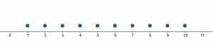 In the second data set, $1, 6,$ and $10$ each appear once. $3$ and $7$ appear twice each, and $5$ appears $3$ times. Therefore, its dot plot looks like this.
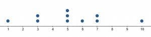 The first data set is more evenly distributed, while the second has more data points in the center.How do their summary statistics compare?The range of both data sets is $10-1=9$.In the first case, the median is $5.5$, while in the second, it is $5$. The mean of the first is also $5.5$, while the mean of the second is $5.2$. $5$ is also the mode of the second, but the first data set doesn’t have a mode.These summary statistics are very similar, but the overall shapes of the data set are very different.
Practice Problems
- Describe the overall shape of the dot plot shown.

- Create a list of the data points in the data set based on the given dot plot.

- Find the mean of the data based on the dot plot.
- Create a dot plot for the data given. (-1, -1, -1, 0, 0, 1, 3, 8)
- Create dot plots for the two data sets and use them to compare the data sets.
Answer Key
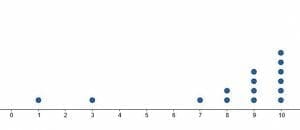
1. The dot plot is skewed to the right.2. $(0, 100, 200, 300, 300, 400, 400, 400, 500, 500, 600, 600, 600, 600, 700, 800, 800, 900, 1000)$.3. $-0.5$4.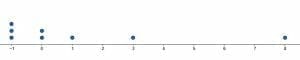 5.
5. 
 Although the two data sets have the same mean and are both skewed to the left, the first has one major outlier. The second has several “smaller” outliers.Images/mathematical drawings are created with GeoGebra.