JUMP TO TOPIC
Frequency Distribution – Definition and Examples
A frequency distribution is any graph or table that shows the frequency of a set of data.
Graphical displays of frequency include histograms, dot plots, and stem and leaf plots. There are also different tabular displays, including joint frequency tables and listed tables.
Statistics employs frequency distributions for data analysis. All fields that use statistics, including every branch of science and technology, employ frequency distributions.
Before moving on with this section, it is a good idea to review statistical frequency and frequency tables.
This section covers:
- What is a Frequency Distribution?
- Frequency Distribution Table
- Frequency Distribution Definition
- Frequency Distribution Examples
What Is a Frequency Distribution?
A frequency distribution is a display of data. Specifically, it shows the number of times individual events occur.
Frequency distributions can be graphs or tables. Recall that quantitative data is data that records a number. These could include variables such as height, mass, distance, age, length of time, etc. This kind of data works best as a graph.
Also, recall that qualitative data is data that records non-numerical data. These could include day of the week, color, gender, yes/no responses, subject, etc. This kind of data tends to work well as a table.
Frequency Distribution Table
A frequency distribution table, also called a frequency table, is a tabular display of data. Though frequency tables work well for qualitative data, they can also work for quantitative data, especially when ranges are used instead of individual data points.
There are many different ways to set up a frequency distribution table. Commonly, they will include data categories in a left-hand column or a top column. Then, the corresponding number of events will be in the column directly to the right or below the category.
Tables are great for displaying multivariate data that includes both numeric and qualitative data. These are data sets that have more than one corresponding entry for each point. For example, consider a survey of people that includes their age, sex, and favorite ice cream flavor. It has three pieces of data for each person in the survey.
Frequency Distribution Definition
A frequency distribution is any graph or table that presents the frequency of events within a data set. Sometimes lists are also considered a frequency distribution.
Frequency Distribution Examples
Examples of frequency distributions include dot plots, pie charts, histograms, bar plots, and frequency tables.
Sometimes, frequency distributions are also put into other categories. For example, frequency distributions can include grouped and ungrouped data. When data is ungrouped, it provides information about specific occurrences in the data. When data is grouped, it usually included information about ranges of data.
Frequency distributions can also be relative frequency distributions or cumulative frequency distributions. A relative frequency distribution shows the number of times each event occurs. On the other hand, a cumulative frequency distribution shows the total number of events up to that point.
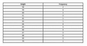
For example, consider the following data about the height of 10 different students in inches:
$58, 58, 60, 60, 62, 63, 65, 65, 65, 70$
An ungrouped table looks like this.
A grouped table, however, looks like this.
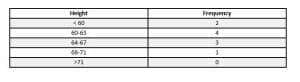
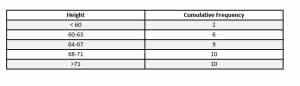
Both of the above examples are relative frequency tables. That is, the right column shows how often each value or range occurs. A cumulative frequency table of the group values, though, looks like this.
Examples
This section covers common examples of problems involving frequency distributions and their step-by-step solutions
Example 1
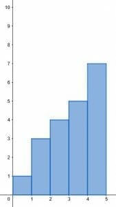
Categorize the frequency distribution shown in the histogram.
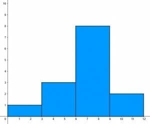
Solution
This example is a grouped frequency distribution with quantitative data. It is grouped because each bar represents the number of data points in a range. The first range is $0$ to $3$, the next is $3$ to $6$, then $6$ to $9$, and finally $9$ to $12$.
It is also a relative frequency distribution rather than a cumulative frequency distribution. It is clear because the last bar is shorter than the previous one. In a cumulative frequency distribution, the frequencies always increase.
The shape of the data is roughly normal because the data points are grouped around the center with fewer points to the left and right.
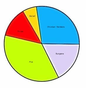
Example 2
A restaurant owner surveyed everyone who came to her restaurant one day. She asked each person what their favorite menu item was. She got the following results:
Chicken tenders: 55 people
Salad: 12 people
Fries: 26 people
Pie: 72 people
Burger: 35 people
Use this data to create a pie chart.
Solution
Recall that a pie chart uses relative frequency to find the center angle for each “slice.”
That is, to find the center angle for each slice, first find the relative frequency and then multiply that by $360^{\circ}$.
$55+12+26+72+35=200$.
Therefore, the relative frequency for chicken tenders is $\frac{55}{200}$. Multiplying that by $360^{\circ}$ is $99$. Therefore, the pie slice corresponding to chicken tenders has a $99^{\circ}$ angle and represents $\frac{55}{200}=\frac{11}{40}$ths of the circle.
Similarly:
The angle for salad is $\frac{12}{200}\times360^{\circ}=21.6^{\circ}$.
Then, the angle for fries is $\frac{26}{200}\times360^{\circ}=46.8^{\circ}$.
$\frac{72}{200}\times360^{\circ}=129.6^{\circ}$ for pie.
$\frac{35}{200}\times360^{\circ}=63^{\circ}$ for burgers.
Example 3
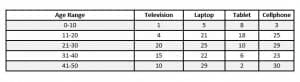
Suppose $150$ people of various ages were interviewed about the technology they own. Based on the table, find the relative frequency of each event stated. If there is not enough information, explain why.
A. A person owns a television
B. A person is between the ages of 0 and 10 and owns a cellphone
C. The person has a tablet but not a laptop.
Solution
A. To find the probability that a person owns a television, it is necessary to find the number of people who own televisions. Since this is stratified by age, add up all numbers in the column titled “television.” This is $1+4+20+15+10=50$. Thus, the probability is $\frac{50}{150}=\frac{1}{3}$.
B. In this case, it is necessary to find the number of people who both are between 0 and 10 and own a cellphone. This corresponds to the upper-right cell, $3$. Therefore, the probability is $\frac{3}{150}=\frac{1}{50}$.
C. There is not enough information to answer this question. Although the total number of people ($150$) is known, the overlap of owning the three technologies is not known.
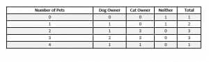
Example 4
Create a frequency table for the given data (mix of 2 subjects and 1 numerical)
There are 10 people interviewed about their pets. They were asked how many pets they had and whether they had at least one dog and at least one cat. These were the results:
($1$, n, n); ($4$, y, y); ($3$, y, y); ($3$, n, y); ($2$, y, y); ($3$, y, y); ($0$, n, n); ($2$, n, y); ($2$, n, y); ($1$, y, n).
Where the first number is the total number of pets, the second column regards whether the person had at least one dog with a “y” meaning “yes” and “n” meaning “no.” Similarly, the last column regarded whether the person had at least one cat.
Solution
In this case, it would make sense to include columns for each of the three questions. That is, include a column for the number of pets, a column for cats, and a column for dogs.
There are multiple ways to organize this data, but one way that makes sense is to organize from least to greatest by the total number of pets.
In addition to these questions, there is other information available in the data. For example, if a person said “no” to have at least one dog and at least one cat, then they have neither. Likewise, the total number of people asked is not equal to the number of people with dogs plus the number of people with cats plus the number of people with neither because there is some overlap with having both a dog and a cat.
Therefore, the table structure that makes sense is to have the number of pets on the left, the number in that range with dogs, the number in that range with cats, the number with neither, and the total number of people in that range.
This is the resulting table.
Example 5
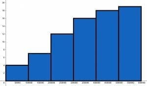
Use the given cumulative frequency distribution to determine the size of each range.
Solution
The first range is $0-100,000$. The corresponding bar has a height of $4$. Since this is the first bar, that means there are $4$ data points in the range of $0-100,000$.
The next bar has a height of $7$. Since this is a cumulative distribution, there are $7-4=3$ data points in the range of $100,000-200,000$.
Likewise, for $200,000-300,000$ there are $12-7=5$ data points.
For $300,000-400,000$, there are $16-12=4$ data points.
Then, for $400,000-500,000$ there are $18-16=2$ data points.
Finally, the last range of $500,000-600,000$ has one data point.
Practice Problems
- Categorize the frequency distribution shown in the histogram.

- Two field workers take the temperature of a body of water in different spots on the same day. One fieldworker has a thermometer that measures to the nearest hundredth of a degree, and the other has a thermometer that measures to the nearest tenth of a degree. They collect $250$ readings between the two of them.
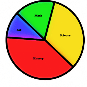
What type of graph would be best for this data and why? - In a survey of $90$ students, 35 liked history class the best, 30 liked science the best, 15 liked math best, and everyone else liked art best. Create a pie chart for the data.
- Find the following probabilities based on the given table describing cookies made for an event.

A. Probability that a randomly chosen cookie has candy pieces.
B. Probability that a randomly chosen cookie is chocolate.
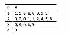
C. The probability that a randomly chosen cookie is plain with chocolate chips. - Find the mean based on the stem and leaf plot given.

Answer Key
- This display is ambiguous. Each range could have an increasing number of data points, or it could be a cumulative distribution.
- The best type of frequency distribution for this data is a histogram. There are many data points, and they are measured to different points (tenths and hundredths), so a dot plot or table would be confusing. Using ranges with a histogram would work best.

- A. $\frac{30}{97}$
B. $\frac{25}{97}$
C. $\frac{50}{97}$ - $\frac{551}{24}$
Images/mathematical drawings are created with GeoGebra.