JUMP TO TOPIC
Histogram Calculator + Online Solver With Free Steps
The online Histogram Calculator is a calculator that allows you to instantly create histograms once you enter a set of information in the tool.
The Histogram Calculator is a powerful tool that helps individuals create histograms quickly as per their requirements.

What Is a Histogram Calculator?
A Histogram Calculator is an online tool that allows the user to make histograms by inputting a set of values into the calculator.
The Histogram Calculator needs a single set of input to create a histogram. The calculator looks at the set and determines its values to create a histogram.
How To Use a Histogram Calculator?
To use the Histogram Calculator, you need to input all the required values into the calculator and click the “Submit” button. The calculator will display the results instantly.
The detailed step-by-step instructions are shown below:
Step 1
In the first step, we enter the values into the Histogram Calculator. When we enter them into the calculator, we must ensure that a comma separates the values.
Step 2
After entering the inputs values into the Histogram Calculator, we click the “Submit” button. The Histogram Calculator quickly creates a histogram for the values given imputed. The results are displayed in a new window.
How Does a Histogram Calculator Work?
The Histogram Calculator works by taking in the input values and creating a histogram. The Histogram Calculator looks at the set of values and checks for their range. The calculator creates a histogram, separates the values, and places them according to the range of the histogram.
What Is a Histogram?
A histogram is a graph that shows the data graphically in which data is organized into continuous number ranges, with each range represented by a vertical bar. Each rectangle bar represents some kind of data and is all adjacent. Rectangle heights are proportional to comparable frequencies of the same and distinct classes.
It is a representation of a variety of outcomes in the form of columns arranged along the x-axis. The y-axis of the same histogram represents the number count or multiple occurrences in the data for each column. It is the simplest method for visualizing data distributions.
Shape of a Histogram
The shape of the histogram is the indication that is used to classify the data distribution. The histogram can represent these various sorts of distributions. There are primarily five types of histogram shapes. They are as follows:
Bell-Shaped Histogram
A bell-shaped histogram is a histogram that has a single peak. The histogram has only one extreme at this time interval, indicating that it is bell-shaped.
Bimodal Histogram
A bimodal histogram is a histogram that has two peaks or the two highest primary points. These points are not always the same height. The two peaks indicate that the two groups in the frequency table appear the most frequently. This also implies that the data exhibits two modes in terms of central tendency measures.
Skewed Right Histogram
A skewed right histogram, also known as a positively uneven distribution, is a non-symmetrical histogram in which the peak of the graph is to the left of the median value.
Skewed Left Histogram
A skewed left histogram is tilted to the left. Negatively uneven distribution is skewed to the left. This type of distribution frequently occurs in the higher value cells (right side) and infrequently in the lower value cells (left side).
Uniform Histogram
A uniform histogram is a histogram where every value in a dataset appears nearly the same number of times. This type of histogram frequently appears as a rectangle with no discernible peaks.
What Is the Difference between a Histogram and a Bar Chart?
The difference between Bar Charts and histograms is that histograms are used for quantitative data whereas bar charts are used to represent categorical data. They are relatively similar to each other, but they do have several significant differences between them. Here are some differences between histograms and bar charts:
- A histogram is a graphical representation of data that uses bars to depict the frequency of numerical data. A bar graph is a visual representation of data that compares different types of data using bars.
- A histogram represents the frequency distribution of continuous variables. A bar graph, on the other hand, is a diagrammatic comparison of discrete variables.
- A histogram represents continuous variable frequency distribution. The comparison of discrete variables is diagrammatic in a bar graph, on the other hand.
- There is no space between the bars of the histogram because of the way it is drawn. On the other hand, a bar graph that shows discontinuity has properly spaced bars.
- The histogram’s elements are integers grouped to represent different data ranges. Items are treated as distinct entities, in contrast to the bar graph.
- Rearranging the blocks in a bar graph from highest to lowest is a widespread practice. With a histogram, however, this is impossible because the classes are displayed in succession.
- The width of rectangular blocks in a histogram may or may not be the same, whereas the width of bars in a bar graph is always the same.
Solved Examples
The Histogram Calculator is an innovative tool that helps you create a histogram quickly. You only need to add the input and press the “Submit” button.
The following examples have been solved using the Histogram Calculator:
Example 1
A farmer had apple trees with the following heights:
58, 62, 63, 66, 68, 70, 70.5, 73, 75, 72.5, 73, 75, 73.43, 74.3, 76.2, 76.4, 76.5, 77, 77.5, 78, 78.5, 79, 79.2, 80, 81, 82, 83, 85, 83, 87.5.
The farmer wanted to create a histogram to keep track of the tree’s height. Using the Histogram Calculator, generate the histogram of the sizes of the trees.
Solution
By using the Histogram Calculator, we can quickly create a histogram. First, we enter the input values into the Histogram Calculator; the input values are 58, 62, 63, 66, 68, 70, 70.5, 73, 75, 72.5, 73, 75, 73.43, 74.3, 76.2, 76.4, 76.5, 77, 77.5, 78, 78.5, 79, 79.2, 80, 81, 82, 83, 85, 83, 87.5.. Once we input all the input values, we click the “Submit” button on our Histogram Calculator.
The calculator will quickly open a new window and display the results there. The following results are extracted from the Histogram Calculator:
Input Interpretation:
Histogram { 58, 62, 63, 66, 68, 70, 70.5, 73, 75, 72.5, 73, 75, 73.43, 74.3, 76.2, 76.4, 76.5, 77, 77.5, 78, 78.5, 79, 79.2, 80, 81, 82, 83, 85, 83, 87.5.}
Histogram:
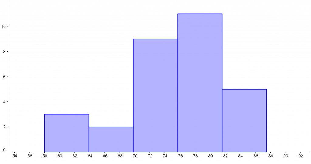
Figure 1
Example 2
Example 2
Consider the following set of values:
{ 23,25,26,27,28,29,32,34,35,36,37,38,41,43,44.5,45.3,46.2,48,49,52,53,54,56,58,64,67,70,74 }
Use the Histogram Calculator to create a histogram for these values.
Solution
We can easily construct a histogram by using the Histogram Calculator. The input values are first entered into the Histogram Calculator. After entering all input values, we press the “Submit” button on our Histogram Calculator.
The calculator will instantly open a new window with the results. The Histogram Calculator yielded the following results:
Input Interpretation:
Histogram { 23,25,26,27,28,29,32,34,35,36,37,38,41,43,44.5,45.3,46.2,48,49,52,53,54,56,58,64,67,70,74 }
Histogram:
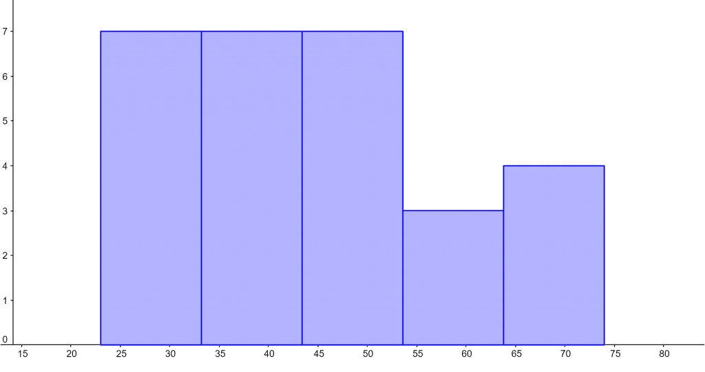
Figure 2
All images/graphs are made using GeoGebra.