Scatter Plot – Explanation and Examples
A scatter plot is a graph that displays all of the data points for a set of data.
Scatter plots are used for data with two quantitative variables or data with two quantitative variables and one simple qualitative variable.
These graphs are important for all subjects that use statistics and data analysis.
This section covers:
- What is a Scatter Plot?
- Scatter Plot Graph
- Why are Scatter Plots Important
- Correlation Vs. Causation
- Regression Lines and Scatter Plots
- Bubble Charts
- Scatter Plot Examples
What is a Scatter Plot?
A scatter plot is a graphical display of bivariate data. That is, scatter plots show data that consists of two variables measured quantitatively.
Examples of bivariate data include the age and height of students at a school, the length and width of houses in a subdivision, and the temperature and humidity in a city.
Sometimes, by color coding the dots in a scatter plot, a third qualitative variable can be included. For example, consider a data set that includes the age and height of students at a school. The scatter plot for this data set could have red dots for data points from girls and blue dots for data points from boys.
Scatter Plot Graph
A scatter plot graph consists of dots plotted along an $x$ and $y$ axis corresponding to each data point in a set. If there are $50$ data points in a set, there will be $50$ dots on the graph.
To plot these points, first decide which variable is the independent variable and which is the dependent variable. Time and age are almost always independent variables, but others, like temperature, will vary based on context. Label the $x$ axis as the independent variable and the $y$ axis as the dependent variable.
Then, for each data point, move to the right along the $x$ axis to the value corresponding to that point’s independent variable value. Next, move up until reaching the dependent variable value for that point. Put a mark there and color code if needed.
For example, suppose a set of data includes the age (measured in months) and height (measured in inches) of students. If a student was $60$ months old (5 years) and had a height of $42$ inches, the data point is $(60, 42)$. Note that since this data set includes age, that is the independent variable. This makes sense because height depends on age, not the other way around.
First, then, find month $60$ on the $x$ axis. Then, move up to the height $42$ inches on the $y$ axis. Plot the point there.
Continue in this manner for each of the data points in the set.
Why Are Scatter Plots Important?
Scatter plots are important because they give a lot of information about a data set in a visual way.
Most importantly, a scatter plot shows the overall shape of the data set.
Do the $y$ values increase or decrease as the $x$ values increase? Is the data all over the place? Does it closely follow a line?
Quickly glancing at a scatter plot helps to answer these questions. Even if a regression line is not included, most people can visually approximate it and get a good sense of the data. This is not true when looking at a large set of numbers.
Often, however, regression lines are included with the scatter plot. This makes it easy to identify whether or not the association between the two variables is strong. It is also easy to determine whether the slope of the line is positive or negative.
Scatter plots do more than that though. They also show the domain and range of the data set and show the number of points. It is easy to see outliers and clusters on a scatter plot as well.
Finally, scatter plots allow the analyzer to see individual data points. Therefore, it is possible to write out the data set using the scatter plot.
Correlation Vs. Causation
Correlation between two variables means that there is a relationship between the two variables. It does not specify what that relationship is.
Causation, on the other hand, specifically says that increasing one variable causes a corresponding increase or decrease in the other variable.
There is an important distinction between these two terms.
For example, it makes sense that a puppy’s weight would increase as its age increases. The aging is causing growth.
On the other hand, a classic example of correlation but not causation is ice cream sales and crime. Plotting ice cream sales on the $x$ axis and crime rates on the $y$ axis shows that more ice cream sales corresponds to a higher crime rate.
But do ice cream sales cause crime? Generally, no. Similarly, crime does not cause ice cream sales. Rather, both ice cream sales and crime increase in the summer. That is, there is a third variable causing this relationship.
This third variable is called a confounding variable. It is for this reason that a scatter plot can show a relationship between two variables but not necessarily prove that one thing causes the other to increase or decrease.
Regression Lines and Scatter Plots
Regression lines approximate a linear relationship between two variables based on a sample. A regression line can have a positive or negative slope. It can also have a slope of $0$. These lines can cross the $y$ value at any point.
Regression lines are used to make estimates about future points or points that are not included in the sample. They can also make generalizations about average values for certain points.
Each regression line has a corresponding correlation coefficient. This number is between $-1$ and $1$ and shows how well the data fits the line. That is, the correlation coefficient indicates whether the regression line is a good or bad fit for the data. If the correlation coefficient has an absolute value closer to $1$, is considered a better fit. If it is closer to $0$, it is not a good fit, indicating that the data is either random or not linear.
Scatter Plots and Non-Linear Data
Regression lines show trends in and help make estimates for linear data.
Sometimes, however, data is not linear. It could be exponential, quadratic, or bell-shaped. While it is still possible to make a regression line for data like this, and perhaps even have a somewhat good correlation coefficient, such a line might not make useful predictions.
The slope of the line, its graph, and the correlation coefficient will not show whether or not this is the case. Instead, a regression line plotted on a scatter plot with the data points makes it clear whether the points have a linear or shape or take on some other kind of shape.
Bubble Charts
Bubble charts are another type of graphical data display similar to a scatter plot. The main difference between a scatter plot and a bubble chart is that a bubble chart incorporates a third quantitative variable.
Like a regular scatter plot, each bubble on a bubble chart is centered around a specific point on the $xy$-plane. The bubble, unlike the scatter plot’s dot, has a size. This size gives information about the third variable.
Note that the third variable usually represents the radius or diameter of the bubble, not its area. Studies have shown that people can more easily interpret the size of the bubble as its radius or diameter than as its area.
For instance, a bubble chart can show the the cost to produce products on one axis, the demand for the product on another, and use bubble size to represent the cost to make the product.
Like regular scatter plots, bubble charts can also have color codes to display an additional qualitative variable.
Scatter Plot Examples
Imagine an insurance agent notices that her company gives out a discount for having had a good college GPA. She wants to see if there is a relationship between GPA and driving safety to justify this discount. How would she do this?
First, she would find a sample. She would need to make sure everyone in the sample had gone to college and had both their GPA and the number of traffic incidents in some span of time. She may opt for the last year, the last five years, or the last ten year.
Next, the agent would have to make a list of all of the GPA and traffic incident pairs. Here, GPA would be the independent variable because the agent wants to see if GPA affects the number of traffic incidents, not whether traffic incidents affect GPA.
Finally, the agent would plot each of the points on a graph. In most cases, she would also find the regression line for the data. She can then analyze this graph to see if there is a trend, identify outliers and clusters, and make sure the line closely fits the data.
The reason a scatter plot is better than a regression line by itself is that the scatter plot makes it easy to see if the data is linear or exponential. It also makes it easy to see if the trends are localized. For instance, it’s possible that maybe as GPAs increased from $0.0$ to $3.0$, traffic incidents decreased. Then, perhaps they level off after $3.0$. The scatter plot would make that easy to see.
Common Examples
This section includes common examples of problems involving scatter plots and their step-by-step solutions.
Example 1
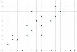
Describe the scatter plot shown. Include the range of the $x$ and $y$ values, the number of values, and the overall trend of the data.
Solution
The range of the $x$ values is $13-1=12$. Similarly, the range of the $y$ values is $9-1=8$.
This scatter plot includes a total of $16$ data points. Therefore, there are $16$ data points in the set.
In general, the $y$ values increase as the $x$ values increase. That is, the data indicates that the two variables are likely proportional.
There are no clear outliers or clusters.
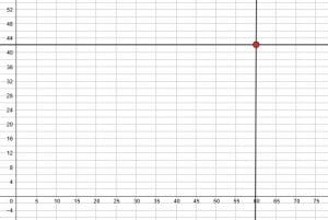
Example 2
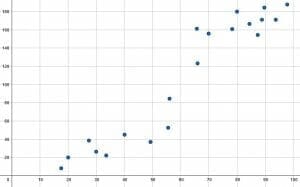
Use the scatter plot shown to make a list of the data points in the set.
Then, use the scatter plot to describe the data.
Solution
First, it is required to make a list of all the data points.
To do this, start from the left side. There are two dots corresponding to the point $5$. One is at $24$ and the other is at $26$. Therefore, these points are $(5, 24)$ and $(5, 26)$.
Continuing in this manner, the other points are $(10, 26), (10, 28), (10, 30), (20, 32), (20, 34), (25, 30), (25, 32), (45, 40),$ and $(60, 44)$.
It appears that there is a general trend of the $y$-values increasing as the $x$-values increase.
Most of the values are also clustered on the left side of the graph with two outliers on the right side, namely $(45, 40)$ and $(60, 44)$.
Based on this graph, it appears that there is a relationship between the $x$ and $y$ variables.
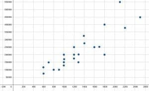
Example 3
Create a scatter plot for the following data set. Then, use the scatter plot to describe the data.
$(600, 75000), (600, 125000), (700, 150000), (800, 100000), (900, 100000), (1000, 125000), (1000, 150000), (1000, 175000), (1000, 200000), (1200, 150000), (1200, 175000), (1200, 250000), (1300, 150000), (1300, 200000), (1400, 275000), (1400, 325000), (1600, 250000), (1700, 250000), (1800, 200000), (1800, 400000), (2100, 550000), (2200, 375000), (2500, 450000)$.
Solution
To make the scatter plot for this data, first make an appropriate $x$ and $y$ scale. Using increments of $200$ for the $x$ values and $50,000$ for the $y$ values should work.
Then, move along the $x$ axis to find the $x$ value for each point, recalling that the $x$ value is always listed first. For example, for the point $(600, 75000)$, find $600$ on the $x$ axis.
Then, move upwards to the corresponding $y$ value. In the case of $(600, 75000)$, move upwards to $75,000$.
Do this for all of the points. The final graph will look like the one below.
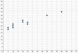
Example 4
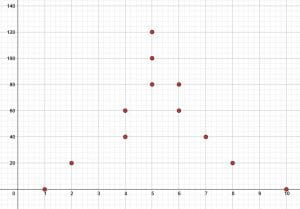
Based on the scatter plot, is there likely a correlation between the two variables? Why or why not?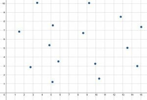
Solution
Based on the scatter plot, there does not appear to be a correlation between the two variables.
There is not a clear trend up or down in this scatter plot. Points on the left and ride sides of the graph have a wide range. There are many points towards the top and many towards the bottom with many in between.
If a regression line was drawn for this graph, it would be almost straight, indicating a slop of $0$. Most likely the $x$ variable does not influence the $y$ variable in this case.
Example 5
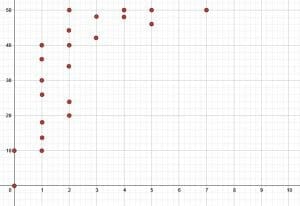
An ice cream company analyzes the average number of sales they make per day for each week of the year. They also analyze the average daytime temperature for that week. Then, they plot some of the weekly average temperatures with the corresponding average daily sales for that week. Some of the data is included in the scatter plot shown.
Based on this scatter plot, what can be said about the average temperature and the average sales?
Solution
Overall, the average number of sales tends to increase as the average temperature increases. That is, there are fewer sales in cold weather compared to sales in hot weather. This makes sense since the data is for an ice cream vendor.
There are also clusters at the upper and lower ends of the graph with fewer points in the middle. Despite this, there are no clear outliers.
Based on this, it is likely that there is a relationship between the two variables.
Practice Problems
- State whether each type of data set would work well as a scatter plot, a bubble graph, or neither.
A. The yearly income, number of vehicles, and number of years of education for a group of people.
B. A farmer records the weight of his calves and their color.
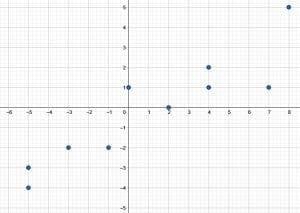
C. The amount of time spent commuting and the monthly cost of gas for a family. - Create scatter plot for the following data: $(-5, -4), (-5, -3), (-3, -2), (-1, -2), (0, 1), (2, 0), (4, 1), (4, 2), (7, 1), (8, 6)$.
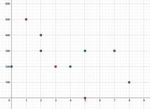
- Plot the following data on a scatter plot: $(0, 200, B), (1, 500, R), (2, 400, G), (2, 300, G), (3, 200, R), (4, 200, G), (5, 300, B), (5, 0, R), (7, 300, G), (8, 100, G)$.
- Use the scatter plot to list the data points and analyze the scatter plot shown.

- The scatter plot shown displays the amount of time students spent studying and their score out of $50$ on a test. Use the scatter plot to find the data points. Then, analyze the scatter plot in context.

Answer Key
- A bubble chart can represent A because it has three different numeric variable. On the other hand, neither a bubble chart nor a scatter plot can display the data from B because it contains one quantitative and one qualitative variable. Finally, C can use a scatter plot since it has two quantitative variables.


- The data points are $(1, 0), (2, 20), (4, 40), (4, 60), (5, 80), (5, 100), (5, 120), (6, 60), (6, 80), (7, 40), (8, 20), (10, 0)$. This data is clustered around the middle with fewer data points at the upper and lower edges. It also does not appear linear. Instead, it has more of a bell shape.
- The data points are: $(0, 0), (0, 10), (1, 10), (1, 14), (1, 18), (1, 26), (1, 30), (1, 36), (1, 40), (2, 20), (2, 24), (2, 34), (2, 40), (2, 44), (2, 50), (3, 42), (3, 48), (4, 48), (4, 50), (5, 46), (5, 50), (7, 50)$. Most of the students studied one or two hours, and there were a wide range of scores associated with this amount of study time. In general, as study time increased, the score increased. The students who studied at least three hours tended to score very well on the test (above $40$), but since there was a maximum score, they leveled off after about $4$ hours of study.
Images/mathematical drawings are created with GeoGebra.