JUMP TO TOPIC
Illustration of Frequency Histogram Concept
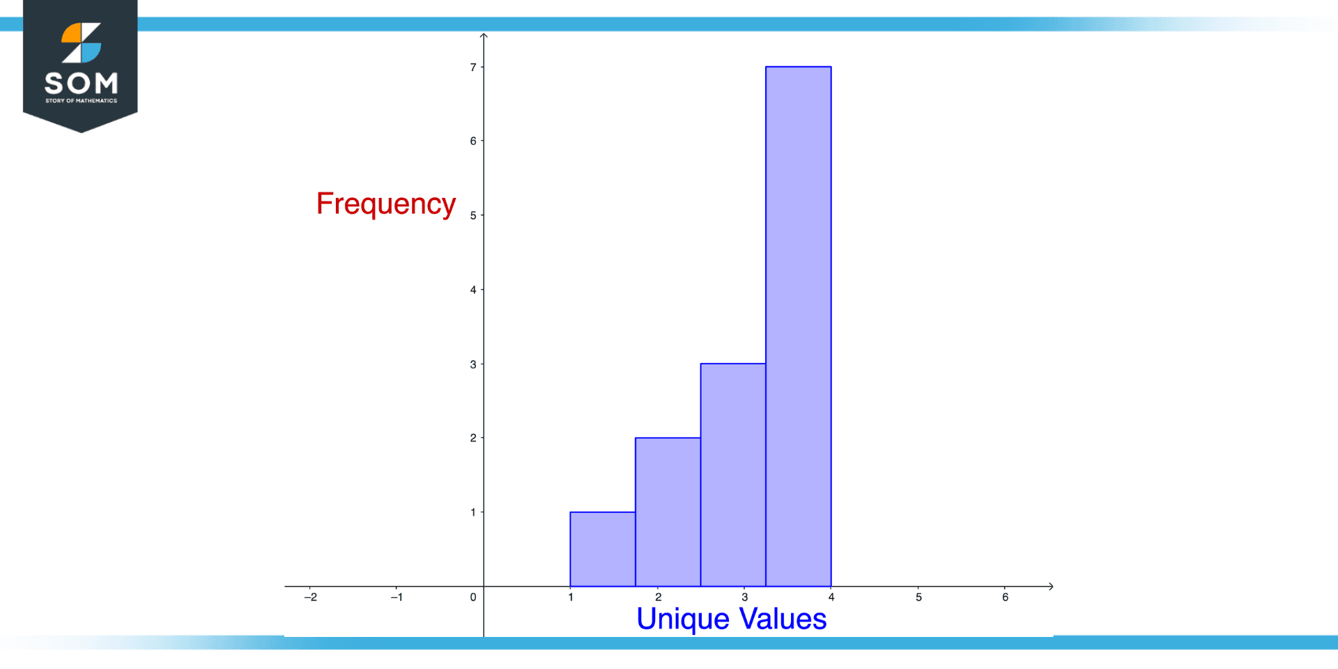
Figure 1 – Illustration of frequency histogram Concept
Frequency histograms are graphs showing the frequency of data. Data sets are visualized with a bar graph showing the frequency of a particular value occurring in them.
In order to make a frequency histogram for a data set that includes 1, 2, 2, 3, 3, 3, 4, 4, 4, 4, 4, 4, 4 numbers, you would first need to create bars for each unique value in the data set. You would need to create four bars in this case because there are four unique values (1, 2, 3, and 4).
In order to calculate the frequency of each value, which is the number of times it appears in the dataset, you must first determine its occurrence frequency. There is one occurrence of the value 1, two occurrences of the value 2, three occurrences of the value 3, and four occurrences of the value 7. The frequencies should be plotted on the y-axis, while the unique values should be plotted on the x-axis.
Components of Frequency Histogram
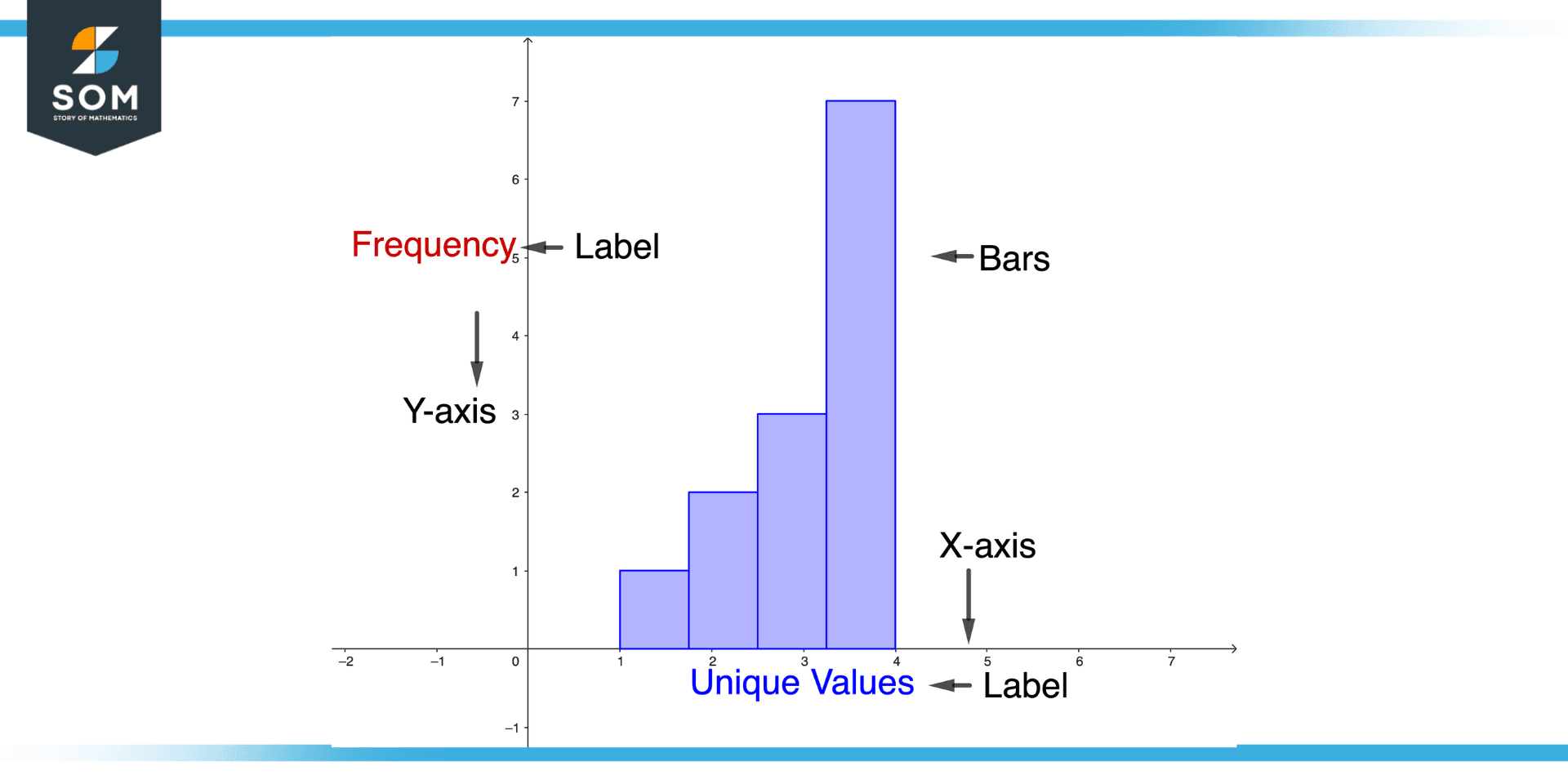
Figure 2 – Components of Frequency Histogram
A frequency histogram has several components, including the following:
X-axis
The x-axis represents the values of the data set. In the example above, the x-axis contains the values 1, 2, 3, and 4.
Y-axis
The y-axis represents the frequencies of the data set. In the example above, the y-axis contains the frequencies 1, 2, 3, and 4.
Bars
The bars of the histogram represent the frequencies of the data set. In the example above, the height of each bar represents the frequency of each value.
Labels
The histogram should include tags for the x-axis and y-axis, as well as a title that describes the data set.
Scale
The histogram should have a scale that shows the range of values on the x-axis and the y-axis. This allows the reader to quickly interpret the height of the bars and the values on the x-axis.
Steps to Create Frequency Histogram
To create a frequency histogram, follow these steps:
- Identify the data set that you want to create a histogram.
- Determine the unique values in the data set.
- Count the number of times each unique value occurs in the data set. This is known as the frequency of each value.
- Create a bar for each unique value in the data set.
- Plot the frequencies on the y-axis, with the unique values on the x-axis.
- Add labels to the x-axis, y-axis, and bars of the histogram.
- Add a title to the histogram that describes the data set.
- Add a scale to the histogram that shows the range of values on the x-axis and the y-axis.
- Review the histogram to see if it accurately represents the data set and if it reveals any patterns or trends in the data.
- Make any necessary adjustments to the histogram to improve its clarity and accuracy.
Frequency Histogram and Bar Graph: A Comparison
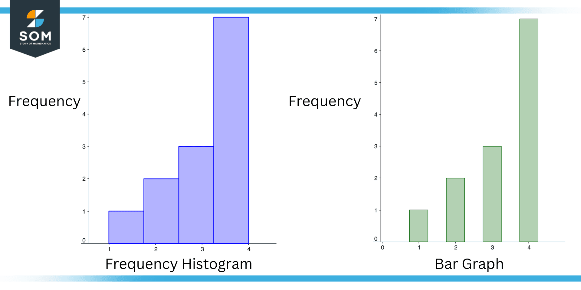
Figure 3 – Frequency Histogram vs Bar Graph
A bar graph and a frequency histogram are similar in that they both use bars to represent data. However, they are quite different things. We highlight the key differences below.
Frequency Histogram
- A frequency histogram is used to show the frequency of a data set. For example, a frequency histogram might be used to show the number of times each temperature occurred in a data set.
- The bars in a frequency histogram must have the same width. This is because the width of the bars in a frequency histogram represents the range of values in the data set, and all values in the data set must be represented with the same width.
Bar Graph
- One difference is that a bar graph compares the values of different categories. For example, a bar graph might be used to compare the average temperatures in different cities.
- Another difference is that the bars in a bar graph can have different widths.
Types of Frequency Histograms
There are several types of frequency histograms, including the following:
Simple Frequency Histogram
A simple frequency histogram is a basic type of histogram that shows the frequency of a data set. It is created by plotting the frequencies of the data set on the y-axis, with the unique values on the x-axis.
Cumulative Frequency Histogram
A cumulative frequency histogram is a type of histogram that shows the total number of observations at or below each value in the data set. It is created by plotting the cumulative frequencies of the data set on the y-axis, with the unique values on the x-axis.
Relative Frequency Histogram
A type of histogram that shows the proportion of observations falling into each category is called a relative frequency histogram. It is created by plotting the relative frequencies of the data set on the y-axis, with the unique values on the x-axis.
Practical Example of a Frequency Histogram
Suppose you have a data set that contains the test scores of a group of students. The data set looks like this 85, 95, 75, 80, 85, 90, 85, 75, 80, 90. Create a frequency histogram for this dataset, additionally comment on the visualization.
Solution
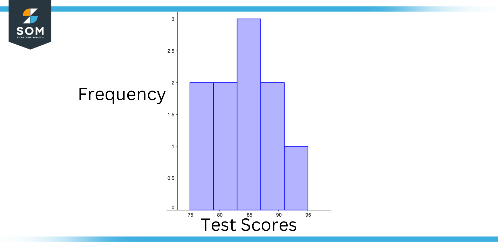
Figure 4 – Practical Example of Frequency Histogram
Step 1
To create a simple frequency histogram for this data set, we first need to determine the unique values in the data set. In this case, the unique values are 75, 80, 85, 90, and 95.
Step 2
Then, we have to determine the frequency of each value, which is the number of times it occurs in the data set. In this case, the value 75 occurs twice, the value 80 occurs twice, the value 85 occurs three times, the value 90 occurs twice, and the value 95 occurs once.
Step 3
Finally, plot these frequencies on the y-axis of the histogram, with the unique values on the x-axis. The resulting histogram would look as shown above.
Conclusion
Histograms display the frequencies of values in the data set as the height of each bar. The height of the first bar, for example, represents the frequency of the value 75, which is 2. The height of the second bar represents the frequency of the value 80, which is 2. And so on.
From this histogram, we can see that the most common test score in the data set is 85, which occurred three times. We can also see that the value 75 and the value 80 each occurred twice, while the values 90 and 95 each occurred once. Identifying patterns or trends in the data set can be achieved by using this information to clarify the distribution of test scores.
All mathematical drawings and images were created with GeoGebra.