JUMP TO TOPIC
Type of Graphs
The following is a list of the sorts of graphs that are most frequently used: Graphs of statistical data (bar graph, pie graph, line graph, etc.), exponential graphs, graphs on a logarithmic scale, trigonometric graphs, graphs showing the distribution of frequencies, etc.
Each of these graphs is utilized in various contexts to condense the representation of a particular set of facts. The specifics of these graphs (or charts) are broken down in the following paragraphs.
Graphs of Statistical Data
Bar, line, pie, and histogram charts are the four fundamental graphs utilized in statistical analysis. These are discussed in greater detail below.
Bar Graph
A bar graph is a pictorial depiction of grouped data that displays the data in the form of vertical or horizontal bars of varying lengths, with each bar’s length proportional to the data’s value. The categorical data is represented by the chart’s horizontal axis, while the chart’s vertical axis defines the discrete data.
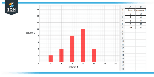
Figure 1: Representation of data by bar graph
As you can see from the above figure, a statistical graph or chart is a pictorial depiction of statistical data in the form of a graphical chart. It is much simpler to comprehend and make sense of statistical information when it is represented through statistical graphs depicting data sets.
Line Graph
It is a type of graph that illustrates change over a while via the use of points and lines. In other words, it is a chart that illustrates a line connecting numerous points or a line that illustrates the link between them. The graphic illustrates quantitative information between two variables associated by connecting a sequence of succeeding data points with either a straight path or a curve. The line or curve may be straight or curved. A linear chart’s vertical and horizontal axes are used to compare and contrast these two variables.
Histogram
A histogram is a chart that uses connected rectangular bars to illustrate the frequency of continuous and discrete data within a dataset. In this case, the number of measurements shown to fall within a predetermined class interval is depicted by a bar chart in the shape of a rectangle.
Pie Chart
A numerical representation of a dataset that uses a pie chart to show the proportions of the data. To draw this graph, a circle is segmented into several sectors, and the proportion of one element that makes up the whole of each sector is represented by the circle as a whole. A circle graph or circle chart is another name for this type of chart.
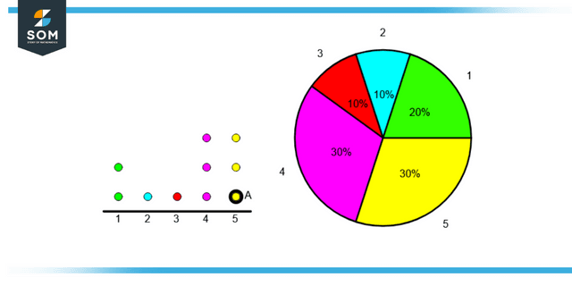
Figure 2: Representation of data by pie chart
Exponential Graphs
The depiction of exponential functions that use a table of values and drawing the points on lined paper is called an exponential graph. It should be noted that the logarithmic functions are the opposite of the exponential functions. When it comes to exponential graphs, the graph might take the form of either an ascending or a descending curve, depending on the function. An illustration of how to graph an exponential function is provided below for your convenience, and it will make the topic much simpler to grasp.
Graphs on a Logarithmic Scale
The reverse of exponential functions are logarithmic functions, and the methods for charting logarithmic and exponential functions are comparable. To draw logarithmic graphs, a table of values must be created, and then the points must be plotted on graph paper in accordance with the table. The inversion of an exponential curve will always be represented graphically by a log function.
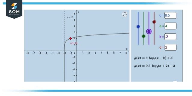
Figure 3: Representation of logarithmic graph
Graph Showing the Distribution of Frequencies
It is possible to demonstrate the frequency of the events in a particular sample by employing a frequency distribution graph. The table of values produced for frequency distribution graphs by arranging the outcomes in one column and the number of instances that occur (i.e. frequency) in another column.
Frequency Polygon Graph
A histogram is used to analyze different data sets or depict a cumulative frequency distribution, and a frequency polygon is virtually indistinguishable from one another. It employs a line graph to display quantitative data. The field of statistics is concerned with systematically gathering information and data for analytical purposes. In cricket, the game’s statistic is determined by tallying up the number of runs scored for each ball. Many tables, graphs, pie charts, bar graphs, histograms, and polygons display statistical data graphically. Frequency polygons are highly recommended as a visually powerful technique for displaying quantifiable information and its frequencies.
Cumulative Frequency Graph
In the field of statistics, the term “cumulative frequency” refers to the sum of individual frequencies that are broken down into various class intervals. It signifies that the information and the total are given in the form of a table, and within that table, the frequencies are spread in accordance with the class interval.
Examples of Graphs
Example 1
How to find distance on a coordinate plane between two points?
Solution
Let the two numbers in a plane be R (1, 2) and S (0, 3).
The distance between the points R and S can be computed with the distance formula, which is:
\[ \mathsf{\sqrt{(x_2-x_1)^2 + (y_2-y_1)^2}} \]
Here, x1 = 1, x2 = 0, y1 = 2 and y2 = 3.
After putting values in it, we get:
$\mathsf{\sqrt{(0-1)^2+(3-2)^2}}$ = 2
$\mathsf{\sqrt{2}}$ = 1.414
Example 2
How to find distance between coordinates in 3 dimensional space?
Solution
In 3-dimensional space we also have z-axis, so the formula becomes:
\[\mathsf{\sqrt{(x_2-x_1)^2 + (y_2-y_1)^2 + (z_2-z_1)^2}}\]
If the coordinates are:
x1 = 2, x2 = 4, y1 = 1, y2 = 3, z1 = 4 and z2 = 5
then after using the above formula the answer we get is 3.
All images/graphs are created using GeoGebra.