JUMP TO TOPIC
In statistics, a graphical representation of the dispersal of data is a histogram. The histogram is defined by a set of rectangles, bordering each other, where each bar or rectangle represents a kind of data.
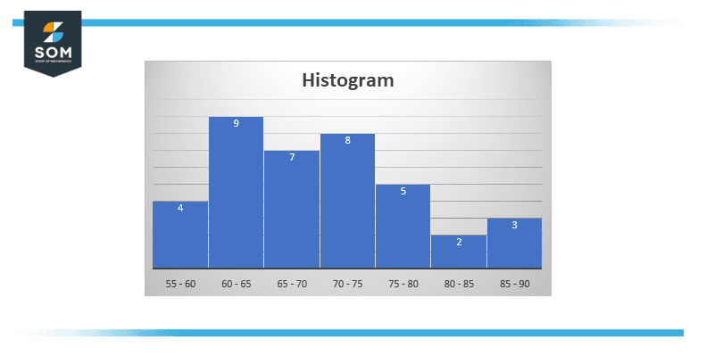
Figure 1 – Depiction of Histogram
Statistics is a kind of mathematics that is applied in different fields. When numerals are duplicated in statistical data, this duplication is known as Frequency and it can also be shown as a table, called a frequency distribution. A Frequency distribution can be displayed graphically by the different types of graphs; a Histogram is among them.
What Is a Histogram?
A histogram represents grouped frequency distribution with continuous classes in a graph form. The histogram is an area diagram that can be described as a bunch of rectangles with bases alongside the intervals between class boundaries and with areas related to frequencies in the related classes. In these representations, all the rectangles are joined and there is no space between them because the base coats the intervals between class boundaries. The heights of rectangles are related to corresponding frequencies of similar classes and for different classes so the heights will be dependent on frequency densities.
In Histogram data is represented into continuous number ranges and each range is related to a vertical bar. The horizontal or X axis shows the number range. And the vertical or Y axis (frequency) represents the density of data which is present in given range. The number ranges relay upon the data that is being used.
How To Plot Histogram?
You need to follow the given steps to make a histogram.
- First of all, on the X-axis, plot the class intervals, and on the Y-axis plot frequencies.
- Both axes should have the same scale.
- Class intervals are required to be exclusive.
- Now plot rectangles with their base as class intervals and the base’s frequencies as heights.
- Each rectangle is based on its respective class interval because the class limits are marked on the horizontal axis, and the frequencies are marked on the vertical axis.
- The height of each rectangle is related to the corresponding class frequency when the intervals are equal.
- The area of every individual rectangle is related to the affiliated class frequency when the intervals are unequal.
In figure 1, Histogram is made using the below data.
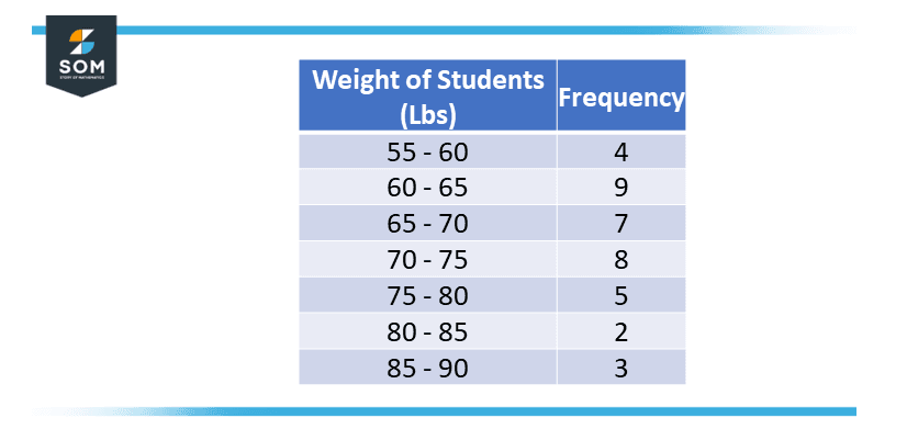
Figure 2 – Tabular Data
On the x-axis is the range of weights of students from 55 to 90 with 7 rectangular bins and on the y-axis is the frequency or how many students have the weight in the particular range.
When To Use a Histogram
Use a histogram when:
- The data is in numerical form.
- When determining whether the output of a process is distributed normally or not, you should notice the shape of the data’s distribution.
- To analyze whether a specific process can meet the customer’s requirements
- To analyze what the output from a supplier’s process will look like.
- To see whether a process change has happened from one time span to another.
- To determine if two or more processes have the same output or not.
- You want to communicate the distribution of data through graphical representation quickly and easily to others.
Difference Between Bar Graph and Histogram
A histogram is one of the most widely used graphs to present the frequency distribution. As we know that the frequency distribution shows the amount of each different value occurring in the data set. The histogram looks much similar to the bar graph, but there are differences between them.
Histogram
The histograms are two-dimensional graphs. The frequency or density in the histogram is shown by each rectangle’s area. Also in histograms, the rectangles are in contact with each other since their bases are ranges.
Bar Graph
Bar Graphs are one-dimensional graphs. The height of a rectangle in a Bar Graph represents the number of happenings and the width has no such importance. In bar graphs, rectangles are isolated and have equal spaces in between them meaning their bases are not connected.
Types of Histogram
The histogram is to be classified into different types on the basis of the frequency distribution of the data. There are various types of distributions, which are normal distribution, multimodal distribution, bimodal distribution, comb distribution, dog food distribution, edge peak distribution, and so on. The histogram can be used to represent the above-mentioned types of distributions. The different types of a histogram are:
Uniform Histogram
A uniform distribution shows that the number of classes is a very small number, and each class also has the exact same number of happenings. It may include a distribution that might have several peaks.
Symmetric Histogram
The symmetric histogram is also known as a bell-shaped histogram. When you cut the histogram from the center creating two equal parts to it, and the two parts are identical in size and shape, the histogram is called a symmetric histogram. The right half portion of the image should be the same as the left half in order for the diagram to be perfectly symmetric. The histograms that are not symmetrical are known as skewed.
Bimodal Histogram
In the event that a histogram contains two peaks, it is called a bimodal. Bimodality happens when the data set has observances on two different kinds of combined groups or individuals and if the centers of the two separate histograms are too far from the variability in both the data sets.
Probability Histogram
A Probability Histogram shows a graphical representation of a discrete probability distribution. It has rectangles that are centered on all the values of x, and also the area of every rectangle is related to the value of the probability of the corresponding value. The probability histogram diagram is drawn by first selecting the classes. The probabilities of each outcome determine the heights of the bars of the histogram.
Application of Histogram: Normal Distribution
The typical shape that looks just like a bell curve is phrased as a normal distribution. In this, The majority of the data points emerge on the flank of the mean as on the other. It is to be mentioned that other distributions occur identically to the normal distribution.
The computations in statistics are used to ascertain a distribution that is a normal distribution. It is needed to notice that the phrase “normal” describes the specific distribution of a methodology. For example, in many methods, normal distribution retains a natural limit on a flank and forms skewed distributions. The normal in this represents the procedures, in the scenario where the distribution is not regarded as normal.
Histogram Example
Make a Histogram of the following data.
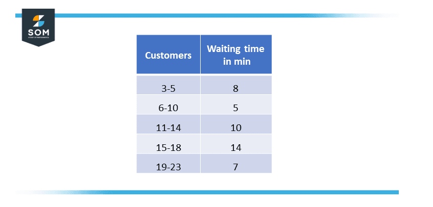
Figure 3 – Customers and waiting time data.
Solution
The histogram of the given data is plotted below:
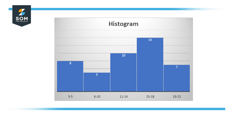
Figure 4 – Histogram of the customer and waiting time data
All images/mathematical drawings were created with GeoGebra.