JUMP TO TOPIC
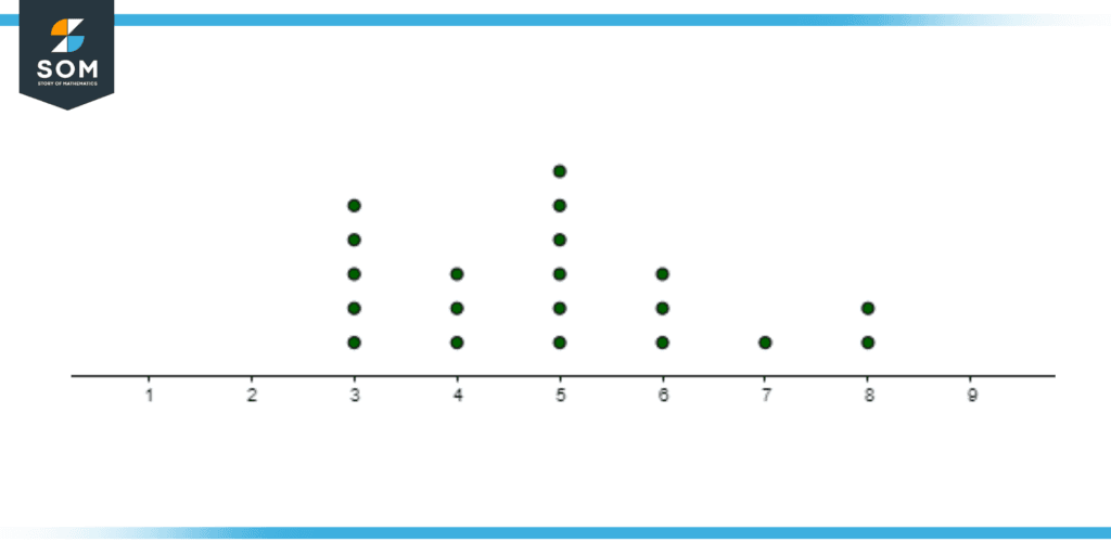
Figure 1: A dot plot showing the data of a person eating lunch in how many minutes.
Moreover, the dot plots are considered one of the simplest statistical graphs to identify clusters and highlight gaps and skews in the distribution. Additionally, these dot plots are effective for a dataset of less than 20 to 30 variables, as it is less manageable for a dot plot to depict a data set of more than 30 variables.
For a higher number dataset, one can utilize the histogram since it is difficult to manage and draw a large quantity of the dataset on the dot plot. This way, it is further emphasized to draw a smaller dataset on a dot plot since it is easier and takes less time to analyze and see the general trend of the data samples.
Classification of Dot Plots
Dot plots are classified into two types:
- Wilkinson dot plot
- Cleveland dot plot
Given ahead is the description of these two types of dot plots, which both use dots, but one uses it in the sense of a bar graph while the other utilizes it as more of a histogram. Both of these dot plot types are widely used in statistics to analyze and interpret implicit meaning from the dataset.
Wilkinson Dot Plot
Wilkinson’s dot plot was created by Leland Wilkinson, who devised this method to ease the analysis of dot plots and depict them as a histogram. These dot plots are the standardized forms of dot plots used in statistics. It represents the distribution of continuous dataset points, similar to a histogram, and hence, is widely used in statistics.
Thus, if we need to depict a room’s temperature for 24 hours per hour, we could use the dataset to write continuous data and draw them on the Wilkinson dot plot for ease of interpretation.
Let us take an example of twelve people taking part in four sports: Badminton, Table Tennis, Football, and Cricket. We have three people participating in badminton, five in Table tennis, two in Football and two in Cricket. The dot plot can be, thus, drawn as shown in Figure 2.
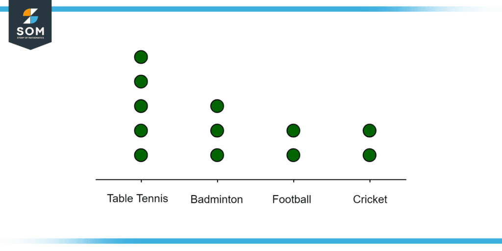
Figure 2: A dot plot of twelve people in 4 different sports.
Thus, with this example, we can see how the Wilkinson Dot plot is utilized to interpret the dataset provided by data sampling and finding the trend of the overall data from the dot plot.
Cleveland Dot Plots
The Cleveland dot plot was created by William S. Cleveland, in an attempt to reduce dot clusters and grouping that might hinder the interpretation of a large dataset on the graph. These dot plots are similar to bar graphs, but instead of the length of the bar graph to depict the data of a particular label, the Cleveland dot plot uses the dot’s position on the graph to show the value of the data.
Cleveland dot plot is very useful when using multiple variables as it does not require starting from the zero axis. Instead of having all the dots, we can use only one dot and its location on the y-axis will depict the value of the dot.
Examples Representing the Usage of Dot Plots
Example 1
Given is the raw data of time taken for a task to be completed by twenty students in minutes: 5, 8, 3, 4, 9, 2, 4, 5, 3, 8, 5, 6, 7, 8, 9, 4, 8, 6, 5, 3. From this dataset provided, draw a Wilkinson’s dot plot and find the mean value of the time taken for the task to be completed by twenty people. What is the most common time value for which the task was done and by how many people was this task done at that time?
Solution
Given below is the dot plot drawn from the dataset given in the Example problem.
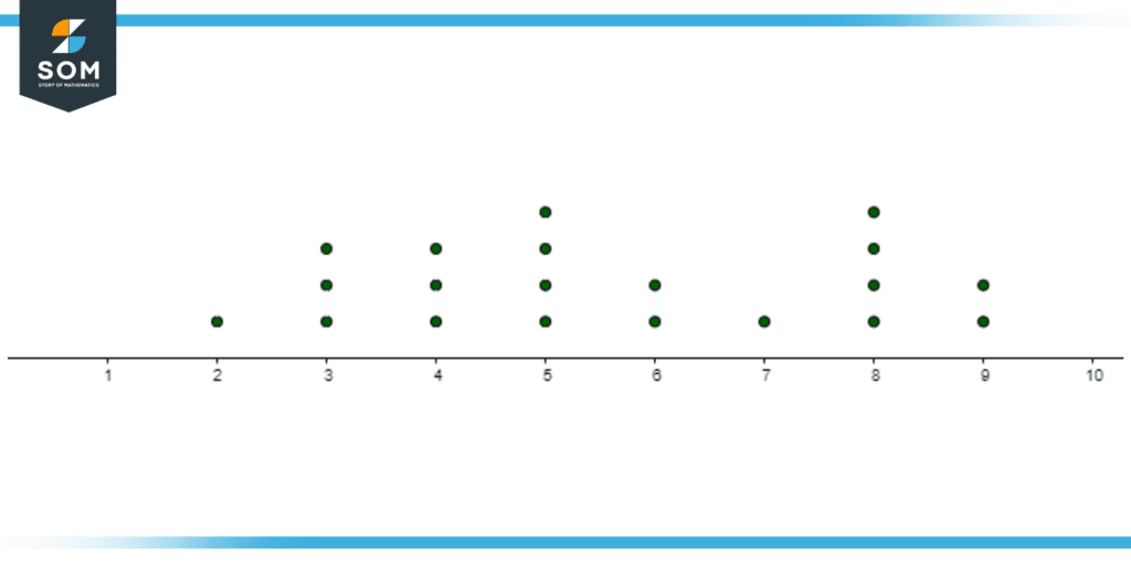
Figure 3: The dot plot for the dataset of time taken, in minutes, at the x-axis and the number of people represented by dots.
Hence, we can see that about four people have taken five and eight minutes to complete the task and so the most common time in minutes for completing the task is five and eight minutes by four people.
Now, to find the mean value of the twenty people to complete the task in minutes by taking the weighted sum of all the grouped data and dividing it by the total number of samples, that is, twenty.
\[ \text{Mean = } \frac{\sum^{9}_{i=2} x_i \times k_1}{n} \]
\[\text{Mean = } \frac{2 \times 1 + 3 \times 3 + 4\times 3 + 5 \times 4 + 6 \times 2 + 7 \times 1 + 8\times 4 + 9 \times 2}{20} \]
\[\text{Mean = } \frac{112}{20} \]
\[\text{Mean = } 5.6 \text{ minutes} \]
Thus the mean time taken for the task to complete is equal to 5.6 minutes.
Example 2
For the dataset of example 1, find the standard deviation of the time taken by the workers to complete a specific task.
Solution
From Example 1, we found that the mean value of the time taken for the task is 5.6 minutes. To find the standard deviation, the following steps are taken to calculate it.
\[ \text{Squared Sum = } (2^2 \times 1) + (3^2 \times 3) + (4^2 \times 3)\]
\[+ (5^2 \times 4) + (6^2 \times 2) + (7^2 \times 1) + (8^2 \times 4) + (9^2 \times 2) = 718\]
\[ \text{Mean of Squared Sum = } \frac{718}{20} = 35.9 \]
\[ \text{Standard Deviation = } \sqrt{ 35.9 – 5.6^2 } \]
\[ \text{Standard Deviation = } \sqrt{ 4.54} \]
\[ \text{Standard Deviation = } 2.13 \]
Hence the Standard Deviation of the data is equal to 2.13 minutes.
All drawings and mathematical graphs are made using GeoGebra.