JUMP TO TOPIC
Overview
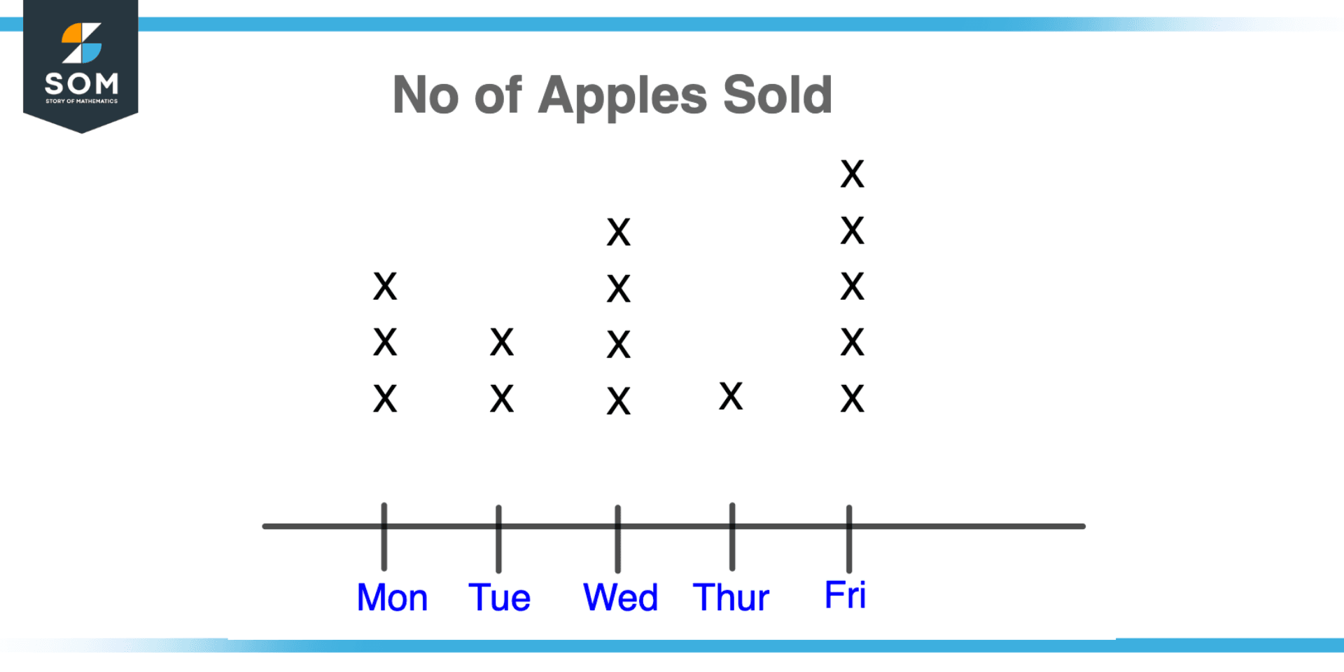
Figure 1 – Illustrating number of apples sold by using the concept of Plot
For comprehending and evaluating data in various disciplines, such as statistics, economics, and engineering, mathematical charts are a crucial tool. They enable us to see how variables relate to one another and to learn more about how the systems we are investigating behave.
We can better comprehend the data we are working with and make more informed decisions based on that understanding if we have a solid understanding of how to produce and analyze various sorts of plots.
Properties of Plot
There are several properties of a mathematical plot that are important to consider when creating and interpreting the plot:
- Scale: The range of values depicted on the x-axis and y-axis is referred to as the plot’s scale. It is crucial to pick a scale that would allow the key elements of the plot to be seen clearly.
- A plot’s x-axis and y-axis are the lines that split it into four quadrants, respectively. The horizontal axis is the x-axis, and the vertical axis is the y-axis. The axes show the values of the variables that are being plotted.
- Data points: The values of the variables being plotted for a specific example or observation are represented by a data point on a plot. The location of the data point on the plot corresponds to the variables’ values.
- Legend: A legend is a label or key that describes the significance of the data that is presented on a graph. It usually isn’t part of the plot but aids in understanding its significance.
- Titles: A title is a succinct summary of the plot that identifies the point or focus of the story. It often sits on top of the plot area.
- Labels: Labels are used to describe the plot and identify the variables being plotted. They are typically found along the plot’s axes.
- Gridlines: On a plot, gridlines are lines that are drawn to indicate the values of the variables. They assist to make the plot easier to read and understand because they are typically separated at regular intervals.
Line Plot
A graph called a line plot shows data along a number line. The link between two continuous variables, such as time and temperature, is visualized using this method. Each data point is shown as a point on the graph and connected by a line in a line plot.
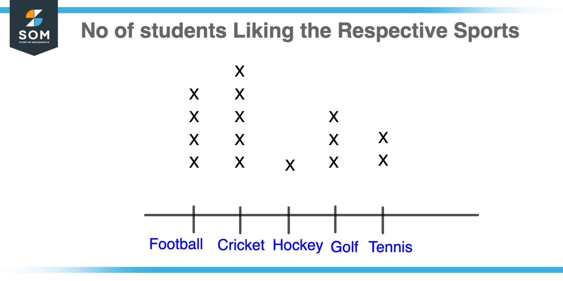
Figure 2 – Illustration of Line Plot
Time series data, such as stock prices or temperature data, are frequently visualized using line charts. They can demonstrate recurring patterns throughout time, such as a rise or fall in a variable. By showing each type of data as a separate line, line plots can also be used to compare different sets of data on the same graph.
How To Create Line Plot
The first step in creating a line plot is to plot the data points on the graph. The x-axis represents the independent variable, such as time, and the y-axis represents the dependent variable, such as temperature. The trend in the data is then depicted by connecting the points with a line.
Line graphs can be made unique by giving the x and y-axis labels and the graph a title. The line and data points appearance, including the line style, marker style, and color, can also be altered.
Bar Plot
A graph known as a bar plot uses rectangular bars to represent data. It’s used to show how a categorical variable, like gender or eye color, is distributed. The height of each bar in a bar plot corresponds to the frequency or number of data points for that category.
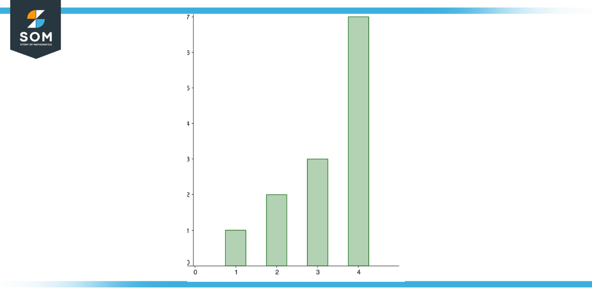
Figure 3 – Bar Plot Illustration
The frequency of several categories is frequently compared using bar graphs. A bar plot, for instance, could be used to compare the proportion of male and female students in a classroom or the number of persons in a population who have different eye colors.
How To Create Bar Plot
The frequency or count of data points in each category is plotted on the y-axis, and the categorical variable is plotted on the x-axis to generate a bar plot. Although they can also be drawn vertically, the bars are often drawn horizontally.
Scatter Plot
A scatter plot is a graph in which data are shown as a group of points. The relationship between two continuous variables, such as height, and weight, is visualized using this method. Each data point in a scatter plot has two values. one that is represented by its location on the x-axis and another that is represented by its location on the y-axis.
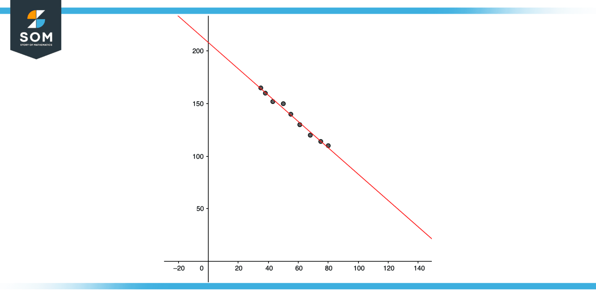
Figure 4 – A simple Scatter Plot
Data patterns such as a positive correlation (when one variable grows, the other variable likewise increases) or a negative correlation are found using scatter plots (when one variable increases, the other variable decreases). Scatter plots can also be used to see how the data are distributed and to spot outliers.
How To Create Scatter Plot
The two variables values are plotted on the x and y-axes to form a scatter plot. On the graph, each data point is represented by a point. By encoding the values of the third variable as the color or size of the data points, scatter plots may also be produced using a third variable.
Other Types of Plots
There are numerous other specialized plots, in addition to these fundamental forms, that are employed for particular kinds of data or analysis. The distribution of continuous data is shown using histograms, a sort of bar graphs.
In order to construct them, the data range is divided into a number of bins, and the frequency or relative frequency of the data in each bin is then shown as a bar. Histograms can be used to determine the distribution’s shape as well as to spot outliers or other unexpected numbers in the data.
The link between two or more variables is displayed using heatmaps, another style of visualization that uses a matrix to encode data as colors.
A graph that uses a set of vertical lines and horizontal lines to depict data is called a box plot, often known as a box and whisker plot. It’s used to show how a continuous variable, like height or weight, is distributed. The whiskers, or vertical lines extending from the box, display the data’s minimum and maximum values. Outliers are any data points that fall outside of the whiskers.
Visual Examples of Plots
Example 1
There are four classes that are participating in a math competition, from class 1, five students are participating, from class 2, three students are participating from class 3, one student is participating and from class 4, six students are participating. Sketch a Line Plot for this data.
Solution
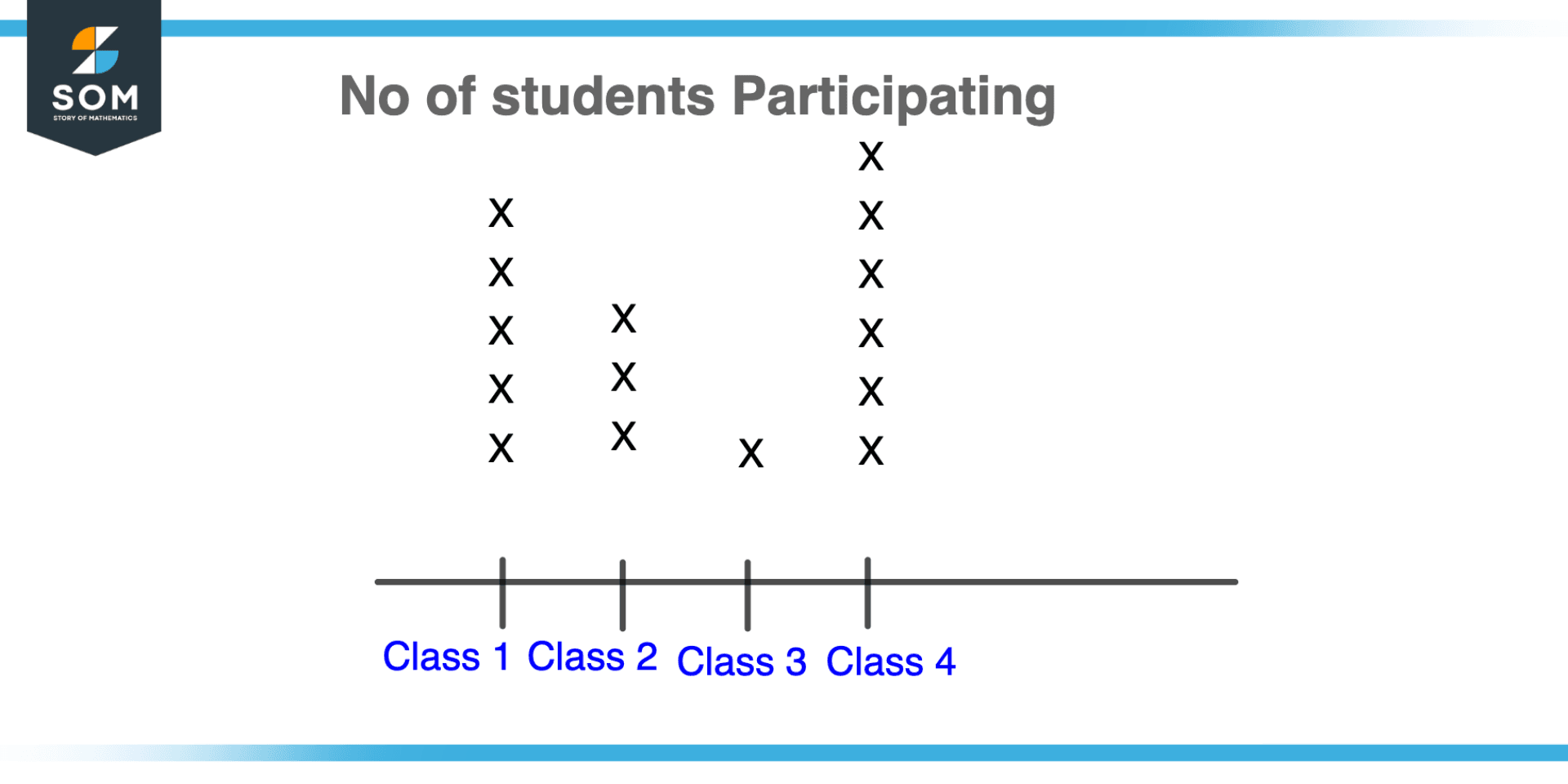
Figure 5 – Example of line plot showing number of students participating in competition
Example 2
Suppose there are four persons, the first person ate one apple, the second person ate two apples, the third person ate three apples and the fourth person ate four apples. Sketch a bar plot for this problem.
Solution
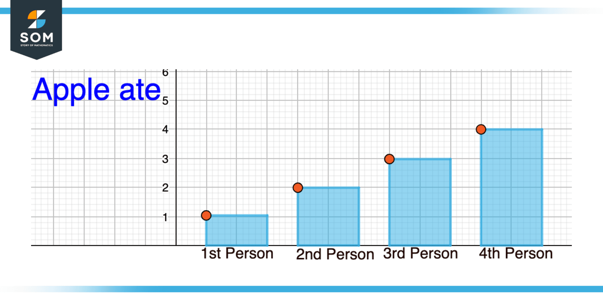
Figure 6 – Example of number of person eating apples represented inform of Bar Plot
All mathematical drawings and images were created with GeoGebra.